Because I’m lucky enough to have birthday and Christmas close but not so close that the presents are combined, I have recently been on the receiving end of a few small silvery items gifted by thoughtful friends. Together they tell an interesting story of what you can (and can’t) learn from your own silver.

H Rodbertus’ silver spoons made for him by F Schultz and engraved 12 February 1869
1.
A few weeks ago I was lucky enough to be given three lovely silver teaspoons for my birthday. They are elegant spoons, long in the handle and narrow in the bowl. They are continental silver, quite probably German. I know they date from 1869 because a date 12 February 1869 is engraved on the back. The date seems to have no great significance in history, so I assume it is probably associated with the owner H Rodbertus whose name is likewise engraved on the back of the handle. They were made by a man (or woman) called F. Schultz whose name is stamped into the reverse of the spoon neck, as is the number 12.
Do you think I can find anything out about F. Schultz? I suppose Europe’s nineteenth and twentieth century history has been a little too turbulent to assist me much here. The continental silversmiths are always much harder to track than their British counterparts. Indeed both H. Rodbertus and F. Schultz have thus far evaded my research skills but at the moment I refer to the spoons as the émigré spoons – imagining that an émigré family escaping Germany in the 1930s brought them to NZ – the path by which most items of this type end up here.
2.
For Christmas I received a little Edwardian folding knife, intended originally as a fruit knife. It is a sweetie. It has a mother of pearl handle, a little engraved folate guard and an inset shield ready for a monogram. The blade in silver is hallmarked. In this case I know exactly who made it and when.

Fruit knife by Thomas Marples 1912
It was made by Thomas Marples in Sheffield in 1912. Thomas came from a family of tool makers (Marples tools are still much admired and collected). He was born in Sheffield around 1833 and in 1851 the census listed him as a fruit knife cutler.
That Thomas could specialize in such an arcane specialist trade is a real testament to the Victorian need for finely wrought objects. There are many surviving examples of lovely fruit knives by Thomas and as he died in 1912, mine is one of his last knives.
This is the wonder of the British systems of hallmarking and probably why collectors have always been so keen on sterling, aka British, silver. A little knife carries with it such a solid history recorded in tiny marks, all of which make the object more resonant. I’ll think of Thomas and his devotion to his craft whenever I use the knife.

Thomas Marples was a specialist fruit knife cutler. His TM mark is the final right hand mark on the blade.
There may be specialist Thomas Marples’ collectors out there (even as I write that sentence I’m tempted to become one) but I suspect he’s fairly obscure, in part because the folding fruit knife has both fallen from attention and was never a high-profile an item in the first place.
3.
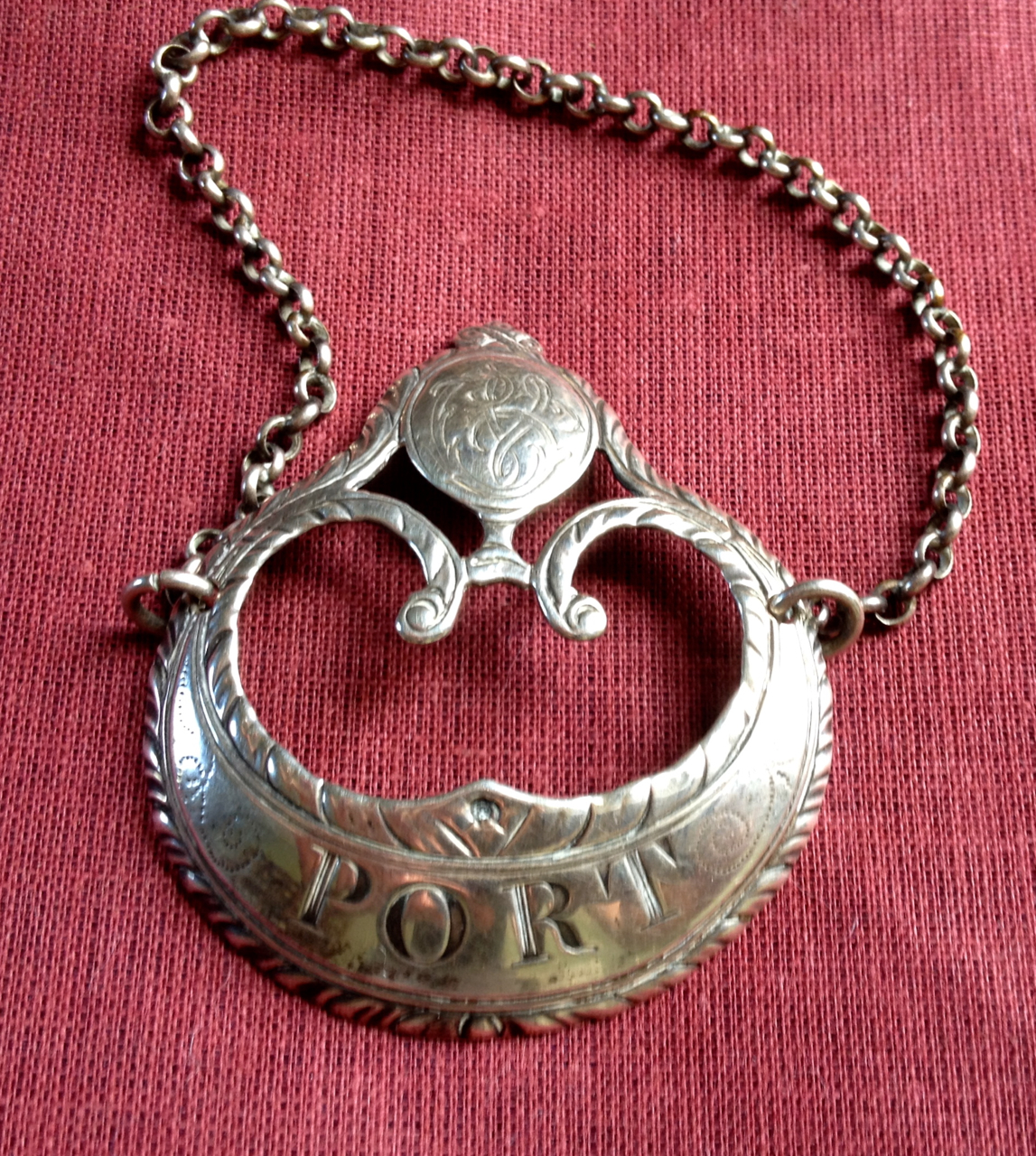
My new decanter label is an all-together different situation. Another Christmas present it is of the ‘suggested variety.’ That is I dropped enough hints about it that the message got through. Indeed so strongly was it heard that two were brought at auction as the lot numbers meant that the more desirous one came up later. Peter wisely hedged his bets. It is the work of an English silversmith called Hester Bateman (1708 – 1794).

Hester Bateman ‘Port’ decanter label
Hester is the closest thing there is to a celebrity Georgian silversmith – probably only rivaled in the fame stakes by the American Paul Revere (1734-1818) who really isn’t famous for being a silversmith but for other things. They are not too far off being contemporaries Hester having had a later start in the industry. Hester inherited the tools of her deceased husband John in 1760. When he died they had already been married for more than 20 years and she had borne him six children. Which is probably why she needed to work and soon picked up his tools – registering her own mark in 1761.
Women Georgian silversmiths weren’t uncommon, as Philippa Granville and Jennifer Goldsborough’s excellent book Women Silversmiths (1685-1945) illustrates. Although I’m happy to have a Hester Bateman piece (Peter has a little inherited collection of Bateman silver) it wasn’t only the celebrity designer appeal of the item that attracted me to this piece but the qualities of the work itself. Decanter labels are slightly strange objects.
After their initial period in vogue (much of the Nineteenth century) they had an enormous revival in the 1980s when, like vesta boxes and watch chains, they were much sought after. Today that fashion has once again subsided but then the preference then was for bulky square labels that suited big square whisky decanters in heavily cut crystal that used to figure in adverts on the back of expensive men’s magazines. My interest really began in my recent return to being a regular port drinker, partially in order to justify some nice Georgian port glasses – found in thrift shops. So I thought I could take the plunge on a decanter label.

Colonel George Washington (1772) by Charles Willson Peale. Washington wears a gorget.
This one is a lovely delicate piece that seem to be to connect in form to the gorgets worn by soldiers in the eighteenth century – perhaps a nice connect for a port label given soldier’s propensity for port – at least in novels.
Gorgets started out as part of a larger suit of armor – a throat guard above the breastplate but lingered as a sign of rank for decades after armor disappeared.
I like the idea that the decanter label, in the form of a throat protector, hangs around the throat of a decanter in order to depict its rank – port, madeira, sherry etc. This is to my mind an illustration of conceptual thinking amongst our eighteenth century design counterparts a sort of fitness for purpose.

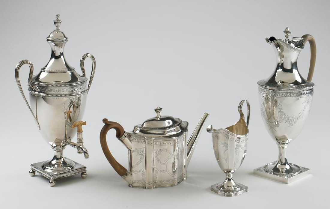
Hester Bateman silver , a hot water urn, teapot, milk jug and coffee pot (dates unknown)
Hester Bateman was something of a thinker – and beyond the need to pick up the tools and support the kids. She realized that silversmiths were facing real completion from the emerging Sheffield plate arena and that she needed to innovate to stay ahead. She perfected a finely cut-out silver style on thinner gauge metal than that previously used and mastered fine engraving on the same. This was therefore cheaper to the customer but very stylish.The little port label is an example, cut from thin silver beautifully lettered and nicely engraved. This worked and established not only Hester’s reputation but also that of the rest of the family, most of whom took up the tools. Hester had at least five children who grew to adulthood – Jonathan, Peter, John, Letitia and Ann. Only Peter, Letitia, and Ann were still living at the time of Hester’s death.
Her sons Peter and John Bateman registered their mark in 1790 but John died a year later. Peter then went into business with John’s widow Anne and they registered their mark in 1791. In 1800 they registered the mark of Peter, Ann and William Bateman, a nephew. From 1839 to 1843 another William Bateman, son of the first one registered his own mark.
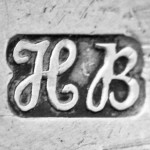
Hester Bateman’s mark.
All of this, confusing as it might seem, illustrates how the Bateman name stayed active in silver from George III to Victorian times. This was no mean feat in competitive time and in the face of constantly changing fashions.
So I love my little label and my other recent acquisitions in the silver line. Yet what I like most of all is that now I get to search out the perfect port decanter – with just the right throat against which to best display my new label.
An Auction House Epilogue
The morning after I’d written this blog I was checking out our favorite local auction house – which had an Antique sale viewing that day. As I wandered out through the general sale rooms I spied a little decanter sitting on a shelf. I had not spotted it on the two trips I’d made to view the general sale. Really I hadn’t spotted much at all in this week’s sale. 
On examination it proved to be a sweet, small-sized decanter, neither marked or stained and with its original stopper. The glass was heavy and deeply cut. I left a bid – it was in a lot with 2 glass cake plates and a glass food cover. By 5.00pm I got the call. It was mine.
I didn’t really think it was the one for my label. It has wide ribs around the neck and a flange top of considerable diameter. However to my surprise the little chain fitted nicely over the rim and holds the label nicely in position. Now to fill it with Port.
DLJ