Sussex armchair envy

052_lA friend of mine recently acquired two superb Morris & Co., Sussex armchairs (c1860)

Not that I envy him. It’s just one of those events that plays on your mind in quiet moments of décor envy. I had recommended he consider them as they were out of my price range. He then acquired them unopposed at auction. I should add they were on the other side of the world and he shipped them over – but this doesn’t lessen my ongoing insane jealously.

Every time I see them at his house – where they look great – I realize what really good pieces of design they are. They have a deep ebonized finish, nicely worn in the right places and are as solid as a rock. They hold their own in the space and have real personality. They complement other pieces he has by Liberty and Heals. I suppose my willingness to pass on them initially came from the lack of a meaningful close encounter with a real example? Should I have kept mouth shut and acquired them myself?

Doing the right thing sometimes pays off. The other day I encountered four Sussex chairs at the last of the Auckland auction houses to deal in decorative arts. These were not alas my friend’s fabulous armchairs but the dining chair (both are by the architect Philip Webb). These are in essence a much more modest proposition. However I was not going to make the mistake of overlooking them and left a bid.

IMG_5479The four proved a good example of how sets of items come together over time. What at first seemed four seemingly identical chairs, turned out to be three chairs and an odd one probably by another maker. Within that grouping there were variations of every sort. Two are ebonized, two are stained brown, two have new, slightly clumsy, seats and one is near as can be original. One is essentially a ruin.

There is plenty of online advice regarding the restoration of a Sussex chair and in time I’ll blog around that ruin. Re-gluing the frame will be easy enough but it seems I’m going to have to consider alternatives to importing river rush which I can’t see New Zealand customs being happy about. For today I’ve done nothing more than remove some fairly rotten seating that had long ago disintegrated in order to discourage a very interested cat from becoming similarly interested in deconstructing the three surviving seats.

The bare frame now sits beside me at my desk in a corner of my office. Glancing at it periodically I can see why early Twentieth century writers on design saw the Sussex chair as a key starting point in modernist design. Its proportions are utterly elegant and its method of making both simple and sensible. Not yet industrialised, the frame has nice variants and a solid and straightforward honesty. It might not be an armchair but its the next best thing and I look forward to putting it back together.

DLJ


Advertisement
Posted in auction finds etc., furniture, practical matters | Tagged , , , | 4 Comments

Mistaken Identity

Maclise 1

Lot 106 Daniel Maclice (Attributed), The Abduction [sic] of the Sabine Women.

The other day while viewing an art sale, for someone else, I had noticed (and immediately fallen for), a rather splendid Victorian painting, The Rape of the Sabine Women, attributed to the Irish painter Daniel Maclise.

Daniel Maclise (1806-1870) is best known for the murals in the Palace of Westminster depicting The Death of Nelson and The Meeting of Wellington and Blücher at Waterloo (1864). He was a favourite painter of Prince Albert and a close friend of Charles Dickens. A Daniel Maclise, of any sort, is a rare thing on the New Zealand art market.

The Rape of the Sabine Women was a watercolour (laid down onto linen) of remarkably good colour and excellent execution and it was presented in an impressive gilt frame. The estimate on the work was well above what I could afford, but I held out hopes that with divine intervention it might fall my way.

I took a few digital snaps and headed home to report back to the friends for whom I’d attended the auction viewing. I continued to think about the work. Perhaps I could afford it? It was after all, splendid and although the subject matter wasn’t quite ‘us’ it would make good company for a little oil sketch by Maclise that hangs in our library. Except that is, that some things about this work worried me. If I was going to spend serious money I determined I’d better do some serious research.

Firstly I didn’t really feel this was a Maclise. Maclise’s approach to figures is quite distinctive and so I checked in Peter Murray’s book ‘Daniel Maclise: Romancing the Past.’ The book refreshed my eye and the figures at the centre of the image did not fit the bill. It also made no mention of their being a Sabine Women attributed to the artist. I felt sure this wasn’t a Maclise (later I found out that experts from Auckland Art Gallery, and Christies who viewed the work came to the same conclusion) but I liked the work even more the more closely I looked at it.

maclise

“Maclise’s figures, are quite distinctive.” Daniel Maclise, The Wrestling Scene in ‘As You Like It’ (Image courtesy Christie’s Images Ltd., 2012.)

Then there was the subject itself. The picture contains only one woman. So it could hardly be The Rape of the Sabine Women, plural. Artists are seldom that sloppy, even given ‘artistic license.’ Also that subject was in itself not popular with the Victorians who were after all a little more prudish than the generations prior – well at least when it came to scenes to be hung on the dining room wall. So if it didn’t depict The Rape of the Sabine Women what exactly was going on?

I went back to the image.

A knight dressed in red is rescuing a woman captured by brigands who was until then seemingly about to be set alight. It seemed we were in popular early 19th century territory – medieval knights rescuing maidens in distress. Perhaps it was from Sir Walter Scott? So into Google I went with an image search for ‘knight rescuing maiden.’

It took a while, trawling through abysmally sentimental images of the Disney meets Game of Thrones kind, but eventually there is was, the painting in question or at least what was left of it.

Sir Calepine Rescuing Serena (1831) William Hilton the Younger (1786-1839). Collection of the Tate Gallery, London.

The work was by William Hilton the Younger (1786–1839) and called Sir Calepine Rescuing Serena (1830) and depicts a scene from Edmund Spenser’s ‘Faerie Queene.’ The painting is in the Tate gallery, however you won’t see it hanging there anytime soon as the painting is almost entirely destroyed by the asphaltum the artist used. This means that, like so may of this other works, this painting suffers from an irreversible creeping blackness.

So if this was a watercolour in preparation for a now lost work by William Hilton that was even better than it being a Maclise. Was this the sort of a work that might have turned up in New Zealand? The auctioneer, when chatting to me, had revealed that the work was from a deceased estate that had ‘some good art.’ This might be worth buying – even without relying on divine intervention.

The Tate website had another Hilton image. In 1989, probably realizing that their large Sir Calepine was doomed, they had purchased a small preparatory watercolour for the work. This illustrated Hilton working with small spontaneous studies. Did he then work these up into meticulously watercolours? It seemed a bit doubtful to me. Watercolours of the finished kind tended to sit in quite a different artistic camp. Clearly more research was required.

Study for 'Sir Calepine Rescuing Serena' circa 1830 by William Hilton the Younger 1786-1839

Study for ‘Sir Calepine Rescuing Serena,’ William Hilton the Younger 1786-1839. Tate Gallery London

I returned to my digital images, one of which was of the frame maker’s label attached to the back of the frame. This work was largely undisturbed it had no real signs of having been repeatedly taken out of its frame. However the label had been gnawed away leaving only vestigial information.

There was the name ‘Alfred Boot Princ … Eastcheap, E.C, & Dockhead, S E.’ and between that and the remains of a title the words ‘Manufactory on the Premises.’ Having grown up in a colonial part of the world in which almost every second street is called Princess Street it seemed obvious that Alfred Boot lived and worked in Princess Street. However Google told me that Alfred Booth was no frame maker but instead a printer. On second viewing the label read Alfred Boot Printer, Eastcheap, E.C, & Dockhead, S E. This explained ‘manufactory on the premises.’ This was not a watercolour but a print.

IMG_4645The print had been laid done onto linen which was a common practice for early chromolithographers and then applied to a stretcher – so it was an easy mistake to think it was a watercolour. A printer’s label attached directly to the rear of a print in assailable evidence you’re not looking at an original work and certainly not a watercolour.

I was now in a strange position of having undertaken extensive and, I thought conclusive, research that I suspected the auctioneer might want to know – but would he? I took some solace in my ability to deliver the first half of the information to him – the proper name and title. Nervous though I was, the news was taken very well and an announcement was made when the lot came up listing the real title and artist and its likely designation as a print. There was of little or no interest in the room and the work remained unsold.

It’s kind of a sad end to the story because they work still retained the same splendid appearance it did when I first saw it. The work was beautifully presented and would have been expensive in its day. Early Nineteenth century Chromolithography is a marvellous thing – but I suppose none of us are quite there yet. But even now I can’t help but think that this was Victorian image making of the best sort and that Sir Calepine and Serena would make splendid décor item in any home.

DLJ


Posted in art, auction finds etc. | Tagged , , , , , , , , , , , , | Leave a comment

A bowl, a plate, a conversation

Emperor_Guangxu

Emperor Guangxu the tenth emperor of the Manchu Qing dynasty


Viewing the local antique sale my attention was captured by a Chinese bowl decorated with two red dragons and with a distinctive disk of gold in the centre. What initially caught my eye was the auction house’s accidental arrangement of this piece on a smart nineteenth century mahogany extending dining table of good quality. Together the two seemed a classy couple compared with some of the fairly ordinary flotsam and jetsam that populate antique sales in this neck of the woods.

I decided to attend the auction.

11043063_1037980636216068_4226135583701395429_n

Slightly annoyed at not getting a couple of things I thought I wanted early in the sale, I decided not to be outbid on the bowl and vanquished both an absentee bidder and a opponent in the room – at some cost. I waited around to see the table go under the hammer – but sadly it went elsewhere and the pretty pair, bowl and table, were separated.

I fled, lest I frittered money on unnecessary items.

When I got the bowl home I gave it a gentle wash and looked it over carefully. Despite a little loss to the gilding around the rim it seemed in great condition. But was it old? I’d bought it because it looked splendid not because I know anything about Chinese ceramics. This has been the general approach to the purchase of both Chinese and Japanese pieces here – it is a subject on which I am not expert but I do find myself attracted to the output of both nations.

plate

I was pleased then, to locate a matching bowl for sale on an online antique site, where it was described as a “Chinese Qing dynasty period bowl having iron red dragons.” The description then went on to note the piece had “the red six character calligraphy Guangxu (1875-1908) reign marks.” The auction house provided an estimate that made me less worried about my purchase price.

Reign marks are a fairly new territory for me. So I was pleased to also match those on my bowl to Guangxu who ruled China between 1875 and 1908. Guangxu came to the throne aged four in 1875 as the tenth emperor of the Manchu Qing dynasty. He was adopted by the ruthless one-time concubine Empress Dowager Cixi, who “aided” his rule. This arrangement didn’t turn out well and in 1895 Cixi, placed Guangxu under house arrest until she worked out a way to discreetly poison him.

reign marks

So my red Chinese bowl is from this volatile period of Chinese rule in the late Nineteenth century.

I’d shown a friend a photo of the bowl the night previously after he had enquired as to whether I was pursuing anything at the sale the next day. He remarked that it ‘went’ with two plates I already owned. This is a pretty astute observation when you realize how many plates there really are here.

The plates in question are by the English maker Minton and date from the middle of the 1880s. So potentially the English plates and the Chinese bowl are contemporaries. The British makers may have been looking a little more to Japan for their decorative inspiration but in terms of colour they’re spot on. It was clear that there needed to be a conversation between our Chinese bowl and our Japanese inspired English plates.

I selected the prime position on the library mantelpiece on which a marble lion has remained undisturbed from the very first posting on this blog. However when it comes down to it, the library is a great room for really looking at objects, so it seemed a fitting location. Accompanied with two Japanese blue and white vases and a pair of Imari style candlesticks (both yet to be properly identified), the Chinese bowl deservedly takes centre stage.

The ebonized aesthetic movement over mantle makes a great replacement backdrop for the regency style table at the auction house and the orange-red chinese plate seems at home.

mantleDLJ

Posted in auction finds etc., Uncategorized | Tagged , , , | 2 Comments

An Easterly Trajectory

east 2

Sir Alfred East, Stow-on-the-Wold (1906)

We spotted this work in a sale. For me at least, the initial viewing was a bit of blur, as I’d left my glasses behind. I could determine outlines of large pieces of furniture and the distinctive shape of a large soup tureen, but the fine details on the surface of an image were beyond me. However as this work was large enough to ‘feel good’ even under those circumstances, I asked Peter to read the signature. This was sufficiently large and clear to reveal the name  ‘Alfred East.’

That name rang a distant bell. Wasn’t that was the name on the little painting that hangs in the library? I was sure that was by Alfred East.

Peter had spotted this earlier work in a Webb’s sale a while back. ‘The Silence of Morning’ (1897) is a lovely depiction of a man in a rowing boat on a tree-lined river. Part of the attraction is that it had an undisturbed backing – featuring the label of J W Gibb, the late nineteenth century art dealer of 109 Cashel Street Christchurch, son of the Scottish maritime painter John Gibb (1831-1909).  The East was however very small and therefore broke the self-imposed ‘no small paintings’ rule. Why this one was allowed ‘in’ was that it passed an altogether different test.

Sir Alfred East is one of the artists represented in the Andrew McIntosh Patrick collection. I have mentioned before that this man can do no wrong when it comes to issues of taste.

east 3

Sir Alfred East, The Silence of Morning (1897)


He and I intersected a while back through the pages of World of Interiors and then through a copy of his Fine Arts Society sale catalogue acquired online.  I’ve been collecting earlier works (Gilpin, Absolon, Taverner etc), but Andrew McIntosh Patrick does a very good line in late nineteenth century/early twentieth century English and Scottish works. That combined with an excellent little book on artists associated with Oscar Wilde (The Wilde Years: Oscar Wilde & the Art of His Time) provide valuable references for this particular aspect of the collection.

Andrew McIntosh Patrick had a lovely little Alfred East called ‘New Moon and Rain Showers’ that dated from a trip made to Japan made in 1889. East spent 6 months in Japan and the subsequent exhibition of works in London caused a sensation in its day and propelled the artist into the spotlight. After that Alfred East’s career was a common enough tale of the alternative artist who becomes an establishment figure, eventually elected President of the Society of British Artists and in receipt of a knighthood from Edward VII.

Establishment British artists aren’t much admired or sought after in New Zealand any longer. It is a type of reverse colonial cringe. Something can’t be good or interesting because it is/was British. It a very limiting point of view but being ‘English’ puts a lot of art outside the interests of New Zealanders, English artists with knighthoods even more so. So generally Sir Alfred East, Sir Frank Brangwyn, Sir George Clausen etc., all once much sought after early twentieth century names have tumbled into that ever-expanding pool of overlooked and neglected artists.

east 1I visited the sale viewing later that day with my glasses and determined that the moldiness was on the glass rather than the work and later sat through 400 lots for the pleasure of acquiring it. The auctioneer described the work as ‘interesting and European’ (anything but British) and knocked it down to me for $25 with no other interest on the floor.

Alfred East was born in Ketteridge, Northampton in 1844 but studied at the Glasgow School of Art (wise decision) and later the Ecole des Beaux-Arts in Paris. He became part of what was considered a new modern British school of landscape artists. That reputation for modernity was much stimulated by the Fine Arts Society exhibition of works completed in Japan. After that he settled into warm lyrical landscapes of pleasing colour and rhythm of line. He was once described as ‘ the most significant figure in English landscape painting in the decades before the First World War’ and positioned ‘in the direct line of Constable and Turner.’ How times change.

The etching titled Stow-on-the-Wold (1906) has all of the characteristics of the artist’s work and once illustrated a Studio magazine feature called ‘The Etchings of Alfred East,’ written by Frank Newbolt which he opened like this,

“When the Director of a Continental Gallery bought a copy of an etching by Mr. Alfred East called Stow-on-the-Wold, he recognised a new force in the limited field of that art; a new planet swam into his ken, and, like other watchers of the skies in this country, he was impressed by it.”

People no longer quite write about art like that, nor does it seem that the watchers of the sky in this country are keeping much of an eye out for Alfred East etchings. However Stow-on-the-Wold is a pleasing work that is sure to find a safe place on the wall here until the taste changes and it once more venturers out into the limelight.

DLJ

Posted in collecting | Tagged , , , | 2 Comments

Back on the tools


hallA few readers have asked where we’ve gone? The answer is no further than the hallway where I have spent a great deal of time staring into the distance – thinking.

The hallway has always been something of an issue, in part because of it immense size and condition.

The hallway, which snakes through the centre of the house, is panelled up to the dado-rail in tongue and groove timber. When at some point in the past the house was modernised this was covered up with hardboard sheeting and the walls lined in softboard. That was a simple enough job to remove and that part was done a long time ago but something stopped me in my tracks.

Underneath, the nice old varnished match lining had been mutilated with a spade drill in a frenzy of ill-logical drilling. We’ve spent much time speculating why this happened. There may have been some idea that it was best to aerate the backing material before the new lining went on but it doesn’t explain the frenzy. I suspect nothing more than an apprentice with a then-new electric drill and a hearty spade bit amusing him while the boss was elsewhere.

Our response to this was to put the whole hall way on hold. We covered up the worse of the damage with furniture and went about decorating, aka hanging pictures, over less than pretty wall linings. However it has become more and more apparent that we needed to tackle the space. The space is too extensive and untackled in leaves the house looking unfinished. Also, and not least of all, I need places to hang additional artworks and I’ve run out of wall space elsewhere.

We’ve had many discussions. We’ve come up with grand plans and went as far as to organize a few builder’s quotes and there we stopped again. The quotes were probably fair enough – it is an immense amount of wall but we just don’t have the dosh.

So it’s been decided after much discussion to go with a simple restoration and relining of the hall relying of the skills of – me!

This is something we haven’t done for a while, a very long while but today I found myself ‘back on the tools.’ This is a builder’s term used when someone who long since got moved to management finds himself or herself back on site swinging a hammer.

I’ve got to say at the end of the day having developed a pretty good scheme for plugging holes (only 32 more to go) which will be revealed later least any on you encounter the same problem – a maniacal apprentice armed with a spade drill.

It seems that it might be good to get out of the office one in a while after all.

DLJ


Posted in Uncategorized | Leave a comment

The right size but the wrong green

egg cups

As both Wedgewood and the colour green are constant themes on this blog, I thought I’d write a short posting on two green eggcups purchased today for a dollar.

They were found at the local hospice, along with a small silver-plated cake slice and two rice bowls – of no particular age – but purchased because you guessed it – they are a nice green colour.

There was some initial discussion as to whether the items were in fact cups but once home and eggs were shown to fit I was proven wrong, (I’m not sure what else I thought they were now).

One thing for sure they are not Wedgewood but one of his imitators, you can tell by the poor quality of the cameo, the lack of markings and the general lack of finesse in the form – oh and that they’re the wrong shade of green.

DLJ 

Posted in collecting, colour | Tagged , , | Leave a comment

A Georgian pursuit

photo

A silver teapot marooned in the centre of the image – surrounded by less obviously attractive items

It began with my usual Maiden & Foster weekly viewing. This usually happens on a Monday, part of the new week although Douglas has said he prefers Thursday. (The auction occurs on a Wednesday.) Thursday is the official day for M&F to receive goods. Douglas says he sometimes catches glimpses of treasures going in to be auctioned. (Some of these might have to await an antique auction.) It’s like a prior viewing.

There is a kind of pleasurable ritual involved in a viewing. You maunder along rows of discarded, abandoned objects, your eye ranging over them in the hope that something ‘catches your eye’. But the fact is I always begin my peregrinations in exactly the same order and direction. Rather like a dog turning round and round before sleep, I am completely put off by starting a viewing in anti-clockwise fashion.

I turn left by the large garage-like door, go along the wall looking at the pictures, then I proceed through usually two avenues of furniture which is followed by the pictures on the opposite wall, which in turn leads me to the shelves on the wall, which are loaded with junk. Then I walk up and down the trestles loaded with cartons full of junk. This is followed by looking at the opposite wall until I end up clock wise back at the large garage door. This week I had some excitement.

On the wall shelves I came across a teapot. Now I am a teapot aficionado – a collector, one of those crazy people who end up with a bedroom full of salt and pepper shakers. There were two teapots slightly below eye level, but the silver one caught my eye. I lifted it up and immediately knew ‘something was up’. It was too light to be either EPNS or Sheffield plate. I couldn’t immediately identify its period. It had two very strange characteristics. One was a pleasingly discoloured bone or ivory knob. The other was a very broad flange around the top of the teapot. I had never seen one like this before. I felt a prick of excitement – alertness.

photo 4Covertly I looked around the auction rooms.I knew the men who worked at the auction paid close attention to what Douglas and I look at. It was not impossible that other punters would do likewise. But it was the usual tepid crowd of stray lookers, wandering around mildly. I turned it over quickly trying to find identifying marks. None. Except inside the lid there was a very very small rampant lion (sterling) and an alphabetical letter ‘a’.

Almost surreptitiously I took out my phone and took a few photos. Now the chase was on. I forgot all my other tasks and priorities and started the familiar process of obsession. 1. I went home and got out the sterling identification books. ‘a’ seemed to belong to a strange period – 1896. I had a gut feeling this was not correct. The teapot had ‘some age’ to it and was even a little battered in parts.

Douglas when he got home identified the ‘a’ as an earlier ‘a’ 1816 using a more detailed and comprehensive guide. Suddenly the teapot became illuminated by a kind of silvery shining light. I kept looking at my photos, enlarging them to see what my naked eye had missed.

I texted my friend Shonagh Koea, who is also a doyenne of the unexpected. I said it had very small marks inside the lid but I could find none on the body. I also asked her to check past auction catalogues to get an idea of possible maximum price. Shonagh texted back: it was possible the identifying marks on the body of the teapot had worn away. If they were not on the bottom (the usual place) it was possible they were on the bowl of the teapot.

The following day I went back to the auction room. I pretended (oh I know it’s pathetic) to be inspecting other objects before I came to a rest before the object of desire. Now my eyesight intensified and became forensic. (I put my glasses on.) I could see faintly, faintly the identifying marks on the bowl. My heart leapt. My phone came out again and I took four photos. I did this because excitement makes my hands shake, and a blurred image is the result. I needed clarity. I casually placed the teapot back and returned home.

2.

The marks revealed that the teapot was made in London (the leopard’s head) and the ‘J.W.’ was the identifying mark of three different London silversmiths – John Wakefield, John Welby and Joshua Wilson. None of them were stellar silversmiths but Joshua Wilson seemed the silversmith most active in 1816 when the teapot was made.

photo 3

This only made me want to get the teapot more.

Let me make this clear. What made me want it was partly the object itself, but it was also the chase. The teapot was in an ordinary junk sale, when objects like old rakes or a box of dirty blankets struggle to get beyond $5. I had the fantasy I could get the teapot for less than $100. I might even, miracle of miracles, get it even cheaper. ‘Nobody’ wanted silver any more, because it entailed the shocking burden of polishing two or three times a year.

That was the fantasy anyway.

Shonagh texted back that $300-400 was a more realistic price I might have to pay. In my mind’s eye I had settled on $200. But a glance at the most recent Cordy’s catalogue showed me that a parallel Georgian sterling silver teapot had an estimate of $450.

I reasoned with myself: I am a tea lover. I love tea. I like the ceremony of tea. Georgian teapots celebrate a great period of both tea drinking and design. ‘It is an investment’. ‘It will never lose its value’. ‘You deserve it.’ So these fevered rationalisations ran through my brain. Tip:

3.

The great day of the auction arrived. The auction starts every Wednesday at 10am. It was lot 219. At 130 lots an hour that was approximately 11.30-11.45am, I reasoned. Nevertheless I found myself crossing the road to the auction house in a mild case of panic at 11.15. What if, for some unknown reason, the auctioneer had managed to roar through hundreds of lots and at that very moment people were bidding for the teapot. I got inside. Oh the relief. It was lot 169.

I had taken a book with me to read and my cellphone so I could look at the photos I had taken, to reassure me. Eventually the number crept closer. I gazed around the room wondering who might be my competition. There were two soigné people in the far distance and I narrowed my eyes in enmity. (I was sitting in the middle of a row of chairs, which themselves were up for auction. This meant I could not see behind me, which turned out to be a tactical blunder).

photo 2

Eventually lot 219 arrived. Immediately I was taken aback as the teapot was identified as sterling. There was a book bid for $50. This was followed by one other bid. There was a pause. I realised I had to enter the race. The bids went up in ten dollar increments. Whoever was bidding against me was behind so I could not see. I held my hand up without retracting it, indicating I was not going to stop bidding. The bidding crept up to $200. A sudden silence fell in the room. Everybody was looking. The bidding went on and the auctioneer leapt to $20 increments. (Damn!) It reached $300 which was really my mental limit. The unseen person bid again – $320. Recklessly I decided to have one further bid. $340. A hesitation – a silence. The hammer went down.

I had bought a Georgian teapot for $340 (plus the auction house costs of 10%, plus GST on that 15%.) These little additions can add up. But I felt light-headed with pleasure. I went outside to text Douglas and Shonagh. I was followed out by the owner of the local antique centre. He had been my competition.

4.

I took my prize home. Now was the time to inspect closely, to really find whatever faults your purchase has. This is the time for buyer’s remorse. The adrenalin fades away and you start to doubt your vision. But I was fortunate. The teapot responded beautifully to silver polish, suddenly revealing itself as a real thing of beauty. It was like the sun came out and glittered all over its surface. It was love. What do I think of the teapot now it is ‘mine’? It has a very jolly sort of look to it, a little bit nautical like a big-bellied 18th century ship scudding along on the breeze. I love its bone finial. It’s completely individual. The spout is so self confident and arching. It also pours beautifully. So I have decided that my few days of madness have been rewarded with something I have been wanting for years: a 200 year old Georgian sterling silver teapot.

PW

This from Shonagh Koea:

‘To make a worn hallmark easier to read, put a little bit of black nugget on a tissue and apply to area. The faintest remnant of hall mark will show up.’

‘To sweeten a teapot possibly unused for a long time, put in a teaspoon of baking soda and fill with boiling water. Let stand until cold. Very sweetening and cleansing. Rinse well.’

Posted in auction finds etc., collecting, Uncategorized | Tagged , , , , , , , | 3 Comments

When pretty and useless collide


The missed opportunity

Tilly Kettle (attributed) Portrait of a Young Gentleman Image: Stephen Welz and Co auctioneers

This week I should not have been bidding at the local antique sale. However I was slightly out of sorts, having missed even placing a bid on a painting I’d had been researching and generally keeping an eye on for weeks elsewhere (only to then hear it went for a song). So, looking for a little sweetener to brighten my day, I left a bid or two, at the local sale.

The missed opportunity had been an eighteenth century portrait of a rather pretty (if sulky) young man dressed in a green coat. The work was attributed to the highly accomplished eighteenth century portraitist Tilly Kettle (1735–1786) but alas the painting was not to be mine (Tilly Kettle by the way is a man).

The auction fates ensured my compensation had an ironic twist in a form in a lot of nine green plates by one of Tilly Kettle’s contemporaries Josiah Wedgewood (1730 -1795).

The jasperware plates are not old. I’d guess they come from the 1960s or 1970s. This is based in part on the fact that they were the very things that my grandmother had in her house. I must say that I paid little attention to them at the time but one of her heart-shaped pin dishes has ended up on my office desk, via my mother. Chosen in part because it features a handsome young Greek boy watering a winged horse.

IMG_2888

The green plates are in their own way very good, that is, they are carefully made and beautifully detailed, as one would expect given Wedgewood had, by the 1960s, been making this sort of thing for about two hundred years.

The little classical vignettes are full of character and there are some great narratives at play – two women and a goat cluster around a child atop a pedestal, something strange going on at a spring, two women pinch Cupid’s arrow while he sleeps.

Two of the plates were of a sensible practical scale, essentially side plates, with their plaques arranged around the rim, but the rest of them are no bigger than a coaster.

This was the initial idea – I’d get a couple of sensible plates in the lot and perhaps what was left could be converted to use as rather distinctive drink coasters? However on testing this plan I found the raised medallions in the centre interfere with the glass and make the whole ensemble unstable.

So it appears that my plates are essentially useless – unless I perfect the ultimate tiny cucumber sandwich.

IMG_2892

1.

It worries me when pretty things and uselessness collide.

When I look at the missed Tilly Kettle I wonder if the pretty boy grew out of that sulkiness and in fact became useful? He, like the plates clearly had a decorative use for a while, but what was his long-term scheme for survival? It’s questions like these that have brought me to really enjoy collecting portraits.

Back to the plates. I worry if they are only pretty their chances of survival are essentially nil and yet they deserve to survive. In order to find a use for the new plates I thought I’d go back to their original intention but what exactly was that?

My grandmother’s sat on tiny plate stands on a high shelf and it seems that really this was their intended purpose. When quizzed on the subject Peter describes them as ‘tasteful thank you presents.’ No real leads for repurposing there. They were, it seems, simply prestige trinkets designed to both spread the name Wedgewood worldwide and to act as a marker of good taste in suburban homes.

As it turns out objects designed solely for tasteful gifting generally have a poor style trajectory. Not least because people append inflated value to the items, evidenced if you visit the jasperware pages of Trade me or E-Bay.

Some of the little plates turned out to be ashtrays, a little hard to find a use for right now. I wonder if eventually people will come to forget what those plates and bowls with funny little grooves to the side where for. What once were once ashtrays will transition into nut bowls etc. However this gives me no leads either.

Richard Parker

A Richard Parker installation. Image: Objectspace, Auckland.

It occurs to me that the contemporary New Zealand potter Richard Parker makes a small plate/bowl of a similar scale that he arranges in large wall works – and perhaps this might be a way to take Jasperware trinkets – as a large installation work of decorative purposes.

If I can achieve 750 x 620mm of coverage it will occupy the space I’d already set aside for the Kettle. However in the end I can’t quite see myself doing that, any more than investing in multiple tiny plate stands.

So for now the little plates will sit in a pile while I consider a potential use.

However their real purpose, at least in the short-term, is to remind me to organise myself in time to place bids at auctions for the things I really do want.  Because out there somewhere someone has ‘my’ Tilly Kettle which has a well established purpose integrated into it the day it was conceived – to hang on someone’s wall and remind us of the sulky beauty of youth and the good style choice that is a well-chosen green coat.

DLJ

Posted in Uncategorized | Tagged , , , , , | 1 Comment

Revisiting paint effects, theatrical and otherwise.

italian I recently acquired a suite of three elliptical Italianate landscape paintings. They were purchased primarily for their frames, which I mistakenly thought were circular – one of the perils of online purchasing but that is, as they say, another story.

The paintings themselves are not the sort that stand up to close inspection. In fact they have some of the characteristics of a paint-by-numbers starter kit but without the harsh colourings. I like to think of them as scenic painting done for, and by, a theatrical painter in order to provide temporary effect.

In this way they work – the further away one is, the higher they are hung, the darker the room, the better and more convincing the effect. The frames are in fact pretty examples of their type and the overall effect is pleasing, as long as one doesn’t look too closely. They will probably find a place in the Garden room.

As we start to look at decorating the Entrance Hall here, I’ve been thinking a lot about paint and colour. When New Zealanders think about paint they usually end up in a Resene store. This is a local paint firm with a reputation for a fairly extensive range of colours. The problem is that their colours have become stuck in the cul-de-sac of ‘what sells’ rather than pursuing Resene’s original mission that of opening up their customers and with it New Zealanders to the rich possibilities of colour. The effect of a visit to a Resene store is rather like the loosely coordinated dip and dab of the paint-by-numbers colour palette, in that it lacks any subtlety or nuance.

Then there is the notion of newness. Every Resene paint type comes out looking and feeling brand spanking new and, dare I say it, like a coating of flat plastic. That might be all well in good for a home in which children are more or less expected to draw on the walls with crayon, but one size doesn’t fit all, even with paints. An old house deserves something a little more sensitized to its age and old décor even more so. I note that with my Italianate landscapes someone has muted down their colouring (and rendered it richer) with a crudely applied coat of thick brown varnish, designed to age the surface.

This is something that works at a distance but if used on the hall walls would look like someone had doused them with a cup of coffee. Still some sort of paint effect might be an option for our hallway.

2.

While in Auckland last week on holiday we visited Porters Paints – an altogether more sophisticated paint retailer and true to its image when we arrived, the assistant was down on the floor paint effecting a shop fitting. We hadn’t gone there to engage in conversations about paint effects but rather to locate a stronger more lively lettuce green than Resene offers and a good yellow (an area Resene doesn’t try in at all). We found both.

The assistant then lured us into a conversation about French washes and options around gilding. After leaving the shop Peter commented that he felt ‘washes weren’t for us,’ that it all seemed ‘a little nineties’ and after all ‘the whole French thing was over.’ I wasn’t so sure – yes people have cottoned on that their antique painted French furniture largely originates in Chinese factories, but were paint effects just a phenomenon of the 1980s and 1990s or do they have some longevity as legitimate decorating tools? Would that noble tradition matter much if every visitor’s first reaction was – how ‘90s?

Innes_2544148b

Jocasta Innes in her home in Spitalfields Photo: GRAHAM JEPSON/WRITERPICTURES c/o Daily Telegraph

All of this might have mattered a little less, if the news hadn’t arrived (via the Guardian online) of the death of Jocasta Innes last week. Jocasta Innes was one of the most influential figures in late twentieth century interior decoration – in part due to two books Paint Magic and Scandinavian Painted Decor. These were just part of a full on output that included early influential, fake it till you make it, style cooks books and a house in the London suburb of Spitalfields – described in World of Interiors – as a constant work in progress and illustrated in its completed form in their March 2014 issue.

The first of her decorating books, Paint Magic, published in 1983, was at the heart of the popularity of paint effects through the 1980s and sold in its millions. The Guardian considered her second book, Scandinavian Painted Decor (1990), as ‘her best book’ and went on to describe it ‘a profound study of the power of colour and pattern to defeat darkness and despair in the home.’

That’s a great line and it lingered with me, so when I happened upon a copy of Scandinavian Painted Decor in an Auckland charity shop, I purchased it (there is a copy of Paint Magic here somewhere I am certain) as much out of respect for the passing of a great writer on interior decoration as I was someone who was about to start paint effecting. 51T47FX00VL._SX258_BO1,204,203,200_

Jocasta’s cult of 1980s paint effect and I intersected only briefly the first time around. I painted a flat door to look like Zebra skin (but I don’t think that counts) and once did a terrible job of sponging white bathroom walls in green paint. There was probably a little bit of marbling while at design school in the early 1980s but I segued out of post-modern effects early on and got into a period of modernist ‘truth to materials’ and stayed there for the next twenty years. So I am prepared to consider paint effects, of the right type, this time around.

The problem really is one of skill and patience. Scandinavian Painted Decor is full of the most beautiful rooms achieved simply but by craftspeople of the type that used to be readily available to home owners – rather than by the homeowners themselves. My attempt at sponging a bathroom wall went wrong because I lost interest after the first layer seemed disappointing. So I know that my chances of pulling off any sort of detailed painted effect in a six metre long hallway are just about zero.  What a pity it is that I can’t dial up the scene painter who completed my little trio of paintings but artists today seem a little more concentrated on the conceptual rather than the decorative.

3.

lamp

On the way back from holiday I spotted a large turned wooden lamp base high up on a shelf in a recycle shop. On closer inspection it had good form, was sufficiently weighty and with the right shade it could be put to good use.

To continue what had become the theme of the week, the lamp had been paint-effected with a partial crackled effect in order that it might look aged. Not, I hastened to add by Jocasta or one of her devotees, but in the factory in which it was made. My initial reaction was ‘oh well, all it needs is a coat of paint.’ However for the moment that’s all I’m sure of – the need for change. What form that will take remains under consideration until I locate my temporarily misplaced copy of Paint Magic and suss my options.

DLJ


Posted in colour, inspiration, original surfaces | Tagged , , , , , , , , , | 2 Comments

The small travels of Reverend William Gilpin

Reverend William Gilpin, Landscape, a River between Hills. Tate gallery, London

Reverend William Gilpin, Landscape, a River between Hills. Tate Gallery, London

I recently acquired a little picture frame from the usual weekly source.  It is very nice example, a mottled wooden frame of good proportion. Even better it was in excellent condition without bumps, knocks, scratches or peeling veneer. It has in it a faded picture of a saintly type of which there may be another posting later.

frame

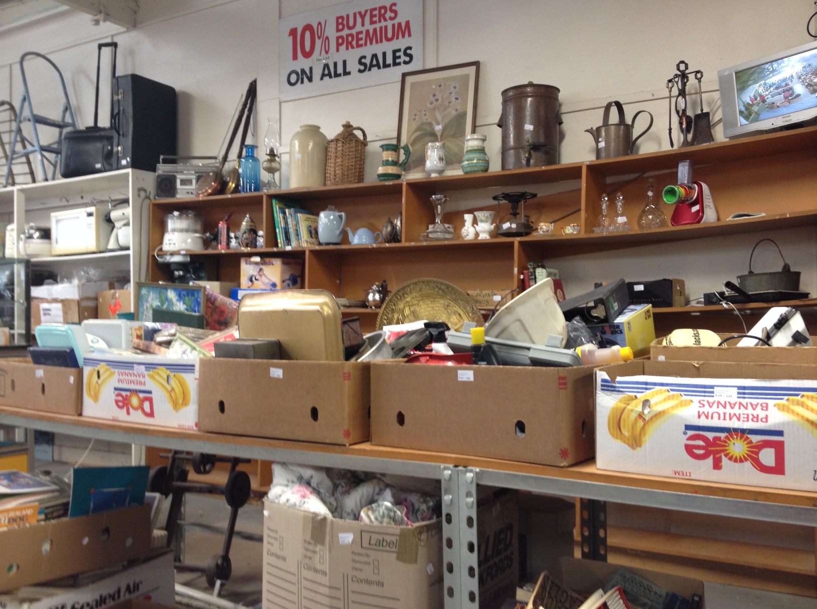
We often buy frames with the intention of reusing them. Our local framer has become used to this and even accepts that we insist on using the original piece of glass. She no longer resists, perhaps because of the sheer volume of work that comes her way from our runway picture buying habits.

The best old frames are empty ones or those with indifferent or damaged artworks inside, as they don’t command much of a price.  Usually I take the old picture out fairly quickly and start sizing up new occupants, either unframed works or pieces purchased in unattractive modern frames. There isn’t always an immediate match and there is a pile of frames in the garden shed and another accumulating at the back of the hall awaiting the right work.

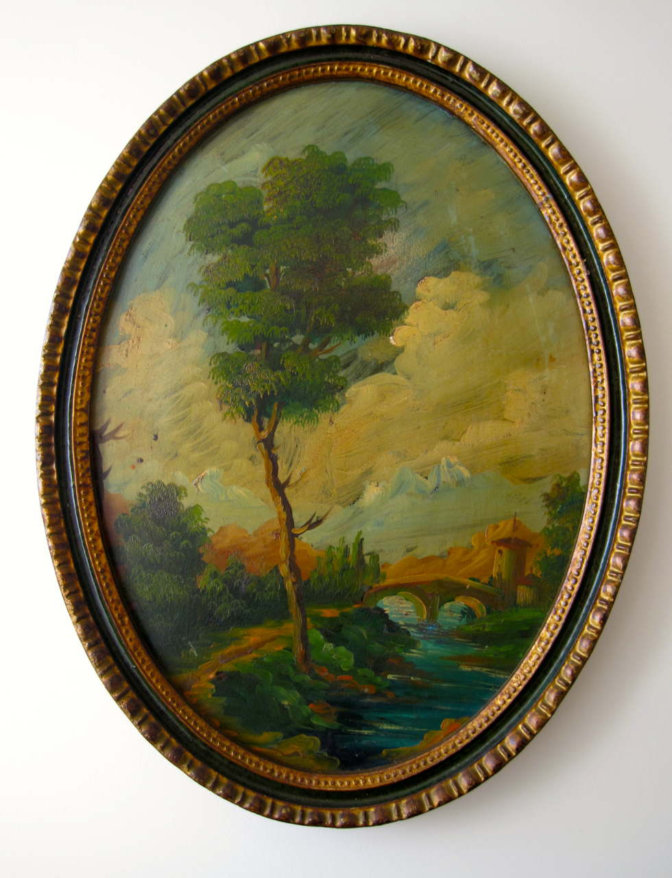
There were two obvious candidates for this frame. A lovely little wash drawing by the Reverend William Gilpin, set in an expanse of white surrounded by a thin narrow frame, or a John Absolon pen and ink drawing. This work is matted in a dark grey green and framed in the same type of narrow wooden frame. Both of these works came from the same sale, so they may have even once hung in the same house. Yet here they have not exactly been star attractions. The Gilpin hangs in my dressing rom and the Absolon has been stuck down the side of a large wardrobe, really due to its indifferent framing.

So which of these two works would get to emerge into the light in a new glossy frame of significant proportion and perhaps end up hanging in the library?

1.

The short answer to this is (and there was much discussion) is the Absolon. Although the stark black and white nature of the Gilpin suited the frame, so did the sepia tones of the Absolon. In the end the current state of the Absolon, meaning that it had never made it to the wall, meant that it came up tops for rescue.

John Absolon, The transept from the south gallery the Great Exhibition (1851)

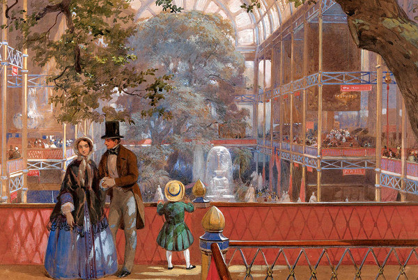
John Absolon, The transept from the south gallery the Great Exhibition of 1851

John Absolon’s (1815-1895) claim to fame, at least in this household, are his beautiful depictions of the interiors of the Crystal Palace exhibition.

These watercolours really are how most us know how the Great Exhibition of 1851 looked. The soon to be reframed drawing is not sadly one of these but a group of women in a tent. I like to think its something to do with Florence Nightingale – I know not why.

So the Absolon duly departed to the framers from whence it’ll be back in 3 – 4 weeks with a generous double mount in off white, original glass and the newly found frame. The Gilpin was scheduled to return to the darkness of my dressing room. However somehow it got stuck half way and came to rest lodged in a chair in our bedroom and there it stayed.

2.

The little Gilpin at rest on a bedroom

The little Gilpin at rest on a bedroom

It is a funny thing but when you live in a house full of objects a simple reshuffling or the transportation of an item from one place to another can bring to it renewed attention equivalent and perhaps even greater than that it received on arrival

I now find myself looking at the Gilpin out of the corner of my eye all the time. Is it reminding me to finish its journey back to the dressing room wall or reproaching me for failing to choose it for star treatment? After all William Gilpin is a far more important artist than is poor old John Absolon even taking the Great Exhibition into account.

This little wash drawing is perhaps the oldest artwork in my collection. Gilpin who was born in 1724 and died in 1804 is really an eighteenth century, rather than a nineteenth century artist. In the object timeline of this house he sits alongside my Hester Bateman port label and a George II chair my cat has personally adopted as his favorite sleeping place – probably because the seat sags.

William Gilpin

William Gilpin

Reverend William Gilpin is not now well-known – who of real interest is? But he is/was for a long time considered the father of the picturesque. Gilpin, who wrote an early book on gardens, A Dialogue upon the Gardens … at Stow in Buckinghamshire (1748), was one of the first to get excited by such things as rugged, wild scenery. Until then people were more inclined to gaze ecstatically upon organized landscapes – ether those organized for work or those organized as symbols to the achievements of man. Because of this Gilpin is one of the key originators of the idea that we should manipulate landscape images (and eventually the landscape itself) into aesthetically pleasing although seemingly accidental forms.

When it came to painting, Gilpin believed that composition should work as a unified whole, incorporating several elements. These were ‘a dark foreground with a front screen or side screens, a brighter middle distance, and at least one further, less distinctly depicted, distance.’ He believed a ruined abbey or castle would add ‘consequence,’ regardless of whether there was one in the view being depicted.

Gilpin knew that nature was good at producing textures and colours, but he considered it was rarely very good at creating perfect compositions. For a perfect composition, some extra help was required from the artist, perhaps in the form of a carefully placed tree, castle, ruin etc. His became a much copied formula.

Rev. William Gilpin, Landscape, Cliffs and Trees. Tate Gallery London

Rev. William Gilpin, Landscape, Cliffs and Trees. Tate Gallery London

So this little picture sits there on my chair – proudly claiming its picturesque properties. Revered Gilpin isn’t only the earliest painter in my collection but he is probably the most important. He was an ideas man, an originator and a key spokesman for a particularly important way of thinking about art. This little drawing does exactly that. Like all his works it is a lesson in this theories, with a bright middle distance, a side screen of trees and, an oh so carefully placed, ruined castle tower.

What I like about the Gilpin now I’ve been watching it for a week is that this landscape is a made up place – there is nothing real about the scene. Gilpin said his works were designed ‘to explain the country rather than to give an exact portrait of it.’ The place might be a fake but what is real is the feel of it and the satisfaction that emanates from this really rather tiny composition.  This little imagined landscape provides a depth of engagement, thus this week’s repeat glances, that can only come from looking at a really good, albeit small, work.

On another level Rev Gilpin’s little missive has worked its charm on me. It has been picked up from the chair, and rather than returned to the dressing room, it has made its way to the library wall. There it awaits the arrival of the John Absolon.

DLJ

Posted in art, auction finds etc., collecting | Tagged , , , , , , , , , | Leave a comment