Sanguimario – here boy!

Tomorrow I head back to the house for the first time in a month. The decorating gods must have known this as yesterday they provided a little companion-animal for the trip in the form of this little oil painting. Until yesterday it had lingered in a local thrift store, a hospice shop, and one that I’ve long given up visiting because it’s overpriced and usually full of floral china and crystal glasses that aren’t as old as me – let alone antique. I might not have seen it, (busy as I was trying on a coat) but Peter thrust it into my vision. It looked competent enough and there was some info on the back suggesting Italian origins but there was, as always the ‘do I need it’ conundrum? In the end, I decided I needed it more than another velvet collared oat.

I love the back of paintings and this one doesn’t disappoint. It came originally from Flor & Findel, picture dealers of Florence whose label promised that ‘All Orders receive immediate attention.’ Flor & Findel were booksellers and stationers in Florence and as was common in the nineteenth century they were also picture dealers. The painting is titled Sanguimario, which translates as ‘Bloodthirsty.’ The name is a bit at odds with the rather noble looking dog which made me wonder if he was a favourite hunter rather than a household pet. A closer examination revealed the signature of Michelangelo Meucci (1840-1890), a Florentine Italian best known for paintings of dead game birds – so Sanguimario as a favourite hunting dog makes sense.

It’s a little treasure for which I’ve not yet found a place but then again I have in my luggage an Old Silver Plate samovar for which I have the same problem and a host of other finds. It’s part of the pleasure of returning to the house – finding places for the new acquisitions – things that you don’t need, and don’t have a place to put yet.

Postscript

This is a detail of a tapestry depicting the return of Charles II and the restoration of the Stuarts to the English throne in 1660, which has caught Peter’s eye at this week’s auction. At the moment he’s thinking – ‘do I need it – where would it go?’ Watch this space.

DLJ

Posted in art, auction finds etc. | Tagged , | Leave a comment

The Tented Room

IMG_0379.jpg

The guest bedroom, once the front parlour

The guest bedroom here remains little changed. Used for a while as our bedroom and then a study, it is square in plan with two double sash windows and high ceilings. In the original house it was the front parlour and it still retains a stately sense of occasion and proportion. Soon after we took over we painted the ubiquitous Softboard linings a light grey and filled the room with a selection of furniture, most of which had Biedermeier leanings. It is a lovely room and because of this it has always passed muster.

Most guests have been too kind to mention that the curtains were rather inadequate when it came to blocking out the nearby street lights but having experienced the room myself recently, new window treatments have become the first evidence of a plan to tackle this room. That I had a plan for these windows all ready to go, was because I’ve been thinking about it for a while, allowing the design to percolate away in the back of my mind.

The first room that really went through a lengthy design process like this was the little bathroom (see Building the Titanic, June 3 2011) with its panelled walls and ornate ceiling. The second was the library where every space was carefully designed on paper. These are to me the two most successfully ‘decorated’ spaces in the house.

The guest room is the last real décor project in the house. After this there is the rather mundane task of painting the small laundry – really no bigger than a cupboard and perhaps the conversion of the old tool shed into an additional guest space or office – but after that we’re looking at rather boring maintenance. At the same time guest rooms are very easy to ignore and to make dull because you don’t occupy them yourself. However I want the room to be memorable, an experience that a visitor remembers and not one replicated in their own homes or any other guest room they might encounter.

There is also one more thing I want to tick off my decorating bucket list – a tent room.

6b0fd082e4dd39fee2c455b8ace09e05c8688721.jpg
Parkier & Fontaine, Napoleon’s Bed Chamber Chateau Malmaison (see http://www.apartmenttherapy.com/in-tents )

Tent rooms date from Napoleon Bonaparte but like most of his ideas the origins of the form are in Ancient Rome. However as far as the modern world is concerned it all starts when Empress Josephine commissioned architects Charles Perkier and Pierre François Léonard Fontaine to design rooms for  Château Malmaison a house redecorated to celebrate Napoleon’s military victories. The two architects, considered to be among the earliest interior decorators, created “tented rooms for Napoleon’s Council Room, his bedroom, and even for the château’s entrance.” The idea caught on particularly amongst the class of people whose exposure to a military tent in the field came with Empire furniture and rich fabrics.

2b75dc9c40bc2d00d47ba00d0da2f04e.jpg

King Freidrich Wilhelm’s spare room in tented form, Charlottenholf Summer Palace, Potsdam (1824-1826)

One of the greatest tent rooms of all time is that created for Crown Prince, later King Freidrich Wilhelm IV of Prussia, in 1824 by architect Karl Freidrich Schinkel at the summer palace of Charlottenhof in Potsdam. This was very much in the fashion of rooms that Josephine had established and which had spread through the palaces and aristocratic residences of Europe. The room, still extant, is a lovely room, simple, bright and graphically strong and something we made sure we saw on a visit to the many, many palaces of Potsdam about ten years back – which made me determined to have my own one day.

Two facts about the ‘tented room’ at Charlottenhof resonate with my current project. It too was designed as a guest room, primarily for Alexander von Humbolt a naturalist and friend of the prince (who had the room designed to remind Humbolt of his trips up the Orinoco river) and it was lined in ticking. Readers of this blog will know that ticking is a favourite material here. Not only for its strong graphic characteristics and its natural fibre (cotton) but because, unlike other traditional upholstery fabrics it is little changed, widely available and inexpensive.

So in many ways Freidrich Wilhelm’s occassional guest crash pad, is my model. Part military, part journey up the Orinocco, part guest room in a palace. I say that also because tent rooms made a comeback in the 1980s – in a blousy overblown version which will be avoided. When I approached the maker of my new curtains to ask whether she had ever sewn a tent ceiling – she said ‘yes once for a wedding’ not the look to which I aspire better, I think, to go with Schinkel.

There are a couple of challenges in a room of this sort. I have been asked, perhaps not irrationally, that the ceiling should be designed so that it can be lowered for the occasional clean to remove dust. Then as this is the last room in the house I don’t want to introduce either new elements but to repeat some of the previously used motifs so that this last room acts to bind the house together. This means using a dado rail (which protects the fabric from abrasion, reduces cost and links to the design on the adjacent hall) and the use of black and white ticking seen elsewhere will help.

IMG_0376 (1)

Sketches to determine yardage and hanging method

As it stands my concept, still in sketch form, is beginning to look a little like a foldout/flat pack tent. Imagine Napoleon travelling with a sort of flat pack wainscoting that he folded out against the fabric walls of the striped tent to give the lower half stability. This lets me tick another thing off the décor bucket list – boiseries – those simply moldings that provide rectangular frames for wall panelling. This should also moderate the extreme stripes of the ticking with a good base of off-white paint.

For now planning is moving into the technical realm with thinking concentrating on just how one might create a pattern for the ceiling and how it might all go together. I have enlisted the help of a couple of friends with experience of similar projects and the sketches are underway. This one will take a while but really it’s a great thing to have a décor project – all be it a tent – floating around in the back of your mind.

DLJ

Posted in Uncategorized | Leave a comment

According to Plan

IMG_8189

A Frank Brangwyn watercolour takes centre stage above a bust of Prince Albert. Surrounding it are works by Copley Fielding, Augustus Pugin and New Zealand artist William Rush.

The hang of the completed hallway was scheduled for Queen’s birthday weekend (first weekend in June). We’ve have lived for a while with the hallway looking spare and now time had come to get our heads around the complexities of hanging detail which, despite anxieties, went really rather smoothly.

The hallway essentially completes the building aspect of the house. When we arrived almost 10 years ago the house was in three flats and the division was nowhere more obvious than in the hallway, which had been chopped into parts. Part of it had leaked rather severely due to a rusted internal gutter and because it was a hallway tenants, (and initially we too) simply resorted to buckets in heavy rain. This left horribly stained wall linings and even once they went horribly stained ceilings.

Then for a long while – once the entire house was ours – again we had an immensely long hallway that despite different hangings and arrangements of furniture just looked sad and dingy. You can convince yourself otherwise for a moment or two but nothing compares to a freshly lined and painted hallway.

Then there was the second aspect of life around here – collecting. We’ve long has a rule that we must not buy small paintings as they get lost in the vast spaces of the house but despite this we’ve continued to do exactly that. In part because good large paintings are hard to find and because good small paintings are easily available.

IMG_8192

At the end of the Entrance Hall the ‘unidentified colonial gentleman stands guard. To the right are included works by Samuel Prout and John Absolon.

So hanging the hallway has brought these two aspects of life into sync. Little paintings it turns out are great for confined spaces and work well in groups. There was a bit of a cull but in large part most have gone up with plenty of room for growth – albeit with a little more of an eye to size and space considerations.

That means we now have a display space for the William Gilpin, Joseph Absolon, Richard Parkes Bonington and the Frank Hol all, or most of, which have featured in their own blog posts but have generally lingered at the back of closets for the last couple of years. A key place has gone to the marble bust of the still unidentified colonial gentleman (https://decorextremus.com/2011/05/20/an-old-colonial-wanders-in/) who featured in a 2011 post when he first arrived. He now takes up a position at the end of the main entrance hall from where he glances down the next hallway.

The result is even better than we were expecting and makes what was a dreary hall and all together more elegant space in which it is worthwhile lingering.

IMG_8190

Peter’s red painted chair, covered with David Hicks, fabric sits below three early Nineteenth century prints. To the left, in the middle, hangs the small Reverend William Gilpin.


 DLJ  

Posted in art, collecting, practical matters | Leave a comment

Journey to a Hanging [My Version]


IMG_2369 (1)

1.

I have pressed a friend who hangs artworks for a living to assist me in hanging the pictures in the newly painted hall. The date arranged is a month away – the long Queen’s Birthday weekend. The day I arrived down in Napier to do the pre-hang plan is the Queen’s real 90th birthday, so everything seems in alignment.

I have called in a professional because I want the paintings to hang level at exactly the same height above the dado. I want also to achieve a nice sense of space around each one. This means there will be a lot of measuring to be done. I also want to minimise the number of ‘accident’ holes in the new paintwork. What goes where is up to me. Well that’s what I thought.

Now the hallway is painted Peter has decided he likes the bare walls and is resisting hanging anything at all. This is I have decided ‘a phase’ that just needs to be got though. I can see his point. The space is clean and bright for the first time ever and the effect is transformational. The hall was always a rather dingy zone, badly lit and sheathed in a Softboard (a feature of cheap flats where it can take impact) and unfinished tongue and groove boards that gave it a log cabin look. For the first time ever it looks crisp and sharp and bright. At the same time, lying in stacks around the house, are more than fifty artworks that need to be hung somewhere.

IMG_7875

The initial concept was for the Entrance Hall (the front section of the hall), to be hung with the bulk of the available works, all works on paper and largely watercolours. This was to be done in strict verticals the placement of which is determined by the architectural form of the space. When the hall takes its right hand turn into the heart of the house, the hang would become sparser and it seems now may even stay blank.

The architectural form of the hall comes down to two main elements, doors and the dado rail. Of these the dado rail determines the lower level of the hang. None of the furniture in the hall protrudes above the rail, so that line is undisturbed visually through the whole expanse. The space above it, now painted grey, is the zone of the hang. One side of the hall wall is pierced with four doors in short succession which makes for a good space for pictures in that the options are limited.


2.

Laying the pictures out of the floor, there seems to be a number of possible groupings whether it is by size, subject matter or artist. There are a couple of round ones and two or three modern works all of which that help out in the variety stakes. There is also an eclectic line up of frame types.

As we always suspected there is a surfeit of small paintings that comes both from our buying habits and the tendency of early Nineteenth century watercolours to be small. Working through the line-up of works on the floor and talking them through with Peter, I realized two things, or I came to the same realization of two different angles.

Not everything can go up!

IMG_7877

The cornice to dado hang initially planned is a pointless exercise when so many of the works will simply not be seen due to their small-scale and detail and a close to 4 metre wall height. Anything much above the height of the doors would be on display but hardly readable which doesn’t help the overall design of the room.

The best way to deal with this had been a plan that concentrates on the middle section of the wall leaving the dado as the bottom edge and something near the top of the doors as the upper limit. I’ve sketched this out and I think it will work and accommodate about 21 works on the left hand wall.

The next realization is a little harder to take. Some of the works turn out to be a little more inconsequential than first thought.

Part of the reason that this space is being used for watercolours is that a gentle Southern light filtered by a deep verandah means the colours will be preserved. Real watercolour collectors don’t expose their treasures to a wall but instead keep works in boxes rather than frames. Most of the previous owners on the pieces here haven’t had such kindly treatment. Rather than simply fade away old watercolours tend to turn brown. At best that gives them a sunset glow at worst they look drab. Too much drab is of course the death of any and all décor schemes.

Some less than stellar works can be lifted by the work next to them and too much indifference can pull down a good work. So the best course of action seems to be a cull. That is hard because you buy a work for what you like about it and unless you’re hard-hearted about it you overlook the flaws. Not hanging things I bought after uncovering them in auctions is going to take some adjusting too on my part. However a little hard heartedness now will make a better room.

Facing up to the opposite wall, where there is less architecture to shape things, I am opting for a concentrated arrangement. It will centre on the space between the library door and the front door, opposite a small sideboard that sits in the hall. It will accommodate 11 works.

With this wall sketched out the total hang accommodates 32 works. So around 18 works aren’t going to make the grade. Which of them won’t make it is something that can’t be worked out on paper or even on the floor. That I’m leaving for Queen’s Birthday weekend. In the mean time there are six weeks of elegantly empty walls to be gazed upon.

DLJ


Posted in art, auction finds etc., collecting, practical matters | Leave a comment

Hanging with Andrew McIntosh Patrick


Awaiting the hang. 59 paintings and 4 mirrors

Awaiting the hang. 59 paintings and 4 mirrors

When I come back to the house I usually end up pulling out one of the books or magazines I have on the homes and collections of Andrew McIntosh Patrick.  It is my way of taking stock. It allows me to figure out whether I remain on track when it comes to the decorating project that is this house.

I find myself doing it now to prepare for my next task.

Andrew McIntosh Patrick and I were first introduced in mid 2007 when I opened World of Interiors magazine and saw his London apartment. I have every World of Interiors except the first issue. I now buy the new issues out of habit rather than any great burning desire. Every now and then a room hits the right spot and I remember why I first started buying the magazine.

The initial appeal of Andrew McIntosh Patrick’s apartment was that I was then going through one of my characteristic moments of believing all colour had been drained out of the world. This is not just a response to dull contemporary interior schemes but to the fact that even the deepest darkest colours on the paint chart seem somehow thin – less rich than I’d like them to be.

IMG_7607

Andrew McIntosh Patrick’s Living Room 2007 Credit: World of Interiors

Andrew McIntosh Patrick’s Charing Cross living room, Georgian in period, Victorian in style was painted in the most gloriously unexpected yellow-green. It was not only brave and individual but it had the aura of authenticity. I had never seen a modern interpretation of a period room that was so dynamic and exciting. It was at the same time equally tasteful and innovative. The room seemed, then as now, as close to perfect as any I’d ever seen.

World of Interiors builds in references to homes and owners they have featured previously. This leads you back to those articles.  I realized that we had met before. I had reacted strongly to Andrew McIntosh Patrick’s first appearance in October 1998 when the Victorian style was a long way from being a pre-occupation.  Perhaps because of his use of early modernist pieces that could be spotted in the detail in the photographs if you looked closely enough.

2.

I’m guessing there are a few decades between Andrew McIntosh Patrick and myself.  However we are both collector scholars in the fine and decorative arts. His interests peak around the 1930s. For most of my professional life that is where mine have started. I refuse to think that one generation is luckier than another in the world of secondhand and auction finds. However Patrick’s period of activity and scholarly knowledge meant that he assembled the most wonderful (arguably the best) collection of Christopher Dresser, Charles Eastlake, William Morris and Edward Goodwin etc. You name it he appears to have it. He also has a great collection of largely late Nineteenth and early Twentieth century Scottish paintings many with intoxicatingly Japanese overtones.

Andrew McIntosh Patrick was for many years the managing director of the Fine Arts Society, one of London’s oldest and smartest galleries. This was James McNeil Whistler’s gallery and Godwin redesigned the façade in 1881.  So when we say smart we mean smart.

Andrew McIntosh Patrick in his office. Credit: Fine Arts Society

Andrew McIntosh Patrick in his office.
Credit: Fine Arts Society

There are similar items in both of our collections, pieces of Christopher Dresser, items of Dunmore pottery, paintings by Sir Alfred East and Mortimer Menpes. All of mine bought in New Zealand a long way from Bond Street and so let’s just say his examples are rather more splendid than mine will ever be. I was interested when rereading the 1998 article that he said his collecting ‘has gone in waves.’ This I like. In this we are the same.

Although I admire and covet Andrew McIntosh Patrick’s collection, it is not the wave my collecting has ridden (in part because I’m just too late). I have instead largely but not entirely leapfrogged over Patrick’s period and been acquiring items in the early part of the 19th century.

3.

Why then am I back staring reverently at Andrew McIntosh Patrick’s living room?

We are getting near to completing the hallway. The painters come next week. New light fittings have been sourced from deepest Fielding. A new carpet runner has been found. We’ve settled on the colours. Everything should proceed without a hitch. This means my next task will be to hang paintings.

This isn’t as easy as it sounds. There are a lot of them (58 of varying size and shape and 4 mirrors). As readers of this blog will know I have been buying early nineteenth century watercolours mostly of the small variety. This is not the most obvious way to decorate a large and grandly scaled hallway. Except that the hallway, south-facing, the darkest part of the house, is ideal for watercolours.

View Andrew McIntosh Patrick's Charring Cross apartment 2007. Credit: world of Interiors

View Andrew McIntosh Patrick’s Charring Cross apartment 2007.
Credit: World of Interiors

There are many books about picture framing and hanging. I’ve not looked at most of them for years. I recall one that said you had to have an extremely good reason to use anything other than a white or cream matt which is something I’ve come to believe. Ancient rules of taste state that oils and watercolours should not hang together in the same room. I tend to agree (as do conservators) but don’t always comply. Where I come unstuck is in creating groupings in a large expanse of wall. So I’ve turned yet again to Andrew McIntosh Patrick.

Andrew McIntosh Patrick hangs a marvelous group. This ability comes both from having a great eye and from having worked in a gallery all his life. It also comes from the nature of his collection.  He likes minor works.  There are a lot of small preliminary sketches and etchings. He doesn’t seem to concern himself overly with condition. He mixes styles, periods and scale and does colour splendidly.

Sadly Andrew McIntosh Patrick’s apartment has no hallway for me to crib.

So I need to determine the underlying principles of his hang. I am looking for a structural model. What is his approach?

Somewhat notoriously in his earlier flat in Bond Street Andrew McIntosh Patrick had hung pictures on the ceiling. Every journalist since seems to have found the reference and they mention it in interviews. In a 2005 interview with The Scotsman Andrew McIntosh Patrick admitted ‘Actually, I rather went off the idea,’ … ‘I don’t think it’s very respectful of the artist.’

The earlier incarnation. Andrew McIntosh Patrick's 1998 flat. Credit: World of Interior

The earlier incarnation. Andrew McIntosh Patrick’s 1998 flat.
Credit: World of Interiors

The ceiling is not an option, even in my more overcrowded moments, but the article went on to provide a few other clues to Andrew McIntosh Patrick’s approach.  In the same article he said of his own method of hanging ‘Of course, I’ve had lots of practice at hanging pictures over the last half century, but there are no rules. It’s a matter of visual balance. Symmetry matters.’ (http://www.scotsman.com/lifestyle/the-collector-1-674140 )

So I’ve settled on a strong and non-wavering vertical arrangement. Every work will be hung on a strict centre line. Placement will be determined by the architecture of the space and works fitted around door architraves. Each picture will be chosen for its ability to react to or complement those around it. This might not appear a particularly major breakthrough but to me it is a reassuring to now have this as a starting point.

I realize too why it is that the October 1998 and June 2007 issues of World of Interiors are never far from hand. Andrew McIntosh Patrick provides an ideal long distant mentorship. He is a reference point that usually allows me to find the way forward if I look long enough. Andrew McIntosh Patrick, whom I’ve never met, (and whose name I just can’t bring myself to shorten), is a collector and decorator of consummately infallible taste, whom I admire immensely and one who provides me welcome silent instruction.

DLJ


Posted in collecting, colour, inspiration | Tagged , , , , , , , , , , , | 1 Comment

Dinner Dogma & Dino – A Midwinter table setting

A short video – depicting the table setting for our midwinter Christmas – seating for 10 our largest yet – requiring two tables.

Posted in Uncategorized | Leave a comment

Out dammed spot

BADA stamp

An almost perfect example of the BADA transfer on the bottom of an 18th century tea bowl – clearly marked for customs purposes only.

Can you imagine living in a world where certain decorative items purchased for the home – came with a large sticker announcing – this person has TASTE and MONEY? From the 1950s until some time in the 1970s New Zealand operated just such a system. The New Zealand Customs department required antiques imported from Britain to be marked with a symbol to certify that said objects were over 100 years old. This indicated that no duty need be paid on the item but inferred so much more.

The British Antique Dealers Association (BADA) took up the task with gusto and antique shop juniors back in England were given the job of sticking little adhesive gold medallions onto endless pieces of Georgian and Early Victorian furniture, silver and china destined for New Zealand.

I’ve often been fascinated that BADA, who were supposed to know all about the preciousness and delicacy of the items they were selling, were often utterly insensitive in the placement of this mark. I realise now that a more careful placement would have risked missing the gaze of Custom’s officials who would then have been pounced on the item as contraband.

In their defence the gentlemen of BADA couldn’t have imagined that New Zealanders would adopt this little circular mark and leave the stickers on permanently.

Retaining the BADA sticker signalled to your visitors that you shopped in the best shops, bought the right things and that you had the money (overseas funds) required to buy British. While discussing this with a friend she told me that as a young girl visiting a smart Hawke’s Bay home for the first time, while waiting for the door to be answered, her older companion had whispered– ‘BADA stickers everywhere, you know.’

This of course reflected two very New Zealand characteristics – insecurity and snobbishness.

Very much still there 50 years later. A BADA Sticker on an Old Sheffield Plate salver.

When I recently acquired a pair of Old Sheffield Plate salvers by Matthew Boulton (see ‘Old friends and rivals reunited,’ June 30 2015), I was amused to see a BADA sticker, well-worn, but still in place on the face of one. What to do? Do I preserve this increasingly distant moment of New Zealand social history or return the two salvers to their real status as an identical pair?

IMG_5982

Slowly disappearing, embalmed in polish

There is a BADA sticker on a sideboard here, which seems to go further, embalmed with every new coat of wax. Between polishes I tend to forget about it and I smile every time it is rediscovered.

So I’ve decided to let that guide my approach. The label on the salver will be removed allowing the pair of salvers to be identical. On the sideboard where the rich gold of the label slowly is slowly melting into the dark mahogany of the sideboard it can stay.

2

I like to think that those New Zealand collectors who had real knowledge and confidence in their purchases removed their BADA labels pronto but how does one now remove an adhesive label? Especially one intended to be temporary but stuck to an item for close to fifty years.

Silver or more correctly Old Sheffield Plate is a delicate surface – an abrasive cleaner is going to take off more than the label. I had no desire to wear a large circle of copper in the otherwise intact silver surface around the sticker.

PhillipsWPegDecalTubing_small

A vintage bicycle transfer

I tried a couple of basic household cleaners, designed for glass and other light cleaning duties but the sticker remained stuck. Before turning to more heavy-duty substances I decided to step back and think for a moment about the sticker itself.

First came the realisation that this wasn’t in the contemporary sense a sticker at all. When I was a child – about the same period BADA were sticking these labels on – we referred to them as transfers. I knew them best from bicycles and tin bodied train sets.

This was confirmed by a quick investigation of techniques for the removals of decals from vintage bicycle frames. Technically they were called water transfers, a form of documentation that was soaked in water and then slid off a paper-backing onto the intended surface – in their case a bicycle frame, in my case an Old Sheffield Plate salver.

The best bicycle world advice for removal was to use of a hair dryer to heat the transfer and then a finger nail to scrape it off. I have a hair dryer but a finger nail was an altogether different issue – my nails are currently cut too short to peel much at all. Heating the label I could achieve a degree of scraping that was only partially effective.

I could of course just wait a week or two to grown a decent thumbnail but I’m not that patient. Next in the bicycle guide’s line up was nail polish remover, not something that a male with no nails to speak of has at hand.

Then it occurred to me that I have an army of cleaners used for the ‘delicate’ surface of my ancient car. How different could the two surfaces be?

IMG_6018

Still there –  BADA as a symbol of British resilience.

A compound designed for removing grime from old and delicate painted surfaces had an interesting effect – it polished the BADA transfer returning it to its original glowing gold – but did little in the way of removing it. A cleaning polish did no better. Even a little petrol had no effect (nor did methylated spirits or turpentine). Ever mindful of the silver itself, I could see that each application was removing something of the sticker but just not  enough for my liking.

In the end I decided to think of that transfer not in terms of the snobbishness of New Zealanders but as a symbol of the famed notion of British resilience and their determination to soldier on. My salver is BADA certified and BADA certified it seems to want to stay.

DLJ


Posted in collecting, original surfaces, practical matters | Tagged , , , , , , , | Leave a comment

Our little Dacha

IMG_5790

Hallway mid-demolition.

Almost a year ago I posted that we were about to get back on the tools and start work renovating the hall. That turned out to be a little optimistic.

What I didn’t know then was that within a matter of weeks I’d leave my job at the Museum and Art Gallery in Napier to take up life as a full-time writer, based 400 kilometres away in Auckland. This meant reclaiming our Auckland house – long rented out – and facing up to a great deal of postponed maintenance. Then came the more pleasant task of refurnishing the Auckland house (robinsimpsonhouse.wordpress.com ) in a very different style, which (no surprises here) I did from the local auction house.

Auckland home - a very different style

Auckland home – a very different style

So Peter and I now live between two cities, occupying two different houses in a complicated relay, which see us spending different periods of time in different zones and relying on house sitters and cat minders to ensure we spend some time together in the same house.

Somewhere in this the hallway project got a little lost.

That was until the other day when sitting at my desk in Napier, having deposited Peter at the airport for Auckland, I decided that the struggle I was having with a particular piece of writing could be attributed to the influence of the depressing water stained wallboard in the hall and that the time had come to do something about it.

It took three days to strip the hallway of its softboard linings (using a garden spade) and then to remove the numerous nails small tacks and left over bits of hessian still attached from the old scrim wallpaper underneath.

The result was a rather severe hallway lined only with the sarking boards – rough sawn horizontal boards of native Rimu – to be found in most older New Zealand houses.

Rimu was always considered the second choice in building after Kauri (NZ Pine) and was therefore used for construction only after Kauri ran out – which it had done by 1906 when Finnis house was built. It is a hard timber that gets harder with age. The heart timber goes a dark red-brown while the outer timber can be almost pale. Sarking boards, cut from Rimu logs, contain both heart and outer board timber.

I am always impressed by the appearance of sarking. Its rich brown tones are warm and its surface pleasantly rough. When contrasted with white painted ceilings it looks rather smart. What I find is that you are usually tempted to consider a brown and white colour scheme for the finished space. However the truth is the flatness of paint means you won’t achieve the same feel as exposed timber. Then there is the option of leaving the sarking? The problem is you can almost see the breezes blowing through the hall now. If only there was some middle ground?

We will line and paint the hall as planned but for the moment it has been furnished in the starkest manner suiting its new severity.

FullSizeRender

On Peter’s return he took some photographs that reminded us both of those delightfully woody Russian or Scandinavian interiors in country houses or fishing lodges.  So just for a moment as I write at my desk in Auckland I’m happy to think of Napier as our little winter Dacha.

DLJ

Posted in Uncategorized | 2 Comments

Old friends and old rivals reunited


Matthew Boulton's Soho works Birmingham

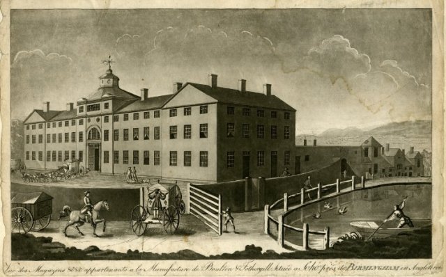
Matthew Boulton’s Soho works Birmingham (c1795)

The other day while looking at an Old Sheffield Plate salver, a friend identified the marks, a pair of suns, as those of Mathew Boulton. Boulton was, he said, ‘a highly regarded Sheffield plate maker.’ I was fascinated. Why was Boulton called a Sheffield plate maker rather than a silversmith? Was there some distinction to be made? Didn’t most silversmiths just segue into Sheffield plate-making once the technology changed? Was there really a hierarchy of Sheffield Plate makers about which I knew nothing?

1.

SCboultonM3

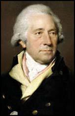
Matthew Boulton (1728-1809) Artist Unknown.

Matthew Boulton was, it turned out, a name I’d come across before but not quite absorbed. Born in 1728, he was the son of a Birmingham manufacturer of small metal products (significantly not a silversmith). Matthew inherited the family business while in his early thirties and expanded the firm, branching into new technologies including fused silver plate – what we now call Old Sheffield Plate.

What catapulted Boulton to international fame was a debt. Boulton was owed money by one John Roebuck who offered  his shares in a new invention. That invention was James Watt’s steam engine. Boulton & Watt went on to provide steam engines for factories and mines across England, powering the Industrial Revolution and becoming immensely rich as a result.

Boulton built a large steam-powered factory, the Soho works, in Birmingham, to make among other things ‘plated wares.’ The factory became one of ‘the show places of Britain in which England had national pride’ and distinguished visitors from abroad flocked to see this wondrous manufactory and to acquire its works.

Matthew Boulton was a member of the Lunar Society, a group of men prominent in the arts and sciences. Members included James Watt, Erasmus Darwin, Josiah Wedgewood and Joseph Priestly. The Society met each month near the full moon, often in Boulton’s home and are credited with developing concepts and techniques in science, agriculture, manufacturing, mining, and transport important to the spread of the Industrial Revolution.

detailBoultonmark

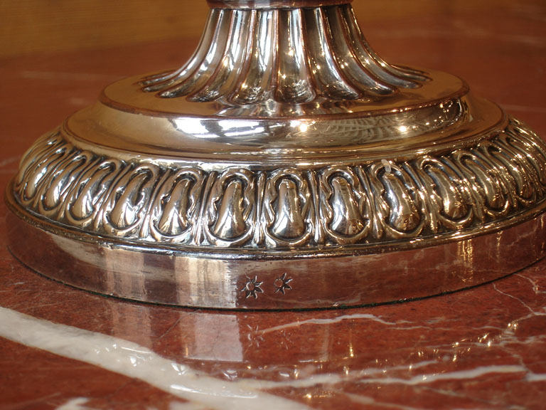
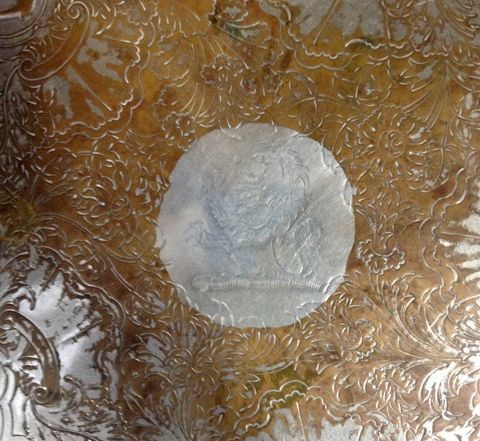
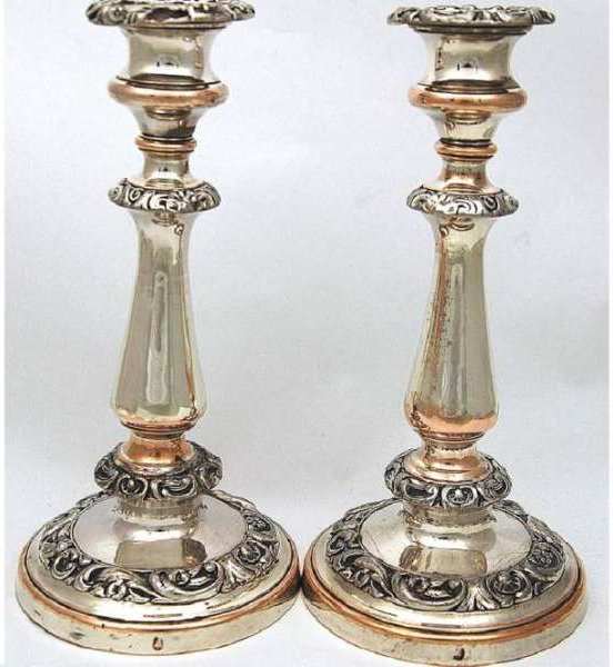
Matthew Boulton’s marks, dual suns, seen here on a candlestick.

So there was Matthew Boulton and his Sheffield plate, at the very centre of the Industrial Revolution in exactly the same way as was Josiah Wedgewood and his pottery. This is in part what makes late Eighteenth and early Nineteenth century decorative arts so fascinating. There was an enormous amount of innovation and technological advancement going on most of which was focused on providing new and better items for the home.

The friendship between Matthew Boulton and Josiah Wedgewood suggested to me the potential for a nicely knowing dinner table pairing of Boulton plate and Wedgewood ceramics. So I set about re inspecting our pieces of Old Sheffield plate looking for marks, well, let’s be frank: looking for Matthew Boulton’s marks.

2. 

The marks on Old Sheffield plate have always seemed slightly impenetrable. The system lacks the clarity and simplicity of the hallmarking system for sterling silver (which is pure genius). Hallmarks are essentially a signature whereas Sheffield plate marks were an early form of corporate branding. When previously I’d looked at books dedicated to Sheffield plate I’d been further discouraged by the dates associated with marks, which seemed ancient and unlikely to be encountered.

In 2013 we blogged about finding a copy of Elsie de Wolfe’s The House in Good Taste, in a box lot. Along with that had come a copy of Old Sheffield Plate by R A Robertson and The Silver & Sheffield Plate Collector by W A Young. After examining the photographs, these books had been filed away on a shelf. Turning to them now I discovered in Robertson one of those delightfully engaging experts with an encyclopedic knowledge and a humorous approach to his subject.

Most of our pieces of Sheffield turned out to be unmarked. Marking Sheffield was optional and often frowned upon by retailers who feared that marks allowed customers to compare prices across competing shops. The four numbers that appear on some Sheffield are seldom dates. So the 1832 discovered on one of my candlesticks are more likely a stock number.

centre

The centre of an Old Sheffield Plate salver by J. Dixon & Co., see ‘The great silver rush of May 2013.’

The first legitimate mark I encountered was on a small salver, itself the subject of an earlier blog (The great silver rush of May 2013). The marks were of J. Dixon & Co of Birmingham, first registered in 1784 of which I’ve been able to discover very little additional information. This doesn’t mean the salver is from 1784; the dates on Sheffield are those when the mark was first recorded – there is no yearly update as with silver. With Robertson’s advice as to style I suspect that the dish is almost 40 years later, the 1830s, once borders of grapes came into fashion.

The next mark (a bell) turns out to be the work of Roberts, Cadman & Co. Samuel Roberts, also from Birmingham, is one of the other great innovators of Old Sheffield Plate and was undoubtedly a close rival of Mathew Boulton. Robertson makes Samuel Rodgers out to be an interesting character and describes his personality in unflinching terms –

‘Samuel Roberts had the feeling of an artist and the gifts of a craftsman united with commercial aptitude. … His zest for life and his tremendous mental vigour made him interested in nearly everything; and a forcefulness of character combined with a practical sense gave him the power to succeed in what every he set his hand to.’

‘Few men have the character to remain unspoiled by success such as his and he was not one of them. The sun of his sterling qualities had spots. He was a little vain, a little smug and was beset of a Smilesian priggishness that was impatient of others less gifted than himself.’

“He always succeeded in being in advance of all his competitors, none of whom has genius that could compare with this. His competitors apparently awaited his productions, before deciding on what line their own goods were to take shape. The quality of his plated goods and the correctness of their outline were excelled by none and equaled by few. Mathew Boulton being a rival of his amongst the makers of note of the time.”

Samuel Roberts mark, a bell, on a pair of candlesticks by Roberts Cadman and Co.

Samuel Roberts mark, a bell, on a pair of candlesticks by Roberts Cadman and Co.

My Samuel Roberts marks are on a chaffing dish which again I suspect dates for the 1830s. It’s not a period of design that Robertson (or his generation) much like (he’s far more Queen Anne, Robert Adam, or Regency focused). He tends to dismiss Roberts Cadman’s later works and anything else of the William IV period. I however am clinging to this remark – ‘Samuel Roberts must be reckoned one of the great figures of Old Sheffield plate manufacture.’

Roberts was based in Birmingham but didn’t much like what he saw around him. R A Robertson has such a distinctive turn of phrase I can’t resist one more quote that points at least in the direction of our target Matthew Boulton. Roberts writes –

Samuel Roberts, from some lofty pinnacle of moral rectitude, looked down on Birmingham, that horrid hotbed of lazy workmen turning out tenth rate trash.

But as Robertson assures us although Birmingham was turning out a prodigious quality of the cheap and nasty there were exceptions – the most notable being Matthew Boulton – ‘equal to Roberts in his own fields and superior in everything else.’ Ouch– take that Samuel Roberts.

IMG_5763

Roberts Cadman & Co, Chaffing Dish (c1830)

3.

Circling around the Old Sheffield plate here, checking for marks, never did bring me to Mathew Boulton’s pair of suns. Like most groups or collections of things here, it’s not a specifically curated collection. I’ve just assembled a few pieces of Old Sheffield because I like its qualities and its usability. But R A Robertson and his charming book Old Sheffield Plate has made me think a little differently.

Robertson is so enthusiastic about the craft aspects and the inherent innovations of this comparatively short lived process, that it seems an art-form to which one could  pay a little more attention. Pairing old friends Wedgewood and Boulton on the dinner table remains a new goal. In the meantime knowing a little more about Samuel Roberts and his personality, I can’t wait for the arrival of a Boulton work and to see what transpires when two Old Sheffield Plate making rivals are similarly reunited on the table

DLJ


Posted in auction finds etc., collecting, Uncategorized | Tagged , , , , , , , , , , , , , | Leave a comment

Sacrilegious fun

IMG_8462 (1)

One day I saw a chair that intrigued me at Maiden & Fosters’ weekly auction. It was a good quality copy of a Chippendale-style chair. By the state of its varnish – yellowy and shiny – I would have dated the chair to the 1940s to the 1950s, though this is difficult to corroborate. I looked at closely – its seat was made of leatherette, but the carving was crisp. The chair stood on its own like a giraffe among all the other chairs about to be auctioned that week.

I had always wanted to paint a chair like this either green or Chinese red, treating it as a ‘decorator item’. Obviously I would not do this with an original 18th century chair, nor would I do it with a good 19th century copy. This one answered my needs. I doubted whether anyone would want it, but since I could not attend the auction I left a relatively high bid of $100.

These days it is possible to luck on an 18th century chair for not much more in an antique auction but I decided I wanted this chair, even though Douglas was slightly incredulous.

When I returned to Napier I got the news I had ‘won the bid’. It had gone for the relatively high price of $93, alas. But I felt really excited to be doing something I’ve wanted to do all my life.

Douglas was away, so I was free to enjoy myself with what, after all, was neither a valuable antique nor even a particularly notable chair in itself.

I needed to strip the chair of varnish before I could do anything else. I went to Mitre 10 and cruised their varnish-removal shelves, fixing on an American solution called        Dad’s Easy Spray Varnish and Paint Remover. It was many years – many decades in fact – since I had stripped furniture. In the 1970s my brother Russell and I had a long period of stripping colonial kauri furniture of the painted surfaces that today we would think were quite lovely. In those days, wood was king. I remembered well that stinging sensation of stripper on bare skin, the way you started off quite carefully but inevitably, in your enthusiasm, you got it on you somewhere. I remembered the smell and the mess.

I was dubious about stripping the chair because of its intricate carving. I bought all the associated gear – mask for fumes, gloves, several types of scraper including a plastic one at the last minute. I also bought grade 2 steel wool for the final removal and turps. mask etc

I decided to work in the back shed. The weather was still fine – in fact it was hot – but by working by the open door I would be ok for fumes. I set to work. I painted on the stripper in copious quantities, beginning with the intricate back of the chair (not a good idea.) The solution had to be left 10-15 minutes then removed. Removal was messy but the varnish seemed relatively easy to shift. I moved on to another part of the chair. (Later I decided to concentrate on one side of the chair at a time, including those parts furtherest away from me. By rotating the chair I would cover all parts of it. Of course I made a mistake by starting with the most visible part of the chair. If it had gone wrong in some way I would have stymied the whole operation.)

Within two days I had stripped away the unattractive yellowy varnish. The cheap plastic scraper I bought was the best implement even though it collapsed in the end. The most exciting part was removing the final remnants of the varnish with steel wool and copious amounts of turps. This revealed the native wood – the mahogany underneath.

stripped chairFor a moment I debated with myself if I should try and ‘pickle’ the wood a la Syrie Maugham in the 1920s. Besides not knowing how to do this, I decided mahogany was too red a wood to pickle. So I allowed the chair to dry overnight.

This is when I began to have qualms, as the chair in an unstripped state actually looked quite attractive. Its cheap varnish had vanished and the mahogany just on its own had a certain…well, dignity.

I looked at this wood a lot, ran my hands over its smooth velvety surface and wondered what would happen if I waxed it with a good old wax. Would it start looking like a ‘proper antique’?

But this was not my endgame. I wanted to shamelessly produce a ‘decorator item’. I had always liked alarmingly false looking furniture in both Chinese green and Chinese red.

I got some oil based primer and set to work giving the chair a proper undercoat. As I did this I felt the shade of my grandfather become very agitated. My maternal grandfather was a wood merchant. He had carefully chosen all the wood for the hallway and doors of the house he had built when he was married. My mother had told me how unhappy he was when my grandmother – inevitably, as fashions changed – decided to paint all over the wood with a cream or white paint. Painting mahogany did seem sacrilegious. Mahogany in my childhood – especially highly finished mahogany – was meant to be the sine qua non of quality. Nevertheless I pressed on. Two days later I had a rather appealing white chair.

white chairIt occurred to me I should, or at least could, stop here. It looked after all like so much French/Scandinavian furniture today, sort of ‘antique’ and sort of ‘contemporary’. I juggled with the green option for a while then decided if I was going to press on I would go with red.

This is where a new set of problems appeared. What red? Douglas had gone to enormous trouble to get a lovely deep saturated red for the library walls. But locating a good red, with blues in it rather than yellow, became problematic. There was a further problem. Obtaining an oil based red in a small quantity (less than a litre) in an isolated place like Hawke’s Bay was difficult.

In the end I had to swap to a water-based red which the assistant told me was quite suitable for an oil-based foundation (but not vice versa.) I began the heretical business of painting the chair bright red.

This was fun. I changed the red for the second coat, hoping to obtain a ‘bluer’ red. (I still think the current colour is too red-yellow.)  IMG_8856But the chair does have a rather dazzling presence (to the degree it makes all our old colours look a bit drab.) The next step is some contemporary fabric for the seat. Altogether it will have cost me probably $250 for this essentially valueless item.

Perhaps I should have saved up another $100 and actually bought….a real 18th century chair?

But then I would not have had such good…sacrilegious fun.

PW

Posted in Uncategorized | 1 Comment