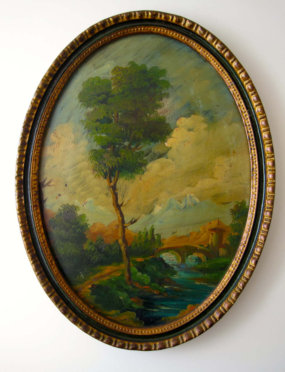
 I recently acquired a suite of three elliptical Italianate landscape paintings. They were purchased primarily for their frames, which I mistakenly thought were circular – one of the perils of online purchasing but that is, as they say, another story.
The paintings themselves are not the sort that stand up to close inspection. In fact they have some of the characteristics of a paint-by-numbers starter kit but without the harsh colourings. I like to think of them as scenic painting done for, and by, a theatrical painter in order to provide temporary effect.
In this way they work – the further away one is, the higher they are hung, the darker the room, the better and more convincing the effect. The frames are in fact pretty examples of their type and the overall effect is pleasing, as long as one doesn’t look too closely. They will probably find a place in the Garden room.
As we start to look at decorating the Entrance Hall here, I’ve been thinking a lot about paint and colour. When New Zealanders think about paint they usually end up in a Resene store. This is a local paint firm with a reputation for a fairly extensive range of colours. The problem is that their colours have become stuck in the cul-de-sac of ‘what sells’ rather than pursuing Resene’s original mission that of opening up their customers and with it New Zealanders to the rich possibilities of colour. The effect of a visit to a Resene store is rather like the loosely coordinated dip and dab of the paint-by-numbers colour palette, in that it lacks any subtlety or nuance.
Then there is the notion of newness. Every Resene paint type comes out looking and feeling brand spanking new and, dare I say it, like a coating of flat plastic. That might be all well in good for a home in which children are more or less expected to draw on the walls with crayon, but one size doesn’t fit all, even with paints. An old house deserves something a little more sensitized to its age and old décor even more so. I note that with my Italianate landscapes someone has muted down their colouring (and rendered it richer) with a crudely applied coat of thick brown varnish, designed to age the surface.
This is something that works at a distance but if used on the hall walls would look like someone had doused them with a cup of coffee. Still some sort of paint effect might be an option for our hallway.
2.
While in Auckland last week on holiday we visited Porters Paints – an altogether more sophisticated paint retailer and true to its image when we arrived, the assistant was down on the floor paint effecting a shop fitting. We hadn’t gone there to engage in conversations about paint effects but rather to locate a stronger more lively lettuce green than Resene offers and a good yellow (an area Resene doesn’t try in at all). We found both.
The assistant then lured us into a conversation about French washes and options around gilding. After leaving the shop Peter commented that he felt ‘washes weren’t for us,’ that it all seemed ‘a little nineties’ and after all ‘the whole French thing was over.’ I wasn’t so sure – yes people have cottoned on that their antique painted French furniture largely originates in Chinese factories, but were paint effects just a phenomenon of the 1980s and 1990s or do they have some longevity as legitimate decorating tools? Would that noble tradition matter much if every visitor’s first reaction was – how ‘90s?
Jocasta Innes in her home in Spitalfields Photo: GRAHAM JEPSON/WRITERPICTURES c/o Daily Telegraph
All of this might have mattered a little less, if the news hadn’t arrived (via the Guardian online) of the death of Jocasta Innes last week. Jocasta Innes was one of the most influential figures in late twentieth century interior decoration – in part due to two books Paint Magic and Scandinavian Painted Decor. These were just part of a full on output that included early influential, fake it till you make it, style cooks books and a house in the London suburb of Spitalfields – described in World of Interiors – as a constant work in progress and illustrated in its completed form in their March 2014 issue.
The first of her decorating books, Paint Magic, published in 1983, was at the heart of the popularity of paint effects through the 1980s and sold in its millions. The Guardian considered her second book, Scandinavian Painted Decor (1990), as ‘her best book’ and went on to describe it ‘a profound study of the power of colour and pattern to defeat darkness and despair in the home.’
That’s a great line and it lingered with me, so when I happened upon a copy of Scandinavian Painted Decor in an Auckland charity shop, I purchased it (there is a copy of Paint Magic here somewhere I am certain) as much out of respect for the passing of a great writer on interior decoration as I was someone who was about to start paint effecting. 
Jocasta’s cult of 1980s paint effect and I intersected only briefly the first time around. I painted a flat door to look like Zebra skin (but I don’t think that counts) and once did a terrible job of sponging white bathroom walls in green paint. There was probably a little bit of marbling while at design school in the early 1980s but I segued out of post-modern effects early on and got into a period of modernist ‘truth to materials’ and stayed there for the next twenty years. So I am prepared to consider paint effects, of the right type, this time around.
The problem really is one of skill and patience. Scandinavian Painted Decor is full of the most beautiful rooms achieved simply but by craftspeople of the type that used to be readily available to home owners – rather than by the homeowners themselves. My attempt at sponging a bathroom wall went wrong because I lost interest after the first layer seemed disappointing. So I know that my chances of pulling off any sort of detailed painted effect in a six metre long hallway are just about zero. What a pity it is that I can’t dial up the scene painter who completed my little trio of paintings but artists today seem a little more concentrated on the conceptual rather than the decorative.
3.

On the way back from holiday I spotted a large turned wooden lamp base high up on a shelf in a recycle shop. On closer inspection it had good form, was sufficiently weighty and with the right shade it could be put to good use.
To continue what had become the theme of the week, the lamp had been paint-effected with a partial crackled effect in order that it might look aged. Not, I hastened to add by Jocasta or one of her devotees, but in the factory in which it was made. My initial reaction was ‘oh well, all it needs is a coat of paint.’ However for the moment that’s all I’m sure of – the need for change. What form that will take remains under consideration until I locate my temporarily misplaced copy of Paint Magic and suss my options.
DLJ

The Garden Room? Your logic does not make sense. The Garden Room is small, light and low ceilinged. One will be forced to ‘look too closely’, and for the Garden Room’s resident-at-large that will be unpleasing. Please, please not the Garden Room. Looking forward to seeing the options for the Hall though.
… not after I take the lightbulb out.