the wedding march

glasses 1

Just the other day I was in a fret about the ultimate fate of all the neglected glass and crystal in the world. I was worried enough to take this photo of small, essentially useless, sherry glasses collected on a table at a local secondhand shop.

None of these is particularly fabulous, of high quality or of advanced age. They were however once considered ‘for best’ which is probably why they survive. They were in large part engagement and wedding presents. Some of them are rather pretty. Some are delicate and beautifully engraved. Some are miniscule. Tiny enough to be comic in the hand.

I cooked up schemes designed to reuse these glasses. I’ve thought about reintroducing Sherry. I’ve plotted to bundle these (and unwanted parfait glasses) off to friends at Christmas time as gifts. In the hope that an up close engagement with the best and prettiest of the table top pile might make people realize how nice a little glass really is. Then at least I’d feel I’m doing my bit to stem the flow of neglect currently suffered by crystal glasses.

glasses 2

Then today while perusing another local shop I encounter two young ladies, accompanied by an older brother and their mother. They were scooping up armfuls of small glasses – in this case the small tumblers the used to come with heavily engraved whisky decanters. They explained that they were going to use them to put tea lights in on the tables at a wedding reception. The brother and mother were holding unloved cut crystal and pressed glass bowls – destined I suspect for the same event.

Happy that some one else was on the case – I let them into the secret of the tables illustrated here and once they’d located their destination on their phones – they set off.

When I got home I had a look at my little tumblers (my parent’s wedding presents). I’m not sure I’ll be using them for tea lights anytime soon – but I’m really pleased someone else has thought up something to keep these little treasures sparkling a little longer and what’s more I like the irony that these little one time wedding presents are heading back for a second matrimonial outing.

DLJ


Posted in Uncategorized | Leave a comment

The great silver rush of May 2013

tray stack

Recently we spotted a little silver tray – three legs and in good solid plate with a little copper showing through – but otherwise unmarked. It was lot 2 in the local sale so it didn’t take long to acquire. Lot 10 was a nice piece of Japanese lacquer ware so I hung around for that and took both boxes home with me – all over by 10.15am.

I wrote, just the other week, about acquiring a large silver candelabra at auction. Looking back, it was as if this started something. Did it mean simply that it turned my mind to silver as a thing to think about and therefore began to notice it amongst the plethora of other items that pass by my notice?

Or was there some greater scheme at play? I’ve noticed this phenomenon at the museum – a collection item will be gifted and then suddenly over the next few weeks others items of the same type will flow into the collection all from different sources.  If that is the case this, as it turned, was to be silver month.

1.

Strangely, until now we’ve had a little silver tray, it was Peter’s. He’d had it for years – it was stylish but it had a foot missing – so it was essentially useless (perhaps this is the moment to remind that the definition of a tray is that it has handles whereas a slaver doesn’t. Either can have feet). I finally convinced Peter to send his crippled tray off in a box lot of our own divesting.

Essentially the new tray, mentioned above, turned up the next week and so the planets seemed aligned. The other box, the one with the lacquer wall pouch, also contained a large silver teapot in the blackest state. My rule is that if its solid black the silver plate must be intact and therefore worth polishing. This again proved to be a good call and the teapot came up nicely. Looking at it, its solid squat style was rather appealing – so for a while at least it’s been dragooned into service.

tea pot

The little tray cleaned up nicely. Its silver had that watery character that old plate does and its plain surface was therefore rather appealing. The chased edge is decorative but not overly expressive. We bemoaned the fact that no one was going to use it to place a calling card on and instead placed it on a little wine table in the library – where it will be used for port glasses.

With a second old silver teapot, (see Silver & Sunshine for the first one), and a little tray, not to mention the candelabra, we might have had enough silver.

2.

Then a week later an extraordinary estate turned up at Maidens & Foster. Spread out across a number of box lots, were pieces of Chinese export ware, Georgian glass, Victorian plates etc. Best of all there was a lot of five trays – four of which where in different version of Sheffield Plate – all with good age.

tays and cupsSheffield Plate is a wonderful material. It dates from the 1740s when it was cutting edge technology and spans through to the 1840s when suddenly it was over – superseded by new cutting edge technology – this time electroplating.

Sheffield Plate was created by rolling thin sheets of silver onto a copper sheet and fusing the metals together.

tray 1This made a cheaper silver – suited to the early developing middle class of the 18th century. Sheffield Plate was heavy, durable and had an excellent finish but was cheaper and therefore the objects made it in it more affordable. Pewter, previously favored, disappeared as a material for functional items and Sheffield plate was in.

The irony is that now the value of Sheffield plate is where it is worn through and you get a lovely combination of silver and copper that when polished up has a wonderful deep glow to it. One would never re-plate Sheffield – because it is an older earlier technology but because it would lose all of its appeal. The nicest of the little trays was the one that revealed its own special characteristics. It had in the middle a shield of a lion. This is in sterling silver insert that of  doesn’t  polish through to the copper so it shines like a spot light in the centre of the tray. Here it attracts attention the same way this mock aristocratic motif was supposed to originally.

centre

In the same box in which Elise de Wolfe’s The House in Good Taste arrived also came a copy of The Silver & Sheffield Plate Collector, by W A Young, which I guess dates from the same period as de Wolfe’s book. We’ve dipped into it but even now as May turns into June there is distinct  feeling that the lode of silver around here has mined itself out and that we probably won’t see another good piece of Sheffield for months.

DLJ 

Posted in auction finds etc., collecting, original surfaces, Uncategorized | Tagged , , | Leave a comment

The House in Good Taste.

I discovered the book almost by accident. Stooping to look through a box of indifferent books at the local auction mart I came across its very strange cover.

Elsie de Wolfe’s The House in Good Taste, has an almost defiant colour schema. It is most unusual. The grey has a touch of blue in it, the pink is rather weird and everything about – the very concept of good taste – is so from another world that it caught my attention immediately.71cd5c50ca83f37c05ecff5a4d666cd8

It was a hardback dating from 1913 and had one of those entrancing almost fairytale covers. A miniaturised chair and footstool sit by French windows and curtains. It was also in excellent nick.

I knew who Elsie de Wolfe was, or thought I did. I had an idea at the back of my mind she was a lesbian decorator who introduced a kind of modernist Syria Maugham decor in the early part of last century.

She was a name and a brand. Wikipedia, such a reliable source, tell me she was the first person to define the position of ‘decorator’, that she pioneered blue hair (which in my youth, half a century later, had spread to old ladies in New Zealand). I also read that she made a ‘strategic’ marriage to a British ambassador but shocked Parisian society when she entered a room doing handstands. She sounds like my kinda gal. Not.

elsiedewolfe

Anyway I wanted the book. Then I opened it. Inside was a stamp: ‘School of Art, Rutland Street, Auckland.’ Now I really wanted the book. There’s something about provenance which is magic. The sense of hands having passed over it, or eyes which have looked at it. I had no idea whether the book had stayed unread on the shelves at old Elam: or had Lois White, for example, opened it up and glanced through it on a slow day? I quickly glanced round me. Had anyone else seen it? The auction mart was unusually busy that day and I spotted the owner of the local bookshop.

Immediately I plunged the book back into the box then covered it over with some innocent books on antique roses. I became convinced everyone in the auction house was after ‘my book’. (It had become ‘my book’ in a few moments of longing.) Was that fat old man looking at a clapped-out motor mower really so interested in an esoteric book on ‘good taste’? I knew auction bidders came in all sorts of guises and the following day, auction time, would be the test.

Fortunately it was box number 8 so I put aside the book I was writing to a very close deadline and attended the auction. Astonishingly – amazingly – not a single person was interested in the box and I got it with a casually raised hand.

mauvechintzdullgreenroomThe box, when I looked at it again, had a lot of interesting peripheral material but now I had ‘my book’. I would read it at some point – I already liked her mauve and green sitting room design. But what gives the book its air of mystery, of having waded out deep into the waters of the past, is not only the strange colours of the cover, or the inside portrait of the hand-standing aristocrat – or her tips on how to make rooms lighter and airier or more feminine. It’s that lovely evocative stamp of a lost world – ‘ELAM’ School of Art, Auckland.

PW

Posted in auction finds etc. | Tagged | 3 Comments

William IV – the overlooked.

viewing

A pair of small portraits spotted amongst the hang at Dunbar Sloane’s Antique sale.

Despite this blog’s subtitle, Douglas Lloyd Jenkins and Peter Wells decorate an Edwardian house, there doesn’t seem to be too much going on around here that’s Edwardian – well not recently. Things seem to have settled into a period around 70 years earlier during the reign of Edward VII’s great uncle William IV.

This has been created in part by a dearth of any great Edwardian splendor in this neck of the woods and the altogether not infrequent appearance of ‘early Victorian’ objects, which fly much more under the radar than do Edwardian works which tend to come with grand names attached – Dolton, Minton, Brangwyn or Orpen etc.

I thought a little more about this the other day when I spied two little portraits at an auction house in Wellington. I took a liking to them and knew from experience that no one else was likely to be particularly interested. A friend kindly attended the auction and they were mine for a minimal outlay. Now I’ve finally got them at home and in front of me they seem lovely enticing examples of their period of art and design.

My guess is that no one wanted them because there is little or no hope of knowing whom either the sitter or the artists were, because the frames are bashed up and because the works themselves will need a clean and a few judicious repairs. Yet perhaps the real reason no one wants them because they’re neither Georgian nor Victorian.

1.

Strangely, of the two, it was the woman who sustained my attention between the viewing and her arrival at home. Looking at the not so good cellphone picture I’d taken over the intervening week, I came to like the delicate representation of the ties of her bonnet as it falls across her black dress, highlighting their wispy pattern, it suggested to me an amateur artist with a skilled hand.

lady 2

Now I have it in front of me I notice the delicate gold chain that hangs around her neck is clasped in a sensitively drawn hand. It terminates in a small gold locket pinned to her dress. Her black dress has deep dark folds particularly noticeable in her voluminous sleeves. On top of her head the bonnet culminates in hundreds of silken tassels while little rolls of curls frame her forehead.

She sits in front of that same ubiquitous red curtain that flutters in every early nineteenth century portrait but an added extra is that in the gloom of the background there is a classical column and if you really peer you can see that a single tassel hangs from the curtain.

Her husband, I assume they are a couple though of course they might be brother and sister (both have large kind eyes), caused some discussion at the viewing as to his attractiveness. I had two friends with me one of whom wasn’t a fan. Nor was Peter.  However I decided he wasn’t being seen in the best light as he suffers slightly more than she from a degraded surface. The painting surface seems at one time to have been splattered in some foreign substance, has eaten away at or at least disfigured some of his face. This gave him a slightly hair-lip sort of appearance which I needed to look past and a rescue package developed.  man

His setting is more severe than is hers. There is only the slightest hint of red curtain or chair back.  He however has that wonderful severity of this period of costuming – a nipped in waist, strong if to our eye curvy shoulders and an immaculately tied white neck scarf.

I assumed by their costume at they were from the 1830s, that perfect storm after the last of the George’s but before the onset of Victoria.  There is of course no sign of a signature but on the back are the labels of the makers of the artist boards on which they are painted.

labelShe proudly sports a label from Rowney & Foster, Artist’s Colourmen of 15 Rathbone Place, London. This label tells me that the painting is on a Flemish Ground Milled Board. However Google tells me more importantly that Rowney & Robertson had shut up shop by 1832. Now unless an artist had the board hanging around this dates my little portrait at the beginning of William’s reign.  The man’s board comes from an altogether different supplier. Roberson & Miller of 51 Long Acre London operated from 1828 to 1839.  So I’m guessing that these two portraits come from the early part of the decade and they are, it seems, confirmed William IV period portraits.

3.

William IV is definitely a style that travels under the radar. In part because the serious collectors of Georgian antique consider it a step too far and the collectors of Victorian excess consider it too restrained.  In the Connoisseur Period Guide – the Early Victorian Period (1830-1860) there is a lot of regretful coming to an end stuff. Witness this book on architecture – ‘Most respectable guides to architecture end at or about 1830,’ or on furniture ‘the thirty years from 1830 to 1860 are the most neglected in the whole history of English furniture.’

That book was written in 1958 and a lot has changed since then. However a lot remains the same and it seems that William IV doesn’t translate for most people into something either recognizable or desireable.

This is perhaps then why in recent months we have rescued a lovely Sheffield plate teapot dating from the 1830’s and a silver tray of similar period – both from box lots. I’ve found three William IV dining chairs for another project for less than the cost of the most basic new chair, while a friend scored two beautiful William IV dinning chairs in a general sale for half as much again. Then there are my little portraits – Mr. & Mrs Subjects of William IV, straight from early Dickens which like me are happy to make the connection between two of Britain’s jollier Kings – bookends to the rather humourless Victoria.

DLJ

Posted in art, auction finds etc., collecting | 1 Comment

Blue and White [and Broken]

Today’s haul from the auction house was spotted the day it was unloaded from the truck, a whole week prior to the general estate sale. My eyes went immediately to an old wooden apple box filled with old plates. My delight at the appearance of the box must have been obvious – because the man at the auction houses clearly felt I needed reigning in – ‘they’re all nibbled’ he called out.

worcester

The Worcester – chips and all.

1.

The main attraction of the box was a lovely part set of Worcester plates – probably mid Nineteenth century. On closer inspection they did indeed all have chips of some sort. Now, when I was growing up a chipped or cracked plate was a terrible thing but I’ve moved on, (dismissing this a suburban nonsense). If I die from a disease concealed in my ancient Worcester, so be it, it’s not the worst thing that might befall me.

The rest of the box was made up of items of various vintages and all in questionable condition. We placed a detached, I don’t care either way, absentee-bid and to our surprise came home with the box the next day.

The Worcester cleaned up nicely and there is enough of it to make a setting for four for a basic meal. The plates are solid and heavy, the decoration splendid and sufficiently colorful that the chips get lost in the in the visual effects – so no one will ever really spot them.

However the real treasure of the box lot were some blue and white plates we suspect are of some considerable age. They were indeed nibbled – some were even broken and glued back together – but they still had real presence. This got me thinking about the value of broken things.

2.

I have plenty of broken and pieced back together ceramics. Strangely most of it is Chinese in origin. The first time I purchased something in this area was a rather nice blue and white bowl – that surprise, surprise – I only purchased because no one wanted it at $20. Still it had good scale and presence as a decorator item.  When I got it home I discovered that the method of repair was via metal rivets which in themselves seemed attractively aged. For a while I became a little obsessed with the craft of metal rivets and they still appeal now, a lot more than does carelessly applied Araldite.

rivets

The piece in question – still a feature of the library (where it sits on a Georgian washstand) is one of those pieces made in China for the European market where the decoration all gets a little lost in translation – or at least that’s what I think it is?

My whole point of this posting is that made in China for Europe, verses made in Europe to look Chinese takes some sorting out – the details, colour, feel and tone of each type of production need to be learnt by heart.   rivet 2

Things are further complicated by the endless reproduction of these styles through the 19th and into the 21st century. However one fells that this is an area one should know about if we are even pretending to be a connoisseur of any description.

Most of the information about the original pieces that you need to know comes in boring books. I say this because the best of them are ancient with old illustrations and dense text. You have to be devoted and, unlike Oscar Wilde, I am not a total full-time devotee of blue and white china.

To really learn what is in the books – even if you do read the text – you need to look intensely at the works in question.  You can do this in a museum but this excludes touching and experiencing the work which is even more helpful. Looking at detail of decoration again and again examining forms repeatedly is the best way to learn. This is best done at home over and over again as you use or simply dust at the items around you.

It occurs to me then that a broken work, picked up for less that a $20 dollar bid, or even less, provide excellent learning tools – preparing you for the day the real thing, in pristine condition, comes along. In the meantime the intensity of decoration means that no one much is going to notice the flaws in your piece – and a room will look better for their presence. Our two plates are for the moment propped up on stands in the library in their own way as full of knowledge as are the books that surround them.

plate 1

DLJ


Posted in auction finds etc., collecting | Tagged , , , , , , | 1 Comment

Candle Power

RIMG0033

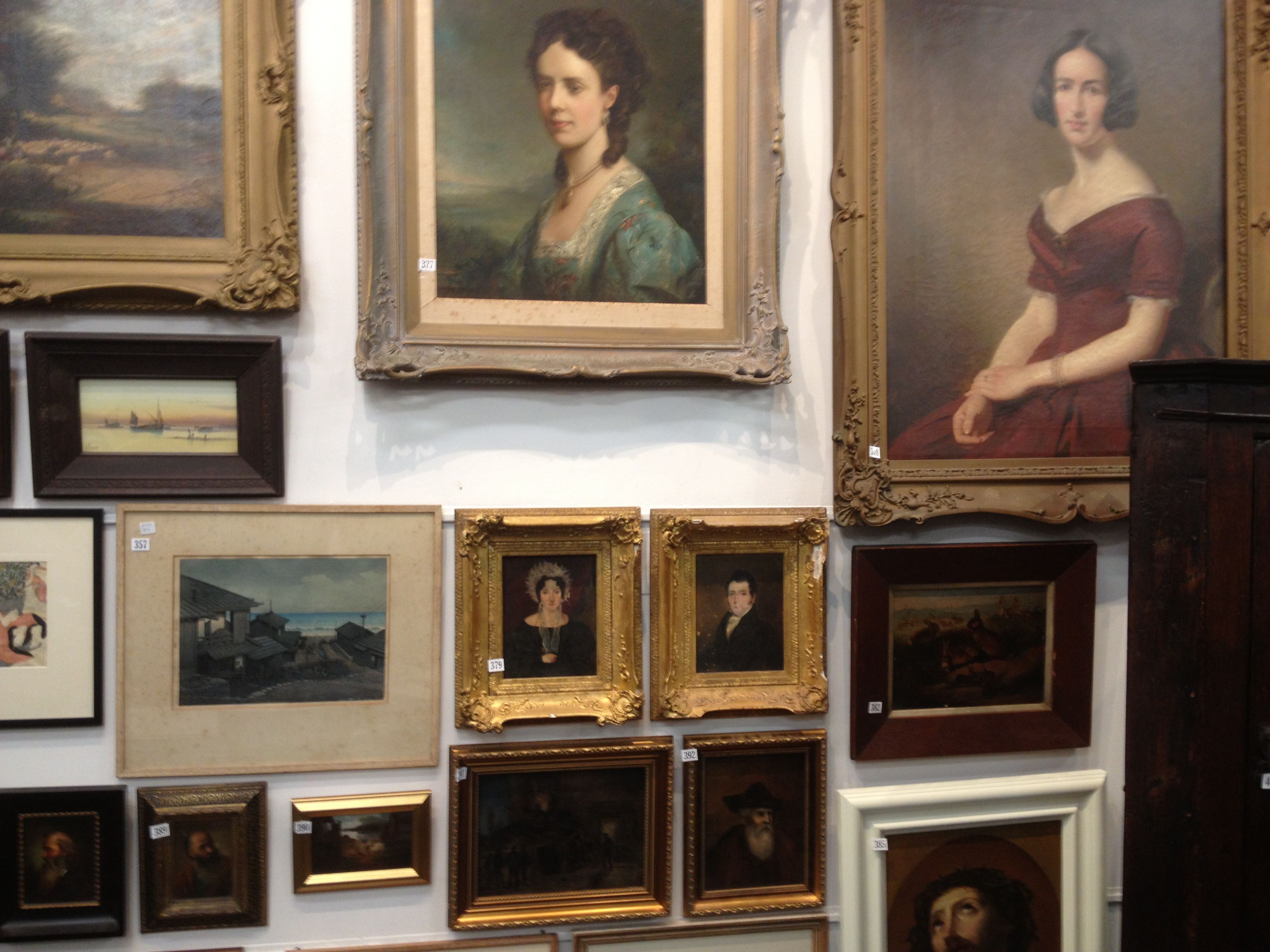
Maidens & Foster’s Antique sale on view. Image courtesy: Maidens & Foster.

Readers of this blog might well be lead to the conclusion that there is something bargain-led about the décor selections here – particularly as buying things cheap at auction is a reoccurring theme. However although we might be a little Shabby Chic (I prefer the Claire Regnault-coined Shabby Baronial) – some items, even auction finds, are the result of strong-willed tussles on the auction floor – and aren’t bargains at all.

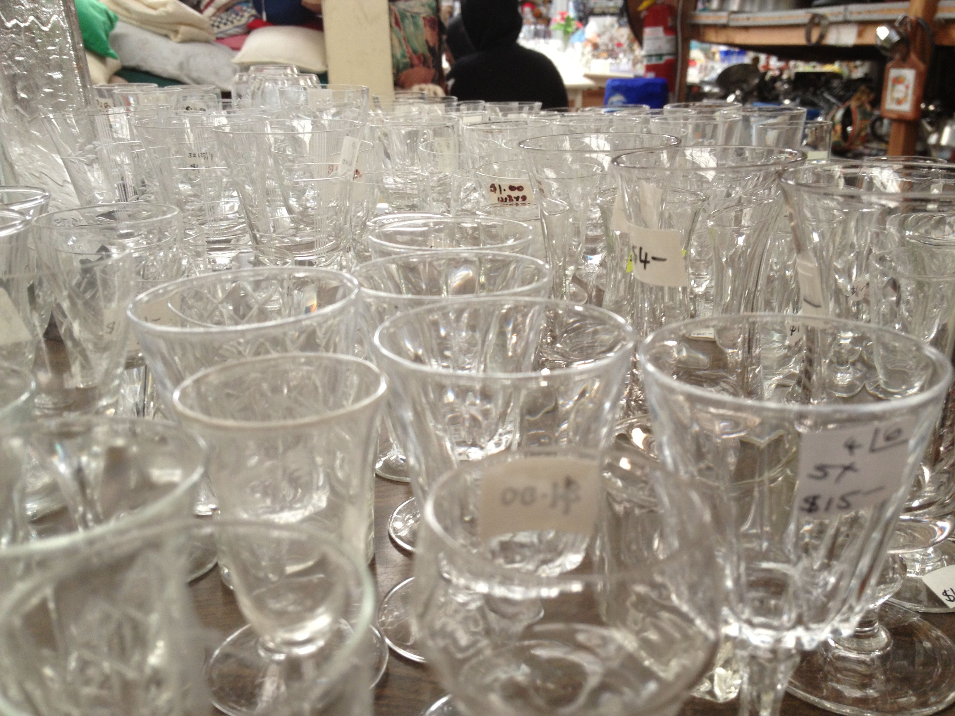
This week I spotted a large candelabra in Maidens & Foster antique sale – this sale wasn’t the most engrossing sale and I was in danger of having nothing to bid-on. The usual obscure art works were missing – there was a faded Howarth but little else. There were no carpets, nor tempting chairs and no eclectic china or glass.

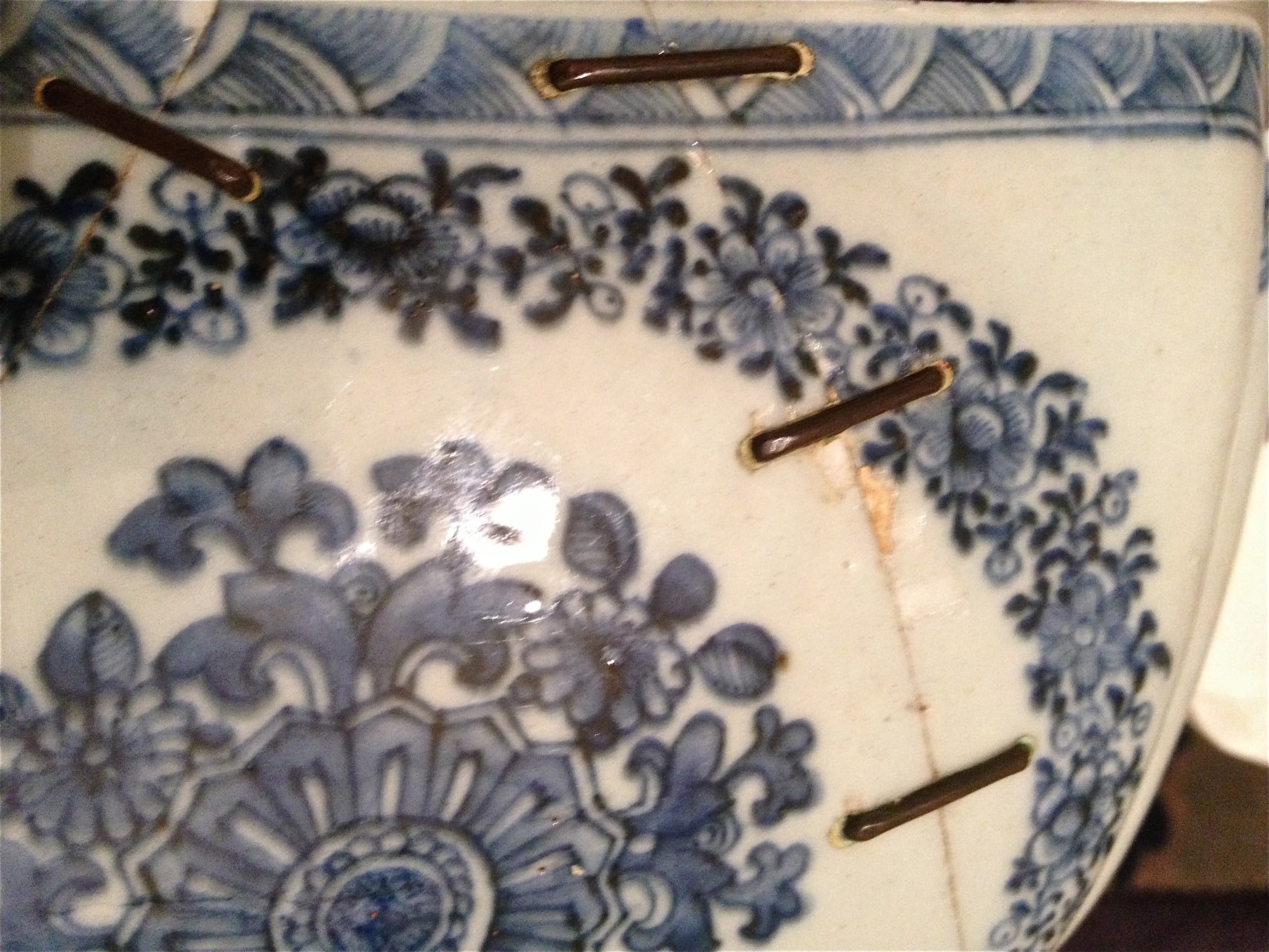
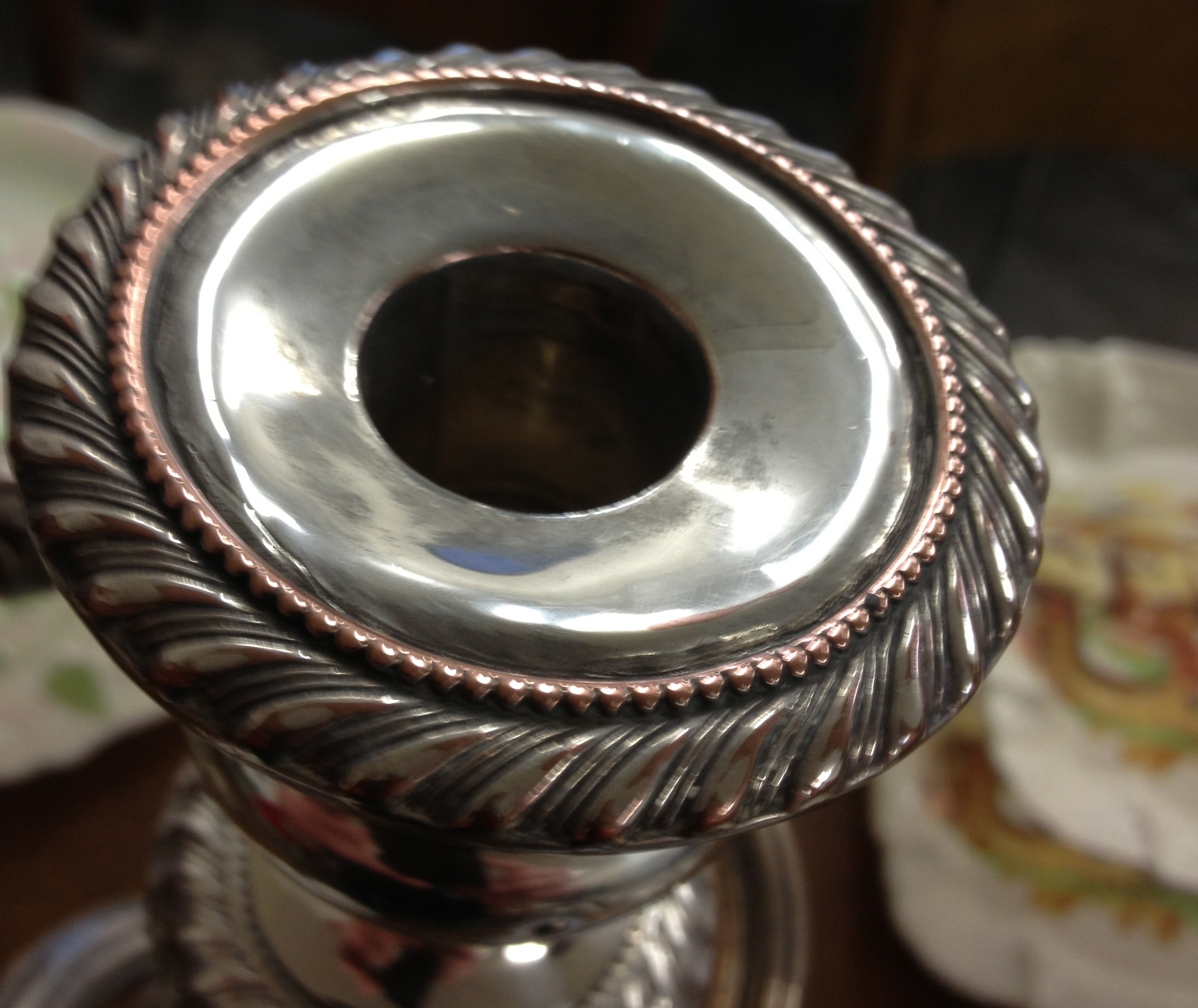
The candelabra occupied a prime place on a table but the general gloom of the sale had led me to suspect it of being a later reproduction. A good candelabra is made of a number of pieces and comparitively few large ones remain intact. Modern versions are generally made in one piece – but they seldom have any real height. So I moved in for a closer look.

 1. 

Auction viewings are strange things because you don’t know who else is looking or who else is looking at you looking. Years ago, at an art auction, I was out bid on a painting by someone who then had the nerve to come up to me and ask ‘what did I just buy?

So I was a little wary of seeming to be looking too closely at the candelabra but for a closer distance it did seem legitimately old. I took a quick cell phone pix and moved on. That night it was revealed that Peter had seen it – but also suspected it might be a later Walker & Hall number or even worse Rodd (or Community Plate) – the lowest of low electroplated silver brands.  c2

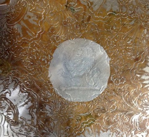
The cellphone picture taken too quickly proved generally useless but did reveal one interesting fact – where the silver had worn away on one of the sconces – copper was showing through. This is generally a sign of age.

Sheffield plate and early electroplated silvers were on copper but it was soon abandoned for cheaper base metals.  I thought about it over night – not that I quite admit to lying awake thinking about candelabra – but close. I recalled the little cluster of leaves hanging below the two outer branches and thought how they were just the sort of detail that would have been eliminated in a later copy and of the heavy turning at the base – nothing very ‘modern machinery’ about its uneven foot print.

c1

The next morning I paid another visit to the pre sale viewing – only to find the object of my desire in the hands of a – KNOWN ANTIQUE DEALER.  To be fair he’s one of the nicer dealers, a slight round grey-to-early Englishman, who does have  good taste and buys in a discerning way. I thought that I couldn’t be too far off in my guesses if he was giving it a close-up once over. At the same time I wasn’t going to be spied looking at it myself, not with him in the room.

I had determined from the auctioneer that there were ‘no expectations,’ that is the vendor hadn’t picked the candelabra out for the special attention of a reserve price. I placed an absentee bid. These usually have to be higher than your usual bid  – as it is the price you pay for not being at the sale and then  I left things to fate.

2.

Except that is, I ended up driving past the auction at lunchtime. About the right time for the lot to be coming up. I decided to pop in. Really to make sure the auctioneer did the right thing by my absentee.

The room was full and when after five minutes the candelabra came up. The auctioneer announced that he had three absentees – and he would therefore start the bid at $100. This meant that two of those bidders had left bids under the $100 mark – perhaps they knew it was a reproduction?

The bidding went up in small amounts with two bidders in the room and my bid written on the auctioneer’s piece of paper. This meant I could stand at the very back of the room and simply watch the fun. The bidding slowed down and it looked like I had it at my top bid – it was surely mine.

Then the bidding seemed to speed off again. Soon it was down to a duel between myself and the previously mentioned DEALER. The auctioneer motioned to me to remind me my bid on the page had run out. I didn’t need reminding. I was already locked into a battle undo the death.

Now, dealers are supposed to pay 30% of the price they are going to charge in the shop – so at $300 in the room he needs to get $900 in his shop. This calculation was going through my head with every rapid-fire bid and the tussle intensified. The bidding climbed – but surely he had to pull out soon? No dealer wants to pay retail? His bid. My Bid. His bid. Then at last he refused to pass one of these key $[X]00.00 thresholds that always provide psychological barriers in auctions.

Two lovely Victorian soup plates - purchased previously in another au

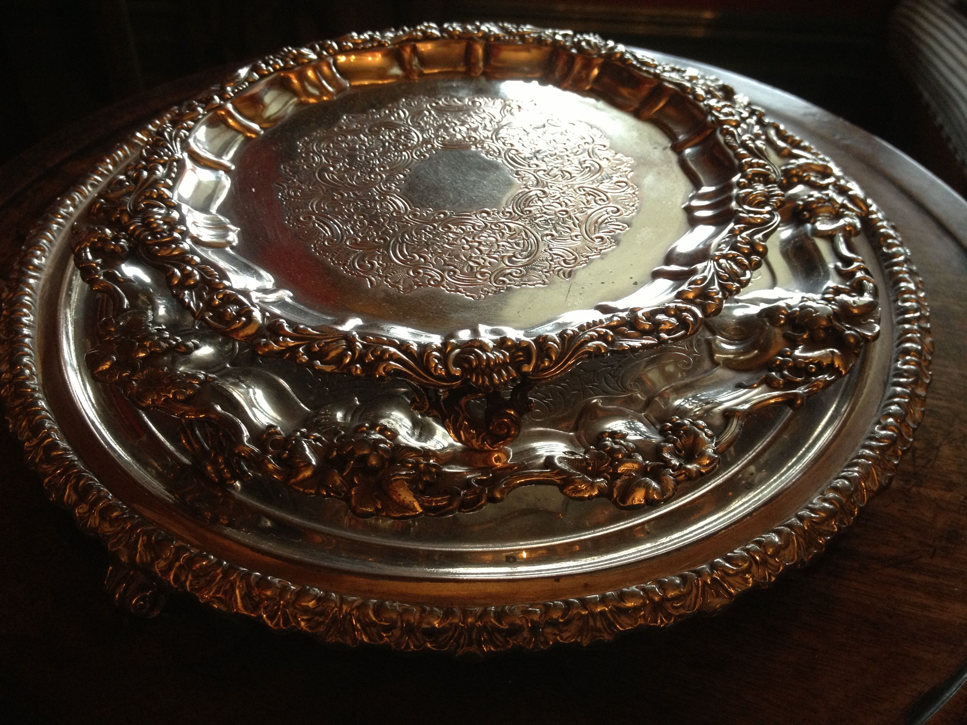
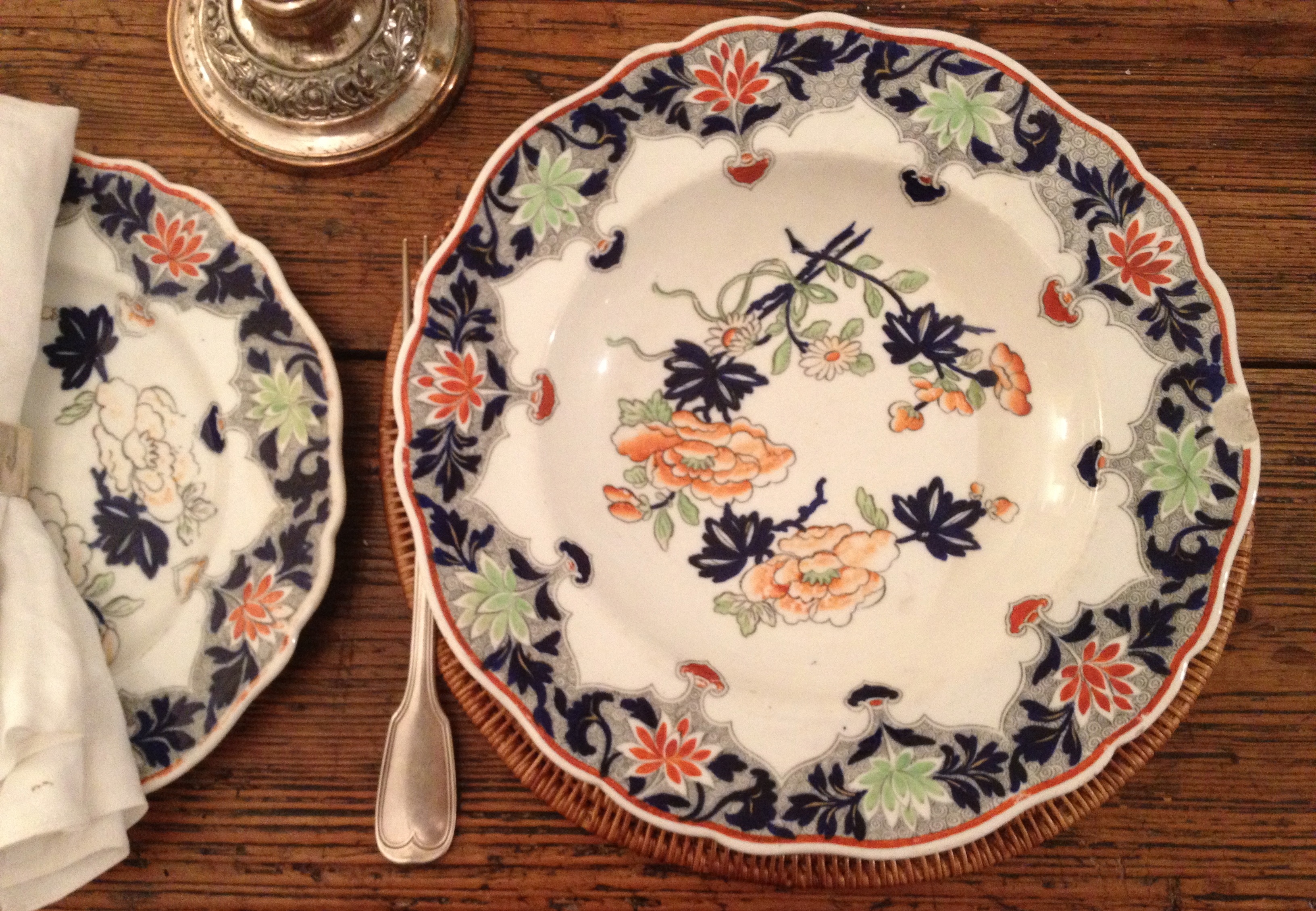
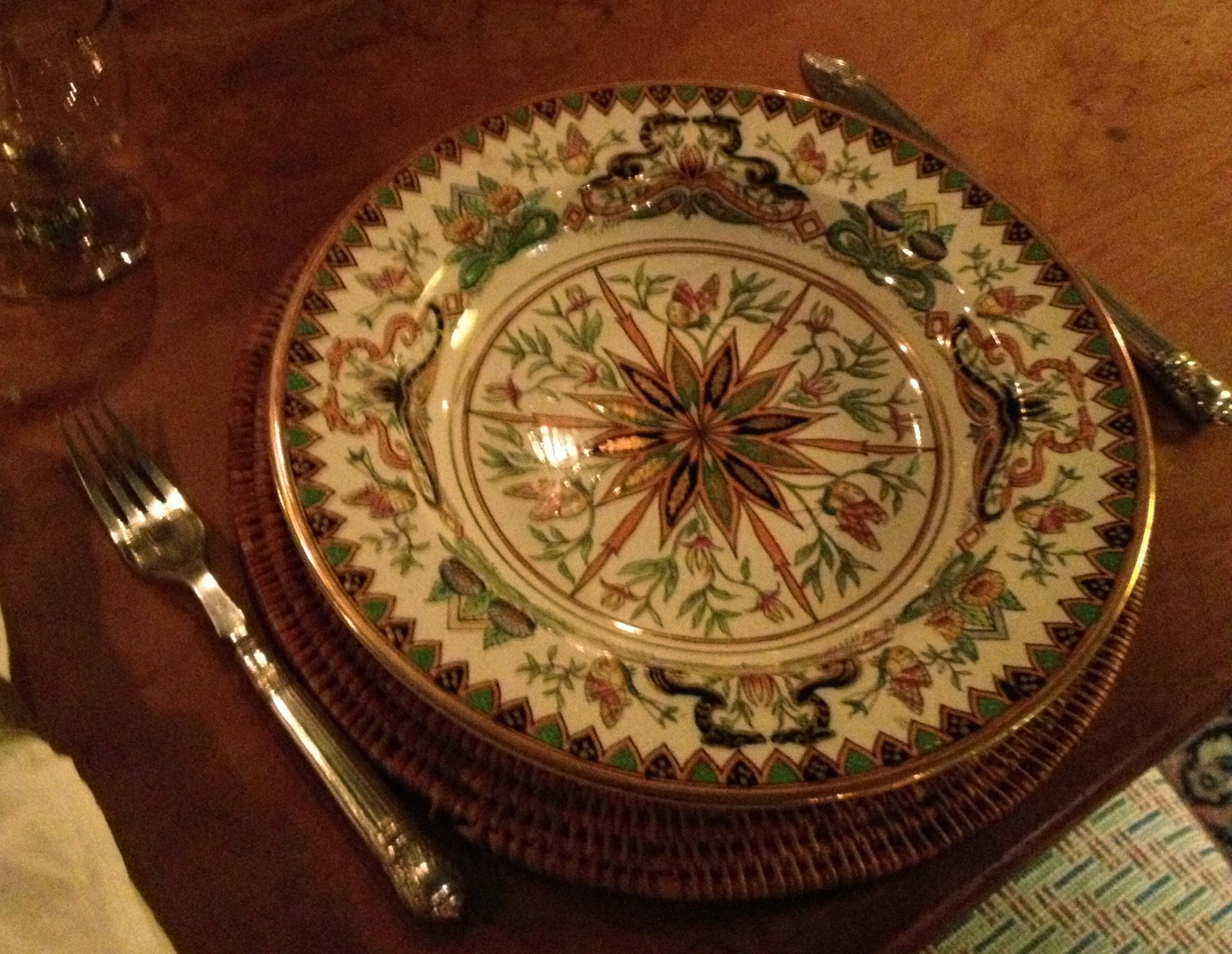
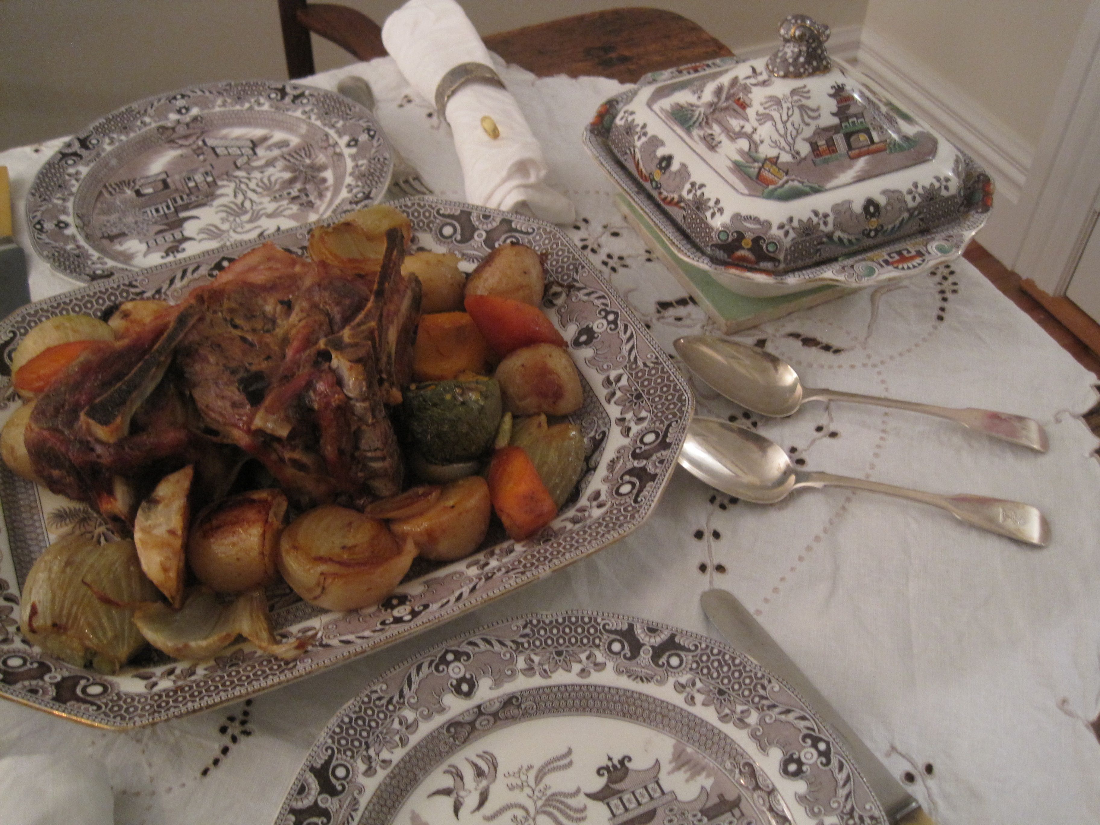
Two lovely Victorian soup plates – purchased previously in another auction battle now long forgotten in their golden candle lit glow

In the end it was a lot more than I’d expected to pay. I’m not sure I’m the best strategist. Annoy me (that is bid against me) and its ultimate firepower, thermo- nuclear war!

3.

I got back into the car to return to work. At my desk I thought ‘I’ve just spent a ridiculous amount of money on the William IV candelabra (the authenticity of which is still uncertain). Worst of all I’d paid more than I would have in Auckland! But rather than the usual buyer’s remorse I thought – so what? Buying candelabra is a great thing to do in one’s lunch hour and it’s only money.

Over dinner Peter quizzed me on the as yet uncollected item? How much had I paid for it?  I refused to confess, in part because there was some lingering doubt – had I paid a fortune for something I might get from a thrift shop for a fraction of the price? Would I being eating humble pie over the dining room table tomorrow?

When I picked up the candelabra the next day – the second I lifted it off the auctioneer’s table – I knew by the weight and scale of it that it was the real thing. It was solid and the dimensions were generous – and it was much bigger than I’d recalled. Once home and on the table it looked absolutely splendid. We placed it in the middle of the dining table, lit a fire and dined, each of us peering through the candle-powered silver tower at the other over dinner.

c5

This allowed us to look at the generous proportions of the base and compare the flaring sides of the columns with our other smaller Sheffield candlesticks. The heavy bulbs on which the branches sit were generous and splendid and then there is the height – at 21 inches/535mm it towers over the table.Did I pay too much? – Well in my mind the answer – no! I’m pleased I won the battle and that the candelabra sits on my table and not in a shop.

With the battle behind me, what now becomes obvious  is that I need a second and matching candelabra. With two you can average the price paid and declare the pair to be a Shabby Baronial bargain.

DLJ

Posted in auction finds etc., collecting | Tagged , , , | Leave a comment

A night in the Garden room

2013-04-25 13.11.13

This is a small space created from what was once the washhouse. In the tradition of that room it is not connected to the main house except by the back verandah. The old concrete-floored washhouse was built on the ground – therefore at a different level to the rest of the house and thus was only barely connected. We’ve left it that way.

laundry 1

The old communal washhouse had a few – if limited charms – its concrete floor meant it was always cool. It had lovely deep laundry tubs and an original copper. It got good late afternoon light from a biggish window and had a generally nice feel to it. However in reality it became a bit of an unused space. Once the other flats cleared out, there was nothing communal about the laundry anymore and it just became a junk room.

When we rebuilt we raised the floor but decided not to create internal access. We thought long and hard about this but in the end what we have is a small sleep out.

It is called the Garden room because it looks into the garden and it houses our collection of garden books. There was also a Garden room in Brideshead Revisited in which Charles painted murals while the besotted Sebastian looked on. Factors like that are never far away in my mind. (Oh, for a Felix Kelly/Charles Ryder to paint me a mural in that room). In the meantime the room houses the books that don’t fit in the library and art works that don’t work elsewhere.

We often send guests out to stay in this room and some have come to prefer it – despite early morning trips in to use a bathroom or to find a glass of water. We have talked about providing a television, but as it stands it is a media free room, one that is instead blessed with an enormous number of books.

For us, those books are some of those we are most attached too and so the room is populated with the books that form the historic pattern of our lives. It is interesting to note how often the books of which we are particularly fond, find their way into the peripheral places in our homes.

garden 1

First of all there are the garden books. I’ve written about the bulk acquisition of a mysterious garden collection and of my love of Beverly Nichols – garden and décor writer supreme. We dip into the shelves in here and bring particular books back into the main part of the house depending on which aspect of the garden we are currently obsessing.

g2Then there are the ‘black penguins.’ I became obsessed with these as a university student. I was reading French Enlightenment philosophy, Voltaire, Diderot, Montesquieu (and enjoying it) my flatmate was reading classics (I ventured as far as Plato and Ovid).  I came to find anything in those stark black covers worth a tilt. Later I got into Balzac and Zola in black jackets and Peter has added Gorky, Stendhal and Flaubert.

garden 3

After that – oh and a good few shelves of gay books – of the literary kind (Paul Monette, Adam Mars-Jones, Andrew Holleran, Edmund White) it all gets well eclectic – a mish-mash of the life’s work on two generally enquiring minds.

Standing in front of the shelves while writing this, there are books that call out to be brought back inside – making strident arguments that their well read paperback status should not necessarily exile them. There are big biographies (Sickert, Sitwell, Chanel and Muldoon), histories of strange things (tourism, Symbolism, Australia), obscure novels by one time promising authors (Frantzen et al.) and host of very obscure between-the-wars volumes including Antony, A Record of Youth (1935) by his father Earl of Lytton (a personal favourite of mine).

Yet these books, like the pictures – an E. Maxwell Fry etching (because I admire him as an architect) a 1940s photograph of a staff-do in an unidentified department store, a Geoffrey Heath photograph from his graduate series, an unfinished R Jack Hutchinson oil of Auckland wharves and a couple of early 20th century embroideries – really are the books that make the house a home. They are  friendly books and this goes a long way to making this our friendly room.

Yes an old quilt helps, as does the soothing Wedgwood green walls and the funny curtained bookcase in a post war polished chintz, but the reason most people choose to sleep out here is the comfort and company of the books which beats the television as a baby sitter/night-light every time.

DLJ

Posted in art, colour, gardening | Leave a comment

Setting a handsome table

plate

Setting the table for lunch or dinner, especially when there are guests involved, should be a pleasure. It’s an opportunity to match the type of food being served to the occasion in which it will be eaten.  This is where the design element inherent in the eating of a meal can really come into play. Even a simple every day meal can be transformed with a little attention. Here in a one-man kitchen like ours, it means that while the cook prepares the meal itself, the other person has their own allotted tasks.

There are certain basics, there are always linen napkins for each of us, there are always good silver serving spoons and candles are set – although in summer not always lit.  The rest is open to interpretation – with variations reliant on how much washing up one wants to commit too.

Because the food we cook is often of a rustic Elizabeth David/Madhur Jaffrey variety, there are days where I am warned in advance that the cooking pot is coming to the table, thus indicating that no serving dishes are required. The plates and flatware should therefore be of the more countrified type – of which there is a fair selection. We have also collected up some cooking equipment that looks pretty good on the table – a good French cast iron frying pan, a selection of smart Scandinavian enamelware casseroles and a Victorian copper fish cauldron amongst other bits and pieces.

However these occasions are usually for when we dine en famille or when close friends are in residence for a day or two. These events take place on the table in the Morning room. At the height of summer there is an even more casual meal taken on a folding table in the deep shade of the verandah but even this gets covered with one of the small checked cloths that have circulated in either family for a generation or two.

1.

Setting the Studio table for quests is an altogether different proposition. There is an increasingly vast array of tablecloths, napkins, napkin rings, dinner services, cutlery and glassware to chose from, not to mention an army of decanters, candlesticks and even an epergne all of which can be called into service.

All these make a pretty impressive looking table almost always presented in the glow of candlelight. Although this often requires ironing linen, polishing silver and glassware and a whole lot of post function washing-up it is, as I say, one of the pleasures of entertaining.   1

However this has a downside. Inviting people to dine at home has always been our primary means of entertaining friends (we’re not one’s for barbeques or pool parties). Years ago I recall asking why there weren’t too many return invitations coming our way? Was it simply that people no longer invited people to dine with them?  A friend said guiltily that she would have us to dinner as soon as she had a decent set of …  (insert what ever you like from the list above) but until then she couldn’t match my obsessive table setting.

Entertaining is about good conversation and good company not good flatware and I will eat anything, anywhere if the company is right. However one thing that occurred to me recently is that not everyone dines the way we do and an over the top table setting can be a little intimidating and even a little overpowering in the height of summer.

So recently when we invited two new younger guests to dine I decided to force myself back to basics and to abandon formal in preference for something essentially easy going to match the summer simplicity of the room.

table 2

2.

The Studio table, (the third since we arrived here and I’m still not sure it’s right) – is a Kauri topped table with impressive turned legs. Peter has been talking about taking the table out into the garden and scrubbing it (which we must do) but for the moment the table is a little spotted (albeit clean) but not so you’d notice in low light levels. When we use it is almost always covered with a white cloth. This was the first thing to be abandoned – tonight basic would mean basic.

On to this went contemporary woven placemats and in the centre a ceramic draining plate from an old meat dish. This is in the centre of almost every table setting useful as it is for placing hot items. The dinner service chosen was Chinese in style but of unknown origin. It is one of the services I contemplate ‘letting go’ every time we need to make room for an new one – but looking back it is surprising how often it gets used.

With a Chinese theme introduced, a red lacquer serving tray was placed at one end of the table and used to hold the dessert dishes. Old brass candlesticks were elevated from the Morning room, as they seemed more suited to a bare table than are silver candlesticks, their colouring complementing both table colouring and that of the tray. Aesthetic movement tiles provided other heatproof services and a matching pair of Aesthetic movements napkins rings were chosen for our guests.

The glasses were old and solid. The water jug is Irish lead crystal and the heaviest thing you’ll ever lift. The decanter is a 1960s one that long ago lost its stopper but get used here almost every night. The water glasses were in contrast delicate wheel turned glasses from the 1920s (note to self: hunt out an nice heavy set of plain water glasses).norwegian

Dinner (a chicken baked in an almond and onion sauce, served with okra) arrived direct from the oven in two Norwegian cast iron pots brought years ago at Webb’s. Dessert (a plum pie) was served in the copper dish in which it was cooked. Cream was served in a Victorian jug – with an Indian scene on each side.

As it turned out the blending of the more rustic method of table setting reserved for family and friend proved the ideal setting for the introduction of new friends to our crazy emphatic way of living and the entire evening passed in pleasant company – with special compliments after those for the meal – going to the rustic Norwegian cookware.

DLJ

Posted in Uncategorized | 1 Comment

Two new Victorians with no place to go

Frank Holl Wild Water (1880) watercolour on paper

Frank Holl Wild Water (1880) watercolour on paper

I aquired this painting some time back, unframed, glued to a backing board and in a not entirely happy state. It is by Frank Holl, one of those romantic English painters who died early and is not well remembered – aka my kind of guy.

To the rest of the world Francis Montague Holl (1845 –1888) was a London lad, born into a family of noted engravers. He entered the Royal Academy schools in 1860, winning silver and gold medals, and making his debut as an exhibitor in 1864.

Initially Holl did very well. Good responses to his work led to him being hired to be the artist on The Graphic a very successful newspaper. Holl’s most famous works are probably No Tidings from the Sea (1871) and A Deserter (1874). The first is a scene set in a fisherman’s cottage and the second in a crofter’s hut. Both are full of that breath-catching pathos and power that the Victorians loved. Van Gogh too was a great lover of Holl’s works and wrote enthusiastically about them to his brother.

Holl was something of a work-a-holic and it seemed that this did damage to his health. At the same time as the fashion in painting changed away from widowed wives – Holl was forced to make a move into portraiture essentially re-establishing himself in another genre. The stress of it all led to a decline in his health and by 1884 he had died aged only 43 – leaving behind a self portrait in which he looks every bit the cute romantic artist.

Frank Holl, 'Self Portrait' (1863) Oil on Canvas.

Frank Holl, ‘Self Portrait’ (1863) Oil on Canvas.

I liked Wild Water for it for its Raft of the Medusa character and its fresh vibrant colour. As Holl is a respectable, if obscure, Victorian I decided to give the work the full treatment and have in conserved and then framed in conservation glass. Re-presented in an old frame the painting is lively, still feels fresh and awaits hanging. It is sitting, for the moment, propped up in the library.

2.

Last week there was a very good local auction at the other local auction house – called Kauri House Auctions (ex Durham’s). The sale has a ring of truth about it – in that the pieces felt drawn from the local community and from long settled houses and vendors. There were lots of good things none of which we strictly needed.

I had been attracted to the sale by a wonderful carved sideboard.  Dating, I’d guess, from the period between 1900 and 1914 it had been carved with elaborate panels of dragons set among flowers and foliage. It was a New Zealand piece and so we crawled over it looking for a mark or signature but nothing and there was no provenance from the vendor. This is so typical of the women craftspeople of the period – in that it was considered immodest to sign even the most elaborate work.  I knew there’d be little interest – to dark, to large, to weird – and in the end it sold for a bargain price and I only hope someone will love it – it’s a gem.

Reginald Jones, 'Untitled,' (c1900) Watercolour on paper.

Reginald Jones, ‘Untitled,’ (c1900) Watercolour on paper.

Peter went to the sale and came home with a small watercolour that I had barely noticed. It is by Reginald Jones and depicts a (perhaps) Kentish street scene. Reginald Jones – might not have attracted Von Gogh’s attention but he did get praised by Walter Sicket – who secretly I like rather more than I do Vincent. It’s a lovely little work and a cut above most works of its genre.

Reginald Jones (here comes the insert bio swiped from Wikipedia) was born in Kent in 1857 and lived there and in London throughout his life.  He travelled widely producing many paintings of the landscapes he observed in Britain, France and Italy. Just like Holl, Jones had friends of influence, this time Walter Sickert who wrote of Jones’ 1889 outing at the Royal Institute exhibition –

‘I am not sorry for Reginald Jones or Raven Hill. Their accomplished chic can hold its own anywhere. It is not progressive art, though a course of it might be a wholesome tonic to our stippling brigade.’

If the painting in front of me is anything like the one in front of Sickert, then you can understand the attraction? Rather than a dull depiction of an imagined village – it is a lively little piece of social observation in which the feel of everyday life is everywhere evident – all achieved in a few simple gestures.

There was no romantic ending from overwork or anything else for Jones – he died aged 63 in 1920 having been elected a member of the Royal Society of British Artists in 1915 and having had a career in which he exhibited extensively at the principle London galleries. Our little watercolour, fresh in it colouring, seems to have been bought directly from the artist and has his business card – Reginald Jones Studio 40 Spring Street Hyde Park W, attached to the reverse.

3.

When Peter got the work he messaged me to say he was pleased with it and he felt sure it would look good in the library. I figured that he hadn’t spotted the little Holl sitting propped up on the library floor – solely because there is no place for it to go.

As the often quoted household rule ‘no more small paintings’ obviously has no traction, we are going to have to start a rethink about the spaces and perhaps investigate the hallway that we have still to complete. Its darkness would suit watercolours. I recall too that there is another older décor rule that watercolors and oils should never be hung in the same room. Perhaps we can use that rule as a starting point to think through just where our new Victorians might eventually go.

 DLJ

Posted in art, auction finds etc., collecting | Tagged , , , | 3 Comments

only walking through

IMG_3894

Sometimes I worry that we don’t use the big studio room in our house enough. It was, in fact, the reason we bought this house – against all reason. Well, Douglas says I forced him to buy this house. And it is true I had a deep sentimental attachment to the house, having passed it and often said hello, as it were, on my way to my grandmother’s house.

In some ways they shared similarities. Both were rather blunt-faced houses, unusual and not the exact run of the mill villa which you sometimes see reproduced side by side in streets, put up by speculator-builders. And in fact both this house and my grandmother’s house were one-of-a-kind, built for a particular person. My grandparent’s house was built by the family firm for my grandparents when they got married, so it had the slight endearing irregularities of an individual house. (I particularly liked the back passage past the bathroom, which seemed secretive and unusual.)

This house of course took all its logic from this massive studio room. It created the large plain street frontage and – all in all – is a sort of out of kilter huge room. When we first recreated the studio, at vast physical effort on Douglas’s side – while I did the painting match-ups – we couldn’t use it enough.

We often ate dinner in there, even a deux, sometimes seeming to echo those scenes in Citizen Kane where two people sit at a vast table in a gargantuan room. We luxuriated in its space and used it as often as possible.

Over time, the wonder did not exactly pall – but the winters rendered the room icy. You would hurry through, on your way to the snug little kitchen.

I always regretted not making a little book to hand visitors so one didn’t have to reproduce the same explanation each time a new visitor exclaimed in wonder. (Yes, we found it in three horrible rooms, the ceiling lowered. Yes, this is the original colouring, the boards were underneath. No, it wasn’t all intact, we had to mend it where it had been pulled apart. Yes, it was an artist’s studio. Yes, he was a colonial artist. No, you won’t have heard of him. And yes, finally, that is one of his paintings over there on the wall.)

Anyway, long story short and this is to say that, though we no longer eat in there as often, there is ‘food for the eyes’ every time you walk through.

The fact is I just enjoying looking at it – into its space.

It is sheer luxury to occupy such deep picturesque space. Sometimes I dress it a little, so it changes how it looks. Douglas’s purchase of these two citrine coloured lampshades, to go on these old fashioned standard lamps, gives the room a lovely glow.

The fact there are two of them also gives the vast space a pleasing symmetry. So…we still enjoy this space. You can just enjoy the luxury of having a beautiful room – even if you are only walking through it.

PW

Posted in colour, original surfaces | 3 Comments