Simple Jams – that look good on the shelf

Image

Knowing that there is still a jam making season (now passed), and participating in it, is a great part living in Napier – indeed it this is a real Hawke’s Bay tradition that has lingered long after the invasion of supermarket jams –  because fresh fruit is so very plentiful here through late summer.

The older generation is full of stories of the 1931 earthquake that came mid-jam making season. The result was pantries stuffed to the rafters with jams and preserves that were then scattered far and wide in a big sticky mess. A story of also heard from Christchurch

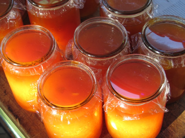
One of the nice connection between then and now is the availability of proper Agee jam jars – either in their 1930s form with an extended neck – in their 1950s version in which the neck is really just a rim on the top of the body of the jar.

The two ages of Agee jam jars

Those unfamiliar with jam making in the traditional way are often perplexed by the lack on lids for these jars. However this is intentional.  Just grab the jars if you see them – they turn up in the Sallies all the time. The ‘lids’ in the form of plastic seals come from the supermarket and are bought new each year.

Waugh Jam Jar Covers – at all good supermarkets

Another nice thing about these jars is that they can linger in the shed for years and with a quick trip through the dishwasher still scrub up nicely. Their transparent plastic seals means that the whole product comes up looking very glossy.

If you’ve never made jam before start with either apricot or plum jam – I’ve never progressed beyond them because they set so reliably. However a couple of dozen jars of each sees us through a couple of years – and fancy difficult jams can be acquired from the specialists jam makers with which the farmers market is full.


This is the Edmonds recipe for Apricot Jam:

6 lbs Apricots

6 lbs Sugar

1 Breakfast cup of Water

1 Vanilla pod

Split and stone the apricots; put into a preserving pan with the vanilla pod and water. Cook slowly until the fruit is pulped. Add sugar and boil rapidly for 15 to 20 mins. Test.

If you whack the stones with a hammer you can take out the kernels (the white bit) these can go in the individual jars and they add to the taste as the jam matures.

Pour the hot jam into sterilized jars (they need to be warm and straight from the dishwasher works). You place one of the cellophane tops on and the heat sucks them down – the top should bow inwards to wards the jam – then place band or string around the jar to seal the connection.

the NZ classic – 1950s versions are the best

This is the recipe for Plum  Jam:

6lbs Plums (use Black Doris for the best jam)

4 1/ lbs Sugar

1 Breakfast cup of water

Split the plums; put into a preserving pan with the water. Cook slowly until the fruit is pulped. Add sugar and boil rapidly for  15 minutes. Test. The stones can be picked out, as they will rise to the surface.

Test: means place a little jam in a saucer and then wipe your finger through the middle – if like the red sea it remains separated than your jam will set in the jar.

The jars need to be hot and should not be  overfilled. The instructions on for the labels are on the packet – but it is the gap between the jam and the top of the jar that makes it all work.

The point of this is to make a jam that tastes good but looks good too – these look great on the shelf and even greater on hot buttered toast.

DLJ


Posted in Uncategorized | Tagged , , | Leave a comment

Havelock – Hero of Cawnpore and Parian

Left to right: Walter Scott, Albert the Good, Major General Havelock

A wet Saturday morning and I have an injured Achilles’ tendon. I was pretty determined not to go anywhere much at all but to stay inside. How then did I end up in Hastings – clutching a Parianware bust in my hot little hands?

The agreed outing was a quick trip down to the framer (to collect a reframed lithograph of the Great Eastern acquired in a tired matt at M&F last week) and to then to the farmers’ market for supplies. Peter, however, decided mid-trip that he needed to go to Hastings there and now for a pair of shoes (it is not widely known that Hastings has superb shoe stores) and I agreed because they have an equally excellent library and I was in need of some comforting picture books to wile away the afternoon.

Despite having been in Hastings two weekends ago I decided to check out the generally good Hospice shop there – sure enough there was a little French provincial cooking dish for $5 and Peter spotted, on their sale table, a nice old Wedgewood plate with a good botanical print of geraniums. Then, at the counter to hand over my $5, I spied, in their glassed in ‘antique case,’ a Parian bust of Major-General Sir Henry Havelock, (the hero of Imperial India after whom Havelock North is named) and at a reasonable price (given some of the Hospice’s antique prices are nuts, even if you are providing support for those in a hospice).

I rather like Parian figures of obscure Victorian heroes. I now have Albert the Good, (acquired in Tirau), Charles Dickens (acquired in Dunedin), Walter Scott (acquired in Wellington) and Napoleon (a present from Peter). I am avoiding the composers but would happily add Tennyson or Byron or perhaps Gladstone and the Duke of Wellington.

Then there are the two larger figures. These were slightly ironically acquired at the same sale at which I sold up my modernist collections. It seemed right to buy something rather than just be selling after all and Narcissus and Musidora were as good a choice as any. Musidora lives in a bell jar in order to keep her detailed modeling free of dust. I rather like it but Peter has allsorts of feminist issue regarding the keeping of women in glass jars – that come all to obviously from Sylvia Plath – “The bell jar hung, suspended, a few feet above my head. I was open to the circulating air.”

The original Narcissus by John Gibson is in the Gallery of New South Wales and I make a point of visiting him whenever I’m there but these smaller versions are a little less likely to go crashing through the library floor than their original marble  counterparts.

I’ve come to like Parian for the very reasons that it was such as success in the first place – in that it provides superior copies of Victorian works of sculpture – to the decorating mad middle classes.

Today there is little understanding of the Parian process. I’ve been stalking (the official term is watching) a piece on Trademe for sale by someone with no idea what it is they have and therefore want a fortune. They refer to the piece as  ‘a one off and a really beautiful collectors item’ (half true). They continue ‘there were a few other different statues out there of which collectors may have, but not of the same person, as only one of each were made.’

Well no – Parian was exactly the opposite and one of those great mass production triumphs at which the Victorians excelled. Where they become rare is that so many have been broken – and many although appearing intact have fingers and other smaller details missing. I recall seeing some stunning pieces in an antique shop in Palmerston North – each one either seriously reassembled (with telling glue marks) or with small details missing – I resisted.

My Trademe nemesis insists that their piece was – ‘commissioned by HRH Prince Albert to be made by an Italian Sculpturer, [sic] and … made by a person by the name of Copeland. Where does one start? I recommend Google. DLJ

Posted in art, auction finds etc. | 1 Comment

How to wallpaper with old book pages

Some time back we came across an old dictionary in a box lot at the local auction house – its cover was missing and it was in pieces but it had great illustrations and great (no longer used) words.

There was no particular plan, we just liked it, until that is we were looking for something to line our dressing room walls with and we decided to use the dictionary. The idea was to create something literary and to pay homage to the early pioneer use of newspapers as wall linings – although I should say that was a habit that had largely passed from fashion in all but the poorest homes by the arrival of the Edwardian period.

Therefore this posting is one of those practical ones about how to wallpaper using rescued pages from otherwise destroyed old books.

1.

The dressing room is a small room lined on two walls and the ceiling with its original match lining. It has a pitched roof and doors in the two long sides. We had put wallboard up on the two short sides were there had been a door and a window when this was a kitchen for one of the old flats.

These were stopped and then sized by the painters. Sizing is not difficult and wallpaper size can be purchased from any hardware store – when you’re there buying the wallpaper paste.  I should say we had an expert paperhanger on the bigger alteration job – and he considered any and all wallpapering to be done – his territory. That was until we described these two walls as being reserved for ‘an art project’ – after that he was happy just to size the walls and let us do the rest.

2.

The next stage is to prepare the pages. The dictionary was ragged but the pages needed to cut out. In order to do this the remainder of the binding needs to be cut. It you look at the spine edge-on you can see the book in made in a series of bound sheaths – cut the string that binds one sheaf to the other by running a knife down the spine between the two.

A sheath of papers should come away in your hand. Remove the remaining binding string (picking away at it, cutting where necessary and drawing it out) and you should have a pile of loose pages each made up of about a dozen leaves that when separated out will give you individual leaves of four pages joined down the middle.

The middle will be pierced with holes from the binding and misshapen from being bound into the spine for 150 years. So this needs to go. Luckily for us each page of the dictionary was edged with a thin black border so it was an easy guide against which to cut the individual pages.

We had borrowed a guillotine to do this with but found a ruler and a craft knife easier. Then eventually we discovered that each sheath could be sliced with relative accurately without being broken down into individual pages – this sped the process up immensely.

 3.

We had decided on a regimented scheme were each page remained readable and there was no overlap. You can of course approach this is a more paper mache/collage way, laying pages one over the other but we sort of imagined you might want to read a section without it being abruptly cut off mid sentence.

Therefore we set up a string line – we started at the bottom because there is to be a wardrobe shelf half way up the wall so when we got to that point we readjusted – so that the papers  above the shelf – the most visible area l– ooked uniform.

We also decided to use wallpaper paste and chose one designed for heavier wallpapers. There had been advice and discussions about other glue types – but the wallpaper paste proved easy to use and is proving up to the task six months later.

From there on it was pretty much wallpapering as usual. Except in that we kept discovering words – that we felt we needed to write down and remember. The pages were liberally coated with glue and then put in place with the same stiff wallpaper brush my father used in the 1960s – this is a really good item to buy. Get a good one and it will last decades (as in the case in point).

Because the pages had a natural black printed border, we had a good guide to create a small even over-lap and although it was stifling hot (this was a mid-summer project) we progressed rapidly.

If you are using a book it is worth remembering that the top edges will be brown (books get dirty even sitting on shelves) and you might want to cover this edge by placing the bottom edge of the next page to be pasted over it. Remember also to wipe off excess glue – to stop bugs feasting on your paper.

The end result is great. The papers come across as clean and tidy with a little of the patina of age. A couple of observation specific to this project. As it is essentially a wardrobe the lower half of the walls ended up obscured and even where the papers are visible – they end up pretty hard to read.

DLJ

Posted in inspiration, original surfaces, practical matters | Tagged , | Leave a comment

Woolen Upholstery Fringe

Lazy blogging? Perhaps? I just wanted to post these Victorian upholstery fringes from the collections held at Hawke’s Bay Museum & Art Gallery.

Mostly because of their vibrant colour. They came into the collection decades ago and have been stored away from light thus preserving their colour.  For years before that they were in an furnishing store that had acquired them new.

To me they are wonderful treasured examples of the upholsterer’s art and show just how good with colour the Victorians really were.

DLJ

Posted in inspiration, original surfaces | Leave a comment

Special moons and strange visitations

During May there was something of a special moon. Or something strange happened to the sun and there on the wall of Douglas’ new bathroom was a shimmering apparition, as close as you could get to magic.

It was in fact a reflection (or was that projection) of the acid-glazed window, which portrayed autumn in the form of a neo-classical young woman, complete with sheaf of wheat, scythe and sandaled feet.

Like a lot of these hefty neoclassical models there seems something slightly transgender about them. But she’s a beauty, no doubt about that.
She came from the centre of a pair of beautiful glass doors which came from the local auction mart. There once would have been a matching goddess in the other central pane – perhaps winter or summer?

But by the time we got the doors she had vanished.

Douglas made the decision to lift the existing goddess out and make her into a solo picture in his bathroom. It was a good decision, as the light is diffused – and every afternoon she positively glows.

The double doors weren’t cheap – but much cheaper than at a demolition yard, where anything decently odd gets priced astronomically. Douglas actually did the delicate work of removing the glass pane by pane. The doors reused in the Morning Room featured in an earlier posting – where in most of the old coloured glass that once surrounded this apparition and her twin still reside.

It was a pain-staking process of  chipping out crumbling putty and removing old nails – but almost all of it came away intact. Ironically it was one of the smallest pieces that broke – small enough to be reset in the doors in its divided state. The large autumn pane was left till last and although slightly nerve-racking it was eventually lifted out in one piece.

These panes leave another lovely hue on the walls as the sun sets in the west – it makes you wonder why clear colourless glass seems to reign supreme in contemporary houses.

PW

Posted in Uncategorized | Leave a comment

Queen’s [Jubilee] Weekend and a free recipe

In my family, Queen’s Birthday weekend has always been put aside for gardening. No holiday for us – because as children holidays were linked to the family yacht and the first day of winter is not the best one for a cruise – instead it was hard labour in the fields.

In Peter’s family Queen’s Birthday weekend is put aside for building numerous small household shrines to Her Majesty and cooking celebratory dinners – or so it seems from the evidence presented.

So you can guess how this weekend has evolved.

1.

I’ve have been working for some time on a complete rebuild of my ‘side’ garden.  This is on a municipal scale where they remove everything and start again.  It’s not that I’m going for bedding plants – a la Victorian parks – but rather that with a couple of plant reaching the end of their life and others grown too large –  it was time to start again.

Not an exciting process – therefore part of the excuse for not blogging – I have been busy digging up and preserving plants I want to reuse and disposing of others. Also a lot of time has been spent simply gazing at the spaces in question and think about what it is I want to achieve.

There is a problem in the middle of this garden in the form of an old mandarin tree. It is enormous and although the fruit are good they are too high and too plentiful (this is Hawke’s Bay after all). We all pretend we like mandarins but on this scale one simply can’t keep up and the tree ends up with fruit from two or three seasons ago – most of which frankly go into the compost.

I consulted with experts ALL of whom advised that with citrus you could cut back as harshly as you like – and they’ll come away again – good idea. Enter a half-witted professional arborist – you refused to the job – as too brutal – thanks mate!

So – it became my job to reshape the mandarin and if it doesn’t respond it’ll come out completely next year – but you have to give the old girl the chance.

Reshaping citrus become the theme of the weekend and the large overgrown (and thorny) grapefruit (above) was next. Now cut into a severe architectural form – we’re happy.  Both trees were sprayed (organically) for black soot fungus and the overgrown mass under the grapefruit had it first thorough going over since the alterations began more than a year ago.

2.

Meanwhile inside, shrine building was a full tilt.

First there was the long-term hallway shrine with open book and iconic image and then the casual shrine made of the newspaper supplements on the Thonet chair. Between constructions there is much to worry about – will boats collide in the Thames armada, which coaches will be used and most pressing of all what jewels will be worn. Then there’s the special jubilee church service to attend and whom do we know with UK TV on Sky?

Dinner, with a nice table setting of our current favorites, (including more crystal than previous days) centered on roast pork.  My job (after a day in the field) is dessert. Luckily I have a big bunch of rhubarb from a friend in the Waikato – and a recipe. It’s called Golden Pudding and is a staple around here but will scrub up for a celebration at short notice.

It comes from a wonderful book called Farmhouse Fare: Recipes from the country housewives collected by the Farmer’s Weekly (1946) and is the brainchild of Mrs. G Wood of Gloucestershire.  and is dead simple and gorgeous (though not necessarily pretty) So here goes –

Smear a dish with treacle (golden syrup will do and at the moment I’m using maple syrup). Then place on layers of white bread spread with butter.  Fill centre with partially cooked and sweetened rhubarb. Place more bread and butter on the top (or go topless like the one illustrated) Put in a hot oven for 15 minutes. Turn out onto a dish (or not) and serve with custard or ice cream.

This is divine – and a perfect jubilee desert.

Posted in gardening | 1 Comment

At the Club

An Edwardian gentleman – or at least those occupying the house of one time Edwardian gentleman artist/farmer – as we do – requires a club. Not a tennis club or bowling club but a gentleman’s club – in which one can reside whilst in town and a suite of paneled rooms from which one can conduct business.

Napier is unusual in that its club, the Hawke’s Bay Club, still operates at full power and in considerable architectural splendour – paneling, potted palms and copies of Punch. However as the Club is about 2 minutes away we’ve yet to feel the need to apply.

Wellington however is a different matter. We often find ourselves in Wellington. More often than not attending the auction at Dunbar Sloane Street. Therefore it perhaps no surprise that we have discovered the gentleman’s club on the other end of the same short street.

Architect Gray Young designed the Wellesley Club building in the mid 1920s. He was the obvious man of his day for this sort of thing and his creation is well-mannered and polite but authoritative. The club itself was not particularly old, dating from 1890, but it did mean that when they came to build there was a lot for him to look at as exemplars in the form of London clubs. Therefore Gray Young was able to supply some considerable graciousness – behind his tidy façade. The building had just the right degree of Georgian flair – to garner its architect the Gold Medal from the Institute of Architects in 1931 just a couple of years after its completion and today it sits in Category 1 listed splendour at 2-8 Magginty Street

The advantage of the modern Wellesley club – over that of old – is that the Wellesley is now a hotel (www.wellesleyboutiquehotel.co.nz ).  This means that a considerable annual fee – is now broken down into easily manageable night-by-night charges – but that little else has changed. Many of the chattels and furnishing of the old club have been retained and are used to surprisingly good effect.

Not surprisingly it is for the décor and architecture that we frequent the Wellesley – that and the opportunity to invite friends to meet us at ‘the club’ – an illusion that they usually accept without spoiling the fun.

The Wellesley has some lovely downstairs reception rooms – including the smart dining room and a good comfy nook or two where you can sit in paneled splendor with a drink in hand. (The restaurant has an excellent chef and is a favourite meeting place for foodies at lunch time.) An elegant staircase from the ground floor is perfect for descending in sartorial splendor before venturing out for the evening.

Although these rooms are a lovely evocation of an altogether English style, one of the nicest elements of the Wellesley are the unexpected moments that one encounters that really do remind you that this was once as gentleman’s club.

The lift here is a real treasure, oak paneled with a scissor grill but some of the nicest of the reminders of times past are to be found on the staircase.  There is a remarkable sense that you are  exploring, as you move up the stairs, heightened by a system of movement sensors that turns the lights on just ahead of your path – ensuring you splendors are continually being lit up and revealed just ahead of you.

There is a copy of a Titian on the first landing and a real Lindauer a little further on. Then come large portraits of Prime Ministers (Seddon and Ward) – of the type one seldom sees including one by Walter Bowring an important if neglected early Twentieth Century New Zealand painter. Then there are imperial lithographs of important events and cricketing photographs. There are framed photographs of HMS New Zealand and bronzes of Wellesley himself.

What’s nice here is that the club has stuck with originals – that have seen better days – but water stains and all they are so much preferrable to most ‘hotel art.’

Although wanting to avoid writing a puff piece on a hotel – the Wellesley is a lovely stay for anyone with a sense of history and of décor. Their preference for the original sits beside contemporary and very luxurious rooms and particularly bathrooms. However what is nicest of all is that the personable young man at reception – greets you with ‘welcome back, how long are you staying with us this time?’ He knows how to play the game, and for a night or two at least  it is great to live out the fantasy of being a member of a very exclusive club.

DLJ

Posted in inspiration | Tagged , | 1 Comment

Decor Neglect

Are we guilty of décor neglect? Probably. A follower has reprimanded us for our lack of postings and it is true – our minds have been elsewhere.  That is not to say that the pressing issues of décor haven’t been top of the list – but we’ve been doing other things – working, writing, travelling, gardening, relaxing and of course hunting out new décor items.

Yet I now realize there has been some neglect of the serious issues. Every morning as I travelled through the Studio, bleary-eyed (making my way to the coffee pot), I had been suffering certain disquiet. What was once the centerpiece of the whole house – our show off room – seemed to have lost its zing.  Was it that, with the renovations now largely finished, the new spaces have taken attention away from the main event? Now that the party happens out in the Morning room and deck is the Studio simply now at the wrong end of town?

It took a while – a few coffees and a long Easter weekend (in which a big garden project was ruined by torrential rain) to take another look at the Studio. What had happened?

Essentially the Studio had become the initial resting place of newly acquired pieces, new paintings, new vases, new pieces of furniture and a collection of 1954 royal tour flags. Here paintings had been put up on any convenient nail, vases have been deposited en masse on tabletops and the neglected dining room table had become home to everything from unsorted mail to glasses awaiting rehoming in the armoire. This had resulted in the generally disorderly jumble that we only ever passed through – and nobody was paying much attention.

What took a while to sink in was that the whole room needed a do-over. This is not an invasive project – but simply a rehanging, a simplification and a rethink.

There was something of a question as to what the Studio is now used for. Initially – when we only occupied 1/3 of the house – we lived in this room – it was our house – now there are other spaces and the Studio basically becomes a large formal dining room and entertainment space.

Early on we thought a lot about making it feel like an Edwardian artist’s studio – that is with a strong Orientalizing feel – Japanese mirrors, Moroccan occasional tables, boxes of artist’s paint and an easel or two. Although we had essentially decided the look was unattainable – without it seeming as if the room was filled with faded tat – however some of these early directions still lingered

There had also been the Shabby Baronial approach. The term had been invented by the fabulous Claire Regnault – as a deeply masculine version of Shabby Chic that allowed us to do sprawling and comfortable but have the whole effect seem big and male. As part of this the mounted deer’s heads and the occasion flag still work and work well – but the wing chairs had gone off to their intended destination in the library and the big Joseph Gaut had gone off to have conservation work done on it. What was left simply no longer hung together.

One of the questions we had asked ourselves was does the Studio need new furniture – and the answer of course is yes. A good large-scale butler’s stand or open sideboard would look great where a smaller sideboard now stands and I for one am still not sure the dining room table is quite right. However these things take time and we needed to work with what we had.

We started in one corner – in a moment of guerilla action Peter had moved a contemporary artwork by Ian McMillan from its corner behind a door – to a more prominent position, displacing two Victorian embroideries but leaving a third hanging high above it. Climbing a ladder I brought down the remaining embroidery. From there we moved around the walls of the room – replacing a Japanese painted mirror with a plain colonial one – hanging a portrait – and then two Theo School panels – that were really propped up awaiting being placed in their specially made crate to go into storage (these are remnants from my last mid-century modern house). We moved around the room hanging pictures so there seemed a conversation between them and at each point we measured and hung paintings at exact heights and equal distances.

This precision and a strong sense of paring back was exactly what the room needed. Vases were disappeared, tablecloths removed, footstools exiled and at the end of the day we had achieved a certain big simple antebellum style that so suits this room and the Studio is back to being the show off room it always has been. What’s more we achieved this in good time for a formal dinner to commemorate the centenary of the sinking of the Titanic this Saturday.

Sometimes it is worth taking a second look at a room, forget silly notions of new wallpaper, carpet or light fittings and ask yourself if what is really needed is a simplification – a paring back to its essence – maybe a good re-hang and a cull of a few unnecessary objects – all of which remain to feature another day, ready to reflect a different mood.

DLJ

Posted in Uncategorized | 2 Comments

The perils and possibilities of Ticking


Ticking is a material most people remember from mattresses. It is, usually, cheap and decorative. It suits old furniture, having a certain Jane Austen quality of elegance and utility (ie it is cheap as chips).

Ticking comes in black, red, blue and green as a general rule, though I have starting seeing variants on these.

It does have a demerit: it gets marked very easily and the very quality which makes it effective – its highly graphic quality – shows up dirt very easily. Douglas had a regency chair recovered and almost immediately it got a spot on it. It’s almost impossible to clean and you can’t hide in such a stark pattern.

All you can do is put a book on it, as on this stool in a masculine Georgian style I picked up at a local auction (useful for the end of a bed where you tend to drop clothes undressing at night.)

When I faced a decision about reupholstering this charmingly ugly colonial chair I went for ticking. It was done by an expert, as you can see from this careful alignment of a button.

This ticking was cheap. From memory it was around $15 to $20 a metre at Spotlight. At the same time high-end upholstery shops were selling ticking for $45 a metre approx. Usually it was of a heavier fabric, which does have its point. (And even fabric @ $45 a metre I have since found out is a bargain…)

Why do I like ticking? It is graphic, strong, simple and goes well with furniture from the Regency period backwards. As you can see here, it kind of goes well with a David Hicks obsession with tiny patternings.

But I almost ran amok when we ordered ticking material for curtains for the new bedroom on line – www.marthas.co.nz.  (This was from the lovely Martha’s in Newmarket: their cafe is highly recommended – and for people who like fabric as a fantasy, what better combo can you have than a cafe where you can think options through: like I shouldn’t really buy it. I can’t afford it while munching on delicious pastry.)

Anyway long story short, I looked at a ticking at Marthas which was basically like the other ticking we have, but stronger fabric. Back home in Napier I ordered it on line. I was slightly mystified by a slight change in price, upwards, but put this down to on-line buying.

Imagine my horror, dear reader, when I opened an expensive roll of fabric ($52 a metre) to find a different ticking. It was a pale cream background (as against stark white) and the fabric also had a kind of almost tweed herringbone pattern woven into it.

Basically it was a contemporary take on ticking. The bars of colour were wider apart. I contemplated suicide or had I already committed décor suicide.

I went back on line and found to my mortification I had made the mistake myself. (Damn!)

However…as it turns out, the cream of the new ticking has gone very well with the nice creamy paintwork of the wooden French doors. Now I have adjusted my sight to what it actually is (rather than isn’t) I find I like it a lot.

I do have a worry. We are getting a logburner thingy for the bedroom so we survive Napier’s arctic winters (in our wooden house). I am a little worried about a sooty hand reaching out to close the curtains.

The fact is, like most things from the eighteenth and early 19th century, they were predicated on an underground staff who laboured hard to keep things looking clean. After all, white was associated with the gentry (white linen) simply because it was impossible for poor people to attain. But since this house operates on the fantasy that there is some unseen Downtown Abbey type staff working away, I guess we have to take on the role of the invisible Minnie and do the damned cleaning of the ticking ourselves.

PW

Posted in Uncategorized | 1 Comment

In praise of footstools


The auction drought is over, from mid December to end of January there’s little in the way of auctions to feed the need of an obsessive auction goer. However from this week that is all over, not only have Cordy’s delivered me a nice little ‘present for self’ (in a non décor line) and Maidens & Foster have delivered a sweet little footstool but Dunbar have put there antique catalogue online.

We like footstools. They are one of those eminently sensible objects that have somehow been discarded, but that greatly aid comfort when seated and can be pressed into service as a small occasional table – for a cup of tea, glass of wine or somewhere to put a book – when required. Admittedly one has to be aware at all times where they are so as not to be sent flying.

Strangely most of our footstools are from the 1920 and 1930s rather than of the beadwork Victorian variety. What’s nice about the new addition is that it is redolent with 20s/30s notions of luxurious décor of which relatively few examples survive. Another we have is perhaps from the opposite end of the spectrum made of empty tins bound into a clever shape and then upholstered – Depression ingenuity in décor.

DLJ

Posted in auction finds etc., furniture, Uncategorized | Leave a comment