I have a lovely little office – decorated on a theme of imperial naval superiority. It is carved from what was once the house’s original dining room. It is full of bits and pieces. However I spend most of my time at my desk looking out of my window – such is the life of a writer.
Never fear I have, until recently, had an excellent view, one carefully composed to make use of a classic example of borrowed landscape. The foreground view, through a double set of Edwardian sash windows, is taken up with Souvenir de la Malmaison a climbing rose strung across the window on wires. This works as a security device and provides a briefly splendid array of pink roses.
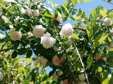
Souvenir de la Malmaison
The middle ground is centered on a lovely Maya lemon. This was on the property when we arrived but has been nursed back to health and clipped into a good strong form. This is one of two lemon trees and as it borders the lane it is the one that supplies of the lane dwellers more than it does us.
This is all backed with a tall wall of clipped leaves – made up of Titoki trees, a Prunus cerasfera Nigra and other assorted hedge materials – all of which lie on the neighbours side of the lane. Although it can get a bit shaggy, this wall of trees blocks their house from my view and provides a backdrop to my composition. I am as they say ‘well pleased.’
The other day, for no apparent reason, the neighbor decided to cut a big whole in this wall of leaves crudely exposing a corrugated iron fence of which I had no previous consciousness. It might be an attempt to let light into the space surrounding their front door – futile though it will be due to the orientation of the house. Although I’d like to think that this sudden hole in my composition is to do with a broadly considered plan on the neighbour’s behalf – but I suspect it is a result of angry gardening.

Hitherto unseen splendours
Angry Gardening comes in 3 Categories – all very popular among New Zealand men.
Category 1: occurs when they first take possession of a new property and usually involves a chainsaw, with which they angrily remove all planted presence of the previous owner.
Category 2: occurs when men are sent out into the garden against their will usually during televised sports events. This usually involves angry use of a lawn mower or leaf blower to drown out the person who evicted them.
Category 3: occurs in those small parcels of land that while on their property sit outside the zone on habitation – aka the little spaces on the other side of the fence, the back of a shed or the unseen side of a garage – these spaces are resented and get angrilly attacked about once every six months.
Although all categories come with a big dose of resentment, Category 3 is the worst – because it seems such a waste of time – gardening you can’t see. Confronted with this realization – massacre is usually considered the best approach.
It is the approach my neighbor has taken to this part of his strip before – a mature flax disappeared one day for no obvious reason – weeds now grow in its place.

Another example of borrowed landscape – this vine originates two houses away in an overgrown back yard – but for how long?
Borrowed landscape is a tricky proposition because you rely on the owner of the landscape in question – and most times you are totally in their hands. You need to know that they have the ability to see a wider view – to see landscape and gardening holistically as part of a series of interlinked properties – such relationships are rare.
The strange thing is should the neighbor come to me and ask me to take over this strip he can’t see but I look at daily, I’d be glad do it.
DLJ