Dahlias – an Impressionist view

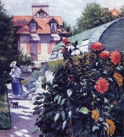
Gustave Caillebotte, 'Dahlias: The garden at Petit-Gennevilliers' (1894)

I was never a great fan of the dahlia. Breeders have bred them in strange day-glow colours and given them embarrassing names – like Princess of Hearts, Bottom’s Up and Kiss Me Quick – and thus ruined them. To add insult to injury dahlia gardeners then plant them in isolated beds – in which they clash and fight with the other day-glow dahlias around them.

Then one day I saw an orange dahlia in a French Impressionist painting and I changed my mind.

This in itself is strange because I’m no fan of Impressionist painting.  Except that the painter of this particular work, Gustave Caillebotte (1848 –1894), had never been mentioned during the course of either of my art history degrees.

Gustave it seems had committed a number of art historical sins – he was wealthy (it’s hard for wealthy artists to get taken seriously), he stopped exhibiting at 34 (instead devoting himself to gardening and to building racing yachts – my idea of heaven) and then, worst of all, he died aged 45 (while working in his garden). All of this has generally meant that Monet, Renoir and Degas have squeezed him out of the popular Impressionist consciousness. Yet as a gardener who was also a garden painter, there’s way more to learn and be inspired by in Caillebotte, than there is in Monet.

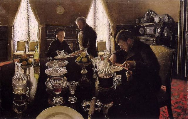
Gustave Caillebotte, 'Le dejeuner' (1876) private collection.

The funny thing is that a couple more Caillebotte works have since been elevate to my list of favourite paintings. The first Les raboteurs de parquet (The Floor Scrapers), (1875) is a great piece of homoerotic art, that I first saw on the front cover of Mark Mitchell and David Leavitt’s Pages Passed from Hand to Hand. The second is Le déjeuner (Lunch) (1876). I credit this painting with inspiring me to use more black in interiors (and not any notion of black as the national colour).

Le déjeuner depicts a ravenous young man at lunch with his somewhat sour looking mother. However it is the dining room that is the real star in this one. Almost every piece of furniture is black or gold and it positively glistens. The only other ‘colour’, besides a flash of red carpet, is the light that bounces off beautiful heavy glassware and simple white plates – if only I could set a table that beautifully, I’d be a happy man. A private collector owns the painting and I often wonder what the room it hangs in looks like and whether it lives up to the poetic quality of the room Caillebotte depicts.

I’m not sure why the dahlia in Caillebotte’s Dahlias: The Garden at Petit Gennevilliers (1893) hit me like it did. I think it had the power of taking me back to a time when dahlias were interesting and highly desired, back to when dahlias were a rich man’s play thing (they were only made available to European gardeners earlier in that century) rather than a suburban gewgaw.

Caillebotte plants his up front and central but you can see that it is part of a border scheme – rather than having them scream ‘look at me’ to passers by. He let me see that the dahlias themselves weren’t at fault – but rather my issue is with what they’ve become and the way they get used.

my 'unnamed' Impressionist dahlia

It is summertime and my dahlias are out. I never got round to finding my version of Caillebotte’s simple orange dahlia. Instead I accepted the gift of a mixed assortment from a collector then moving house – perhaps a strange thing to do given the circumstances. The key performers are two pink dahlias. One beautiful but with the woeful name Park Princess. The other (my favourite) is unnamed. It has a yellow centre and salmon pink outer petals and could be described as ‘day-glow’, but I prefer to think of it as the work of an obscure impressionist.

DLJ

Posted in gardening | Leave a comment

Original Surfaces (3)

Is glass a surface? Glass has a surface but I suppose it’s more a material? No matter – I just wanted to add in an appreciation of old glass when seen as part of the decorative scheme.

When we first moved here we hung an old steel engraving in the Studio – one of those Victorian art works of an obscure religious scene – in this case The First Reformers presenting their famous protest at the Diet of Spires on 19th April, 1529. It was glazed with its original sheet of rippled glass and watching the room change, distorted in its reflections, was essentially more appealing than the print itself. It provided one of those rare transcendent moments of the type you have when you get to relax in a room you’ve created.

We have come, in our own in-house language, to call this ‘wiggly-woggly’ glass, because of its effects, but officially its drawn glass created by drawing molten glass out to form flat sheet. Modern glass is float glass – created by floating molten glass on a flat surface. The difference is the uneven ( including the occasional bubble) surface of the former. Float glass is, like so many other things (insipid paint colours, clumsy mouldings, artists who can’t draw) one of those changes that is supposed to represent a positive advance in the world – but for all their efficiencies lack charm or any reason to engage.

When framing old art works, in vintage frames, I now try, where possible, to use original glass – air bubbles and all – something my framer is slowly coming to terms with. As to the house itself, too many years as flats mean that few original window panes remain except in the library where there are four large panes of wiggly-woggly glass. Although I can sit in the library and look through the window – and as I do subtly moving my head back forth to make impressionist waves ripple across the garden, the pleasure is hard to explain and the effect difficult to capture.

Today is unusual. Light is trickling into the library. The sun is reflecting off the windscreen of a car parked across the road and streaming through the drawn glass windows of the south-facing and usually sunless library. Its intensity is such that the light is casting rippled patterns against the flat red walls and transforming the flat paint surface into something wondrous and temporary. What I can usually only see by looking out is imprinted on the internal walls of the library and messing with the highly programmed twenty-first century intelligence that runs my camera’s, efficient but charmless, decision making processes – perfect.

DLJ

Posted in original surfaces | Leave a comment

Feeling up the furniture

I mentioned ‘leg love’ a while back. I have this passionate, almost uncontrollable fixation on the legs of tables and chairs. (I realise this sounds rather weird and even kooky.) I find unusual leg shapes utterly fascinating. I basically bought the big table in the studio because I found its chunky, dark coloured, segmented legs irresistible.

Like most extremists I have specialist tastes. I only like wooden legs. I don’t find marble legs, or cast iron legs at all interesting.

It is something to do with the warmth and richness of wood, which is wildly unfashionable at the moment.

You only have to drone the word ‘brown’ with a kind of nasal sneer in your voice to allude to the concept that wooden furniture has had its day.

Pooft! I say. Lemmings, take a jump.

I adore wooden furniture for its rich warmth. I actually love the fact it came from a tree – something real and living. I love the fact there are so many different woods in the world and as a lover of furniture you have to look at any piece carefully to note what kind of wood it is.

I come from a family of wood merchants, so that probably predisposed me to look at and appreciate the sheer colour variations, tonal complexities and lustrous beauty of wood.

One thing that really amuses me about the ‘brown’ brigade (people who sneer at wood furniture): you can almost guarantee they will be searching out organic food, drinking a certain sort of coffee and wine. Yet their interiors are peopled with, basically, the most inorganic crap by way of furniture.

If you look closely at those horrible uniform houses in so many contemporary ‘nesting’ magazines, you will see – maybe – some plywood, but the rest is a dreary mass of concrete with harsh looking furniture, basically created for stick-people. These stick insects drone on about their love of the organic, the environment, all things natural (usually incorporated into the ‘design’ of their incredibly expensive ‘holiday homes’) but they would feel distinctly uncomfortable being surrounded by furniture which comes from trees.

Funny that.

I love trees, I love wood, I love wood in furniture.

Now here’s a tip. Turn your back on expensive design stores. Go to an auction and feel up the furniture.

I can almost guarantee, money back, that in ten years time what you bought at a knockdown rate at the auction, given a little study, will be worth more than the fortune you paid at a design store.

This is from William Cottrell, the doyen of New Zealand colonial furniture:

‘For $50,000 – about what you pay for a quality contemporary work of art – you can still put together an absolutely first rate collection of New Zealand colonial period furniture – top level, almost museum quality.’

Makes you think.

So go on … go and feel up a bit of wooden furniture soon.

PNW

Posted in Uncategorized | Leave a comment

Ring out dem curtains

Regular readers of this blog might think that we are obsessed with curtains. It is true that while Peter has been opening up the eastern side of the house to sunlight (Summer Look) by removing curtains and filtering light to the north by closing curtains (Delicious Gloom), I have been perfecting total sun block curtains to the west (for the reason see Romanovs & Me and for the approach see Going Gock on David Hicks).

Well my new curtains have arrived and their greeny-yellowy, neo-David Hicks, Greek key pattern and my two tone (red and  brown) wallpaper – is one of those perfect matches that no interior decorator would ever recommend. They block both sun and heat and I love them and thus another curtain posting – well not quite.

The lady who made my curtains suggested I needed a few more rings to give them proper bulk and fall. Ever hopeful I asked where I could source extra brass curtain rings (other than the insanely expensive price of $7 each on the Recollections website). She suggested ‘imitation brass’ (gold painted plastic) as they were preferred by ‘most people’ as they made less noise.

As much as I might like to be, I am constantly reminded that, however hard I try, I am not most people. This new information regarding curtain rings provided what was just another piece of evidence in support of my weirdness. As it stands, in range of my noisy curtain rail I have a middle aged man with a Harley that he takes out of the garage and revs for hours on end but never rides, a neighbour who plays music, he’s thirty years too old for, until the stroke of midnight, a children’s toy that plays the Omm Papa song from Oliver in a harsh mechanical voice for days on end, a teenager that runs up and down on the wooden floor of a hallway that works just like a drum, and the thwack, thwack, thwack of a tennis court. Not all of these noises are annoying – but no one has ever apologised for those that are, or done anything to lessen their effect.

So, not being most people, I’d like to apologise in advance to any neighbour woken by the early morning rattle of my curtain rings – but gold painted plastic?

DLJ

Posted in Uncategorized | 1 Comment

What a dump

These were the immortal words that Bette Davis spat out in her 1949 film – Beyond the Forest and that Liz Taylor later incanted as the opening lines of Who’s Afraid of Virginia Woolf.

It was pretty much what was running through Douglas and my minds when we came to have a first look at the inside of the house we live in now.

I had always liked the outside – it is simple, almost gaunt.

But the inside turned out to be a rabbit warren of flats, with awkward dividing walls and horrible decor. Worse still, the land agent was a blabbermouth. His idea of good salesmanship was to keep up a rapid fire commentary on everything from rugby and the weather to any other crap subject his turgid brain could dredge up.

He never shut up for a second.

Meanwhile Douglas and I walked round the house in an advanced state of shock.


mind blowing decor

The purple room was …’mind blowing’ – but not in a way you might like.

We decided after this, that the house was a no go.

BUT

We got ambushed.

Down in the city council – remarkably, since most papers got burnt in the earthquake – was a plan for the interior which showed this remarkable space – a studio.

The Studio as was – divided into 3 ugly rooms

We ended up in a bidding war for the dump (the property cycle in 2005 was revving up, heading straight towards the 2007 cliff…)

I’ll let Douglas tell in another blog about how he discovered there was enough of the studio left for us to really really really want the house.

In the meantime, luxuriate in the sheer horribleness of the interiors of the house that we bought. And I guess the message is: there’s an awful lot of work in changing things, but it is worth it (just…)

PW

The Studio: as it became (an early incarnation)

Posted in Uncategorized | Leave a comment

Going Gock on David Hicks

David Hicks at home in the 1970s - not worrying about resale

A stylish friend with a small potentially chic apartment in Wellington is in the market for window coverings. She was advised that curtains needed to be floor to ceiling and of a plain neutral colour. This is both good and bad advice.

The good bit is the floor to ceiling part. Firstly mid-wall curtain drops look dopey in almost any setting and secondly the larger the expanse of curtain the more adaptable they are  – BECAUSE YOU’RE GOING TO TAKE THEM WITH YOU.

This is important.

New Zealanders seem set on the idea that chattels stay with the house but recognising from the beginning that you intend to take your curtains with you, will free you up to commit to a fabric you love or to rationalise buying a more expensive fabric (and let’s face it the new owner will probably thank you).

The bad (really bad) part of the initial curtain advice is of course the neutral bit and this is also connected to resale.  It seems that New Zealanders would rather get it wrong with a discreet neutral curtain than with a bold colorful pattern, as if this makes our mistakes less noticeable. Unfortunately bland-on-bland is the single biggest mistake made in contemporary home decorating and all because resale has come to govern decorating decisions. This reaches the point that it is not the pleasure we will get from living in a house that dominates its decoration but what might possibly offend someone on resale.

My advice to my curtain-less apartment-dwelling, friend – was “look at David Hicks – he knew what to do with curtains.”  No sooner were the words out of my mouth and I thought where did that come from?

David Hicks 'Hexagon' wallpaper

I’ve never been a huge Hicks fan – indeed in my modernist youth I used him as a symbol of … well let’s say I was less than complimentary. So why was I now promoting Mr Hicks? Was it that when looking for curtain fabric at our local Spotlight, I’d spied a number of geometric designs that were very like the fabrics on which David Hick’s early reputation had been based (I feel as if I’m channelling Gok Won, suggesting High Street versions of designer fashion)? Was it that he understood that in tackling the decoration of an old house you need to steer a path closer to sympathy than to authenticity?

Having gone and had another look at the classic Hicks on Decoration (1971) and the more recent David Hicks: A Life of Design (2009) – I’ve decided it was something all together different that made me suggest his approach.  I don’t think either Hicks’ or his clients thought even once about resale value and because of that lived in wonderful personalised and satisfying interiors – which is what we wish of any of our friends.

DLJ

Posted in Uncategorized | 2 Comments

Delicious Gloom

After talking about giving a room a summer look a while back, a very knowledgeable friend told me (ex-blog-communicus) that no room had a summer look if it still had carpets on the floor. I stand corrected.

The idea is to generally denude a room and take it as far back to bare bones as you want. Anyone can do it with any kind of room. Just take something out (preferably quite a few things).

‘A change is as good as a rest’ has to be one of the better cliches (most truthful).

But what I want to write here is a paeon to gloom. There is nothing more delicious in high glaring summer than having curtains almost pulled across windows – especially bedroom windows.

Light in New Zealand is so fierce that it’s like going out into an incredibly unhealthy ultraviolet storm from about 2pm till evening.

Having half pulled curtains in a study, a bedroom automatically gives the room a sort of pleasing illicitness. Shadows multiply in depth. A headache is averted.

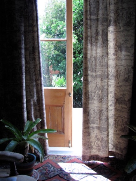
These are my favourite curtains. I bought the toile at the fabulous Ab Fab in Newmarket, Auckland (www.abfabrics.co.nz) who specialise in end of line fabrics at cheapish prices.

It is Robinson Crusoe a toile ‘from the Christopher Moore Toile Collection’. It is very delicate and pleasing. I have also pinned some over an ugly door into my study and even, believe it or not, made some covers for my completely utilitarian desk chair. (I’m aware you can ‘over-toile’. Next thing my kitten will be wearing a toile poke-bonnet and kick-skirt.)

So – if you don’t want to take your curtains down and have a ‘nude’ look, the alternative is to pull your curtains so they almost meet, so that light enters as if in a painting or a Scandinavian film.

(An alternative here is to hang some cheap light white gauzy fabric, which filters the light but doesn’t have the naïf quality of ‘nets’. A thin cotton does the trick. Hey presto, you’re in Sweden.)

I realize this all makes me sound like a decor obsessed queen. Maybe I am? Another way of looking at it is: how can you change your life easily? Well, let’s start by gently pulling the curtains on the high noon of a painfully bright summer’s day… at least it will get the neighbours talking.

PW

Posted in Uncategorized | 2 Comments

Original Surfaces (2)

a prime example of Edwardian design idiocy - the original dining room wallpaper

I don’t want to leave the impression that dealing with original surfaces is entirely simple. Often old surfaces are fragile and sometimes, attractive as they are, they’re in entirely the wrong place.

The Studio walls were a gift but they needed some attention. There were places where sections of wall and ceiling had to be replaced, having been long ago cut out to accommodate picture windows and the like. Matching not only the colour but also the surface character took forever – and lucky for us candlelight is as kind to old walls as it is to aging skin.

Our second surprise old surface appeared in what was once the dining room but had been carved into three in order to make a kitchen, a bathroom and the back porch for the second flat. The room had lots of potential – it has large west-facing windows into the side garden and overlooks the coming and goings on the lane. It also has its own external door. I had no fixed plan for what this room was going to look like. I only knew it was to be my study and dressing room – all I required was a suitable background – so I was open to possibilities.

When we started taking off the kitchen wall linings we exposed the porridge coloured papers that were quite inexplicably popular before the First World War. These had been generally damaged by the installation of kitchen benches, hot water cylinders and other necessities. However, above these, intact and undamaged, were the original decorative papers – used on the upper third of the wall. They were in those splendid rich colours in which no wallpapers any longer come and had just the right degree of late Victorian/Edwardian idiocy – they depict a branch on which a multitude of fruit and flowers bloom in a way they don’t appear together in nature – to make them worth keeping.

The problem was that the papers followed the perimeter of the old square dining room – which meant they now passed through three rooms – the kitchen out onto a small recessed exterior porch and back into the bathroom.

This took a while to figure out – could I use the old papers on the three walls of the study and treat the dividing walls differently? This was a possibility. Yet however I approached it all ways ended up looking like a 1950s feature wall. In the end it was decided that as the old papers were on scrim (hessian nailed to the walls) we would try and lift them from the porch (removing weatherboards first) and bathroom and re attach them so that old papers would circle the new study.

In the end we didn’t have lot to lose, if it didn’t work we could start the whole room again from scratch. I should add that, in Napier where the air is dry and humidity is rare, scrim survives well and is often still quite strong, whereas in old houses I’ve had in Auckland the scrim has generally rotted away causing the papers to sag.

the paper comes off ...

... and goes back on

Nervous as we were starting out, the process proved surprisingly easy. We cut off the scrim under the cornice line and cut off the less attractive lower papers below leaving us with the good paper which was rolled around a piece of plastic pipe as we went. This reduced the risk of tearing while handling the large expanse of paper.

Once freed from the old walls the roll of paper was stapled up to the newly gib-stopped walls of the study. As the cornice had yet to go up (it too was shifted from the other rooms) we were able to conceal the staple line at the top. We brought the bottom line of the old paper up slightly around the whole room to conceal weaker and damaged edges of the paper. By using a small wooden beading (or picture rail) the old paper was, in essence, captured under the woodwork.

I’d had the room lined with gib-board and stopped to a particular height. This means that above the line, the papers are still on scrim against the sarking but below new papers (I chose a little striped paper in red-brown tones) are pasted, as normal, to new gib-board.

The change of colour halfway through indicates some likely water damage to the earlier paper - but no one ever notices.

The effect works well and it looks authentic – because in large part it is. These papers are now more than 100 years old.  Yes, there are places were the paper is faded and water-stained – but florid patterns are great at hiding such flaws. There are some details –  the pattern of old and new papers is misaligned in the corners – but you know no one ever notices.

Like the blue of the Studio, I’d never choose a vivid russet orange and purple wallpaper with green highlights given the choice but delivered back from the past it’s a gem worth keeping.  Although I often find myself annoyed at the impermanence of New Zealand houses, in this case, the Kiwi way of building old houses delivered up was an old surface that turned out to be highly portable. It is nice to think that a nice original surface in the wrong place is something that can be moved and have a new life somewhere else.

DLJ


Posted in original surfaces | 1 Comment

Snaps

I ran out into the garden last night before it got dark and took these ‘snaps’ (to use a nice old fashioned term). Gardens are so hard to photograph in full sunlight. They bleach out and look flat. They lose the mystery. And it seems to me a garden is all about mystery.

This is our front garden. Or I should say ‘my’ front garden. I’m allowed the front while DLJ has the back. Make of that what you will.

When we arrived here, the house had been in flats for almost fifty years.  There was the remnants of a garden. The hydrangeas were there, but mauled by over severe pruning. The tecoma hedge was a mess. It was allowed to grow just enough to hide a garden rubbish bag.

In the five years we have lived here we have encouraged the tecoma hedge along the front wire fence. (Tecoma capensis)  is the old fashioned hedge, which used to once be everywhere. It has orange flowers. As kids we used to lick the ‘sugar’ out of the funnel of the flowers as we walked home from school).

The hedge is now just below the eyesight of passersby. DLJ’s idea is to carve a picture window in the hedge. This allows people on the street to look ‘into’ the garden and enjoy the flowers. It also allows us the view of the occasional handsome muscular runner jogging by. So everyone is a winner, you could say.

But like most gardeners I am always looking to the next season. I can see how to improve the summer garden (even though now it is at its height.)

2.

A hydrangea hedge was very common when I was a kid. There’s something about the rangy bulk of it and that slightly peppery smell of the flowers. They require a lot of space and sprawl everywhere. They fade in the sun and then die away in winter to stalks. But somehow their bravura expenditure of flowers seems to me to be all about summer.

I have twinned these smoko-pink hydreangeas with pink mellow and red chinese lanterns (abutilon). The redder accents are tall hollyhocks wavering in the wind.

A friend who is an accomplished professional gardener took one look at the ‘border’ and saw what was wrong. It should run against the front fence, she said, so we view it from the windows of the house, looking out into the garden. As it is, we tend to see the back of the border.

I know what she means. I well remember a Hawera farm garden which you looked at from inside the house, across a lawn. It always seemed elegant and you felt you lived practically in a palace, but it’s too late to change now. The kaizuku trees are in position, as is a box semi-circle.

Sometimes you have to live with your mistakes.

3.

Our neighbours to the side don’t have a front garden. They have gravel and dirt. To be polite it ‘lacks imagination’.

I want to grow the tecoma hedge on that side of the garden and block them out. There’s enough ugliness in every day actions, in political corruption, in human behaviour. So I choose – we choose – to have one small zone of beauty. I guess that is what this garden – and house – is about.

I love the kind of mystery you get at dusk when you blur your eyes and you suddenly see the garden as it might be, in the future, when it grows.

Dusk is the magic time to be working in the garden and I always find myself lingering out there.

The cats come out and join me.

In my mind’s eye I can almost see how the garden will evolve in the future…

I’m a writer by trade and there are so many similarities to writing and editing and gardening.

But gardening at dusk. Now that’s bliss.

PW
Posted in gardening | Leave a comment

Original Surfaces (1)

There is a vogue (fashion, compulsion, illness) amongst New Zealanders renovating old villas and bungalows that leads them to buy them ‘because they love old houses,’ and then to relentlessly remove all trace of old or original surfaces from the house in question.

There is nothing more disheartening than visiting an open home for a property featuring attractive old paintwork and wallpapers and then to see that property back on the market a couple of years later with every individualised character moment stripped away in a hurricane of dopey, thoughtless, decorating.

It comes of course from upbringings in the outer suburbs were anti bacterial sprays, wipe clean surfaces and plastic paints (“Sandfly point, Pencarrow, Sandfly point”) still hold sway and where if its not new, it’s on the curb awaiting recycle. So when you move into an older house a period of attitude adjustment is required while you realise that dirt is just dirt – removable not life threatening.

Having said that, there are plenty of times that an old surface needs to go. I understand the desire to eliminate worn 1970s wallpaper or an old vinyl floor covering from a house the architectural style of which, seriously predates the invention of either. However every now and then the past throws up a challenge around original surfaces that really does require some thought.

In this project a combination of good luck and fate has delivered us a number of original surfaces that belong to the original decorating scheme first conceived in 1906.

The Bedroom: with modern midnight blue paint finish.

This first occurred in the Studio. A large room, it had been divided into three, one of which had been painted an unattractive midnight blue. The one thing we knew is that the reinstated Studio wasn’t going to be painted dark blue. Once the more recent partition wall came down and the first of the wall linings came off – what was revelled was a horizontal match-lined wall surface – painted midnight blue.

The Studio: midnight blue paint finish revealed

The difference between the horrible painted surface of the demolished bedroom and that of the original studio walls, was that the original studio paint has deteriorated to a point where its colour was uneven – a series of dark and light patches and some sort of bloom. Either that or it is one of the old washes that decorators try so hard to emulate (it has a translucent quality). either way it has a worn attractiveness that can not be achieved with one coat of plastic paint – no matter how nice the colour seems on the paint chart.

Add to that a few tack holes and a bruise here and there and you have a surface that works wonderfully with older furniture and faded carpets. It has even encouraged us to leave the old pox-marked and paint splattered shellac floor finish.  In the end the finish suits an old house (even if people do ask if “We’re going to do the floors”) in the way that a new coat of Polymethyl methacrylate (acrylic paint) could never do.

The effect in the Studio is certainly individual and in a colour we would never have chosen but it is unmistakeably a gift from the past – one to be respected – not least of all because it looks fabulous at night under candlelight.

DLJ

Posted in original surfaces | 1 Comment